A Brief Look WITH
We crafted a high level sustainability report for executives and investors, prioritizing absolute consistency, disciplined typography, and credible data visuals. The result communicates progress, compliance, and intent with confidence, without visual noise or ambiguity.
categories
Software & Skills
3D Modeling
3D Rendering
Adobe Illustrator
Adobe Photoshop
Branding
Client Collaboration
Data Visualization
Icon Creation
Keyshot 3D
Layout Design
Presentation Optimization
3D Modeling
3D Rendering
Adobe Illustrator
Adobe Photoshop
Branding
Client Collaboration
Data Visualization
Icon Creation
Keyshot 3D
Layout Design
Presentation Optimization
Color Palette
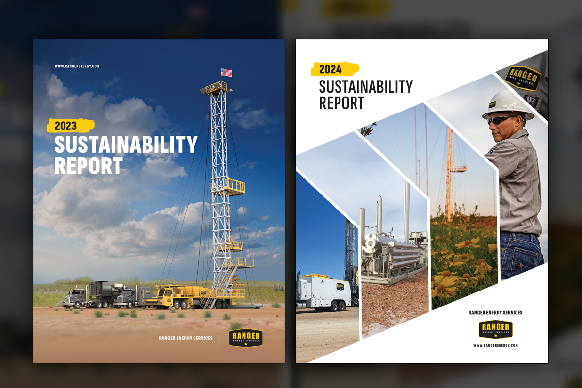
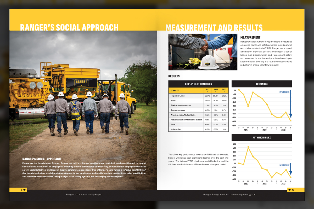
Leadership wanted the next iteration of the ESG report to spread the visual focus from only the equipment to the technology and the people out in the field as well.
Progress
Progress
Summary
We designed Ranger’s investor-facing ESG report to present material progress with clarity and consistency. The publication applies strict typography, disciplined charts, and a restrained image strategy so executives can scan diversity data, emissions movement, and initiatives quickly. Every spread prioritizes legibility, credible annotation, and repeatable structure. The result is a clean, confident report that reads fast, withstands scrutiny, and represents Ranger’s standards without distraction.
Project Goals & Purpose
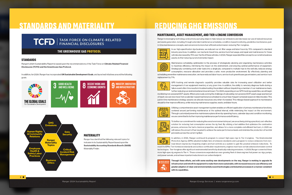
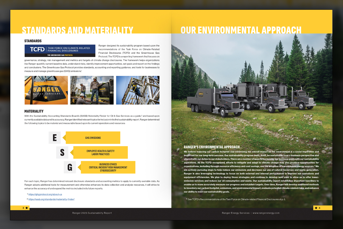
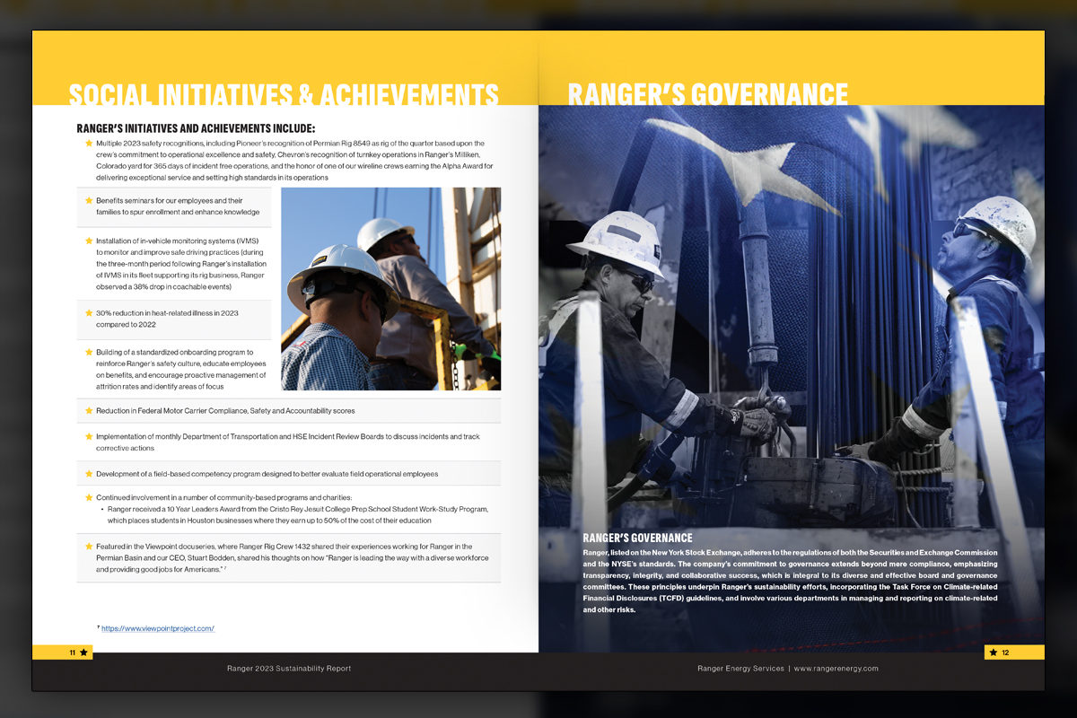
We set out to earn trust in the first minute and keep it on every page. Success looked like a report that communicates clearly to executives and investors, while remaining practical for annual updates. Before any design work, we defined table styles, chart conventions, and annotation rules that would make comparisons fair, readable, and consistent. UN Sustainable Development Goals provided recognizable anchors, and custom iconography localized priorities such as reducing GHG emissions and documenting safety performance. Photography would support, not lead, with a single hero image and minimal decoration. Copy length needed to flex to the grid so no paragraph overwhelmed the page or felt thin. The team asked for a repeatable system that scales to slides and web summaries without rebuilding the story each year. To keep delivery efficient, we maintained the report through our design retainer, which functions like an On-Demand Creative Services lane for time-sensitive edits and verified data changes.
This approach fits Marketing Directors and brand managers who want Corporate Design Solutions without unpredictable costs, and it ensures the next edition can grow in scope while preserving the same disciplined reading experience.
Challenges
ESG content arrived at varied lengths and technical depths, which risked irregular pages and orphaned ideas. Diversity tables required meticulous alignment, accurate category naming, and consistent footnotes. Carbon capture processes needed clarity without revealing sensitive operational specifics. A technology spotlight demanded diagrammatic rigor alongside investor friendly language. UN SDG icon usage had to remain respectful and standardized. Finally, photographic composites and 3D asset integrations needed to feel authentic in context, while periodic content changes required precise version control to keep the entire publication perfectly consistent.
Solutions
We codified a publication system with master grids, optical type sizes, and table styles that withstand edits. Charts follow fixed scales, label rules, and color semantics for repeatable comprehension. Carbon capture and TOPS were communicated through clean process diagrams and simplified 3D overlays placed into photos with disciplined perspective, lighting, and grain. SDG icons appear in a governed band with consistent spacing. A QC checklist validated numbers, notes, and captions before lock. Delivered through our On-Demand Creative Services within a Design Retainer Service, this approach reflects Corporate Design Solutions that update annually without sacrificing precision.
Client Reception
Leadership and investors responded positively to the disciplined presentation, citing easier briefings and stronger confidence in the underlying data. The team noted fewer layout edits, faster approvals, and a clearer connection between initiatives and results. Stakeholders appreciated how the system scales to decks and web, while preserving credibility.


Additional Images