A Brief Look WITH
We built a safety icon system and honeycomb risk map for Ranger, then developed a management training deck that applies those visuals to real hazards. We are proud it clarifies life-saving behavior companywide.
categories
Software & Skills
Color Palette
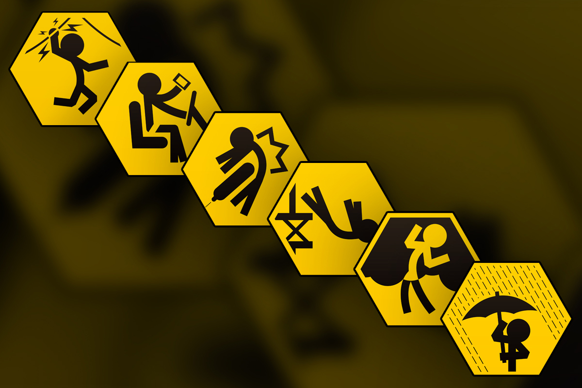
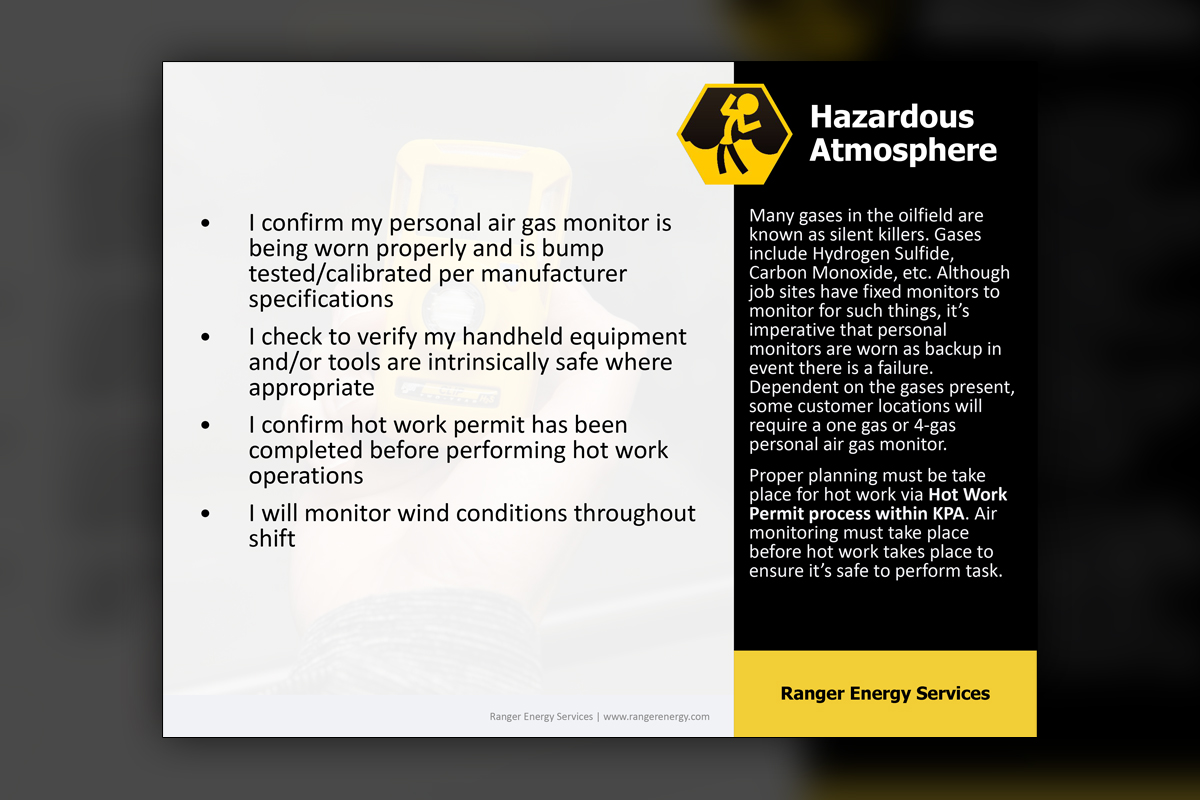
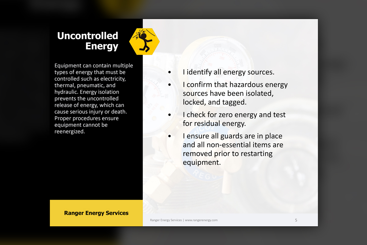
A stacked view of the six core hexagons presents Uncontrolled Energy, Driving, Line of Fire, Working at Heights, Hazardous Atmosphere, and Weather together. The icon style remains consistent while each category reads instantly at any size.
Awareness
Awareness
Summary
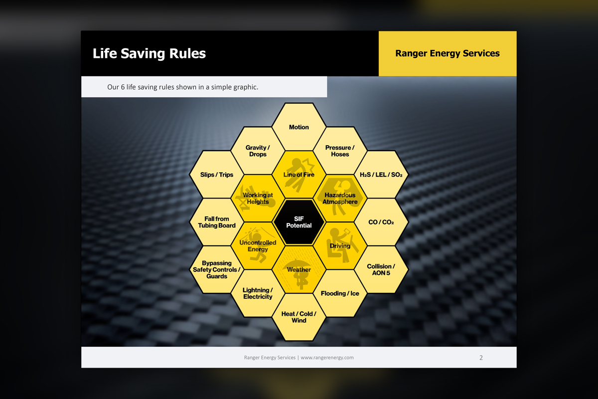
We created an internal Life-Saving Rules campaign for Ranger that centers on a honeycomb risk map and a set of clear, government style stick figure icons. The system highlights six priority categories around SIF (Serious Injury or Fatality) potential and connects each to specific field hazards. A companion PowerPoint equips managers to teach scenarios, discuss controls, and reinforce safe actions. The result is a simple, consistent language that crews understand quickly and leaders can deploy across locations without confusion.
Project Goals & Purpose
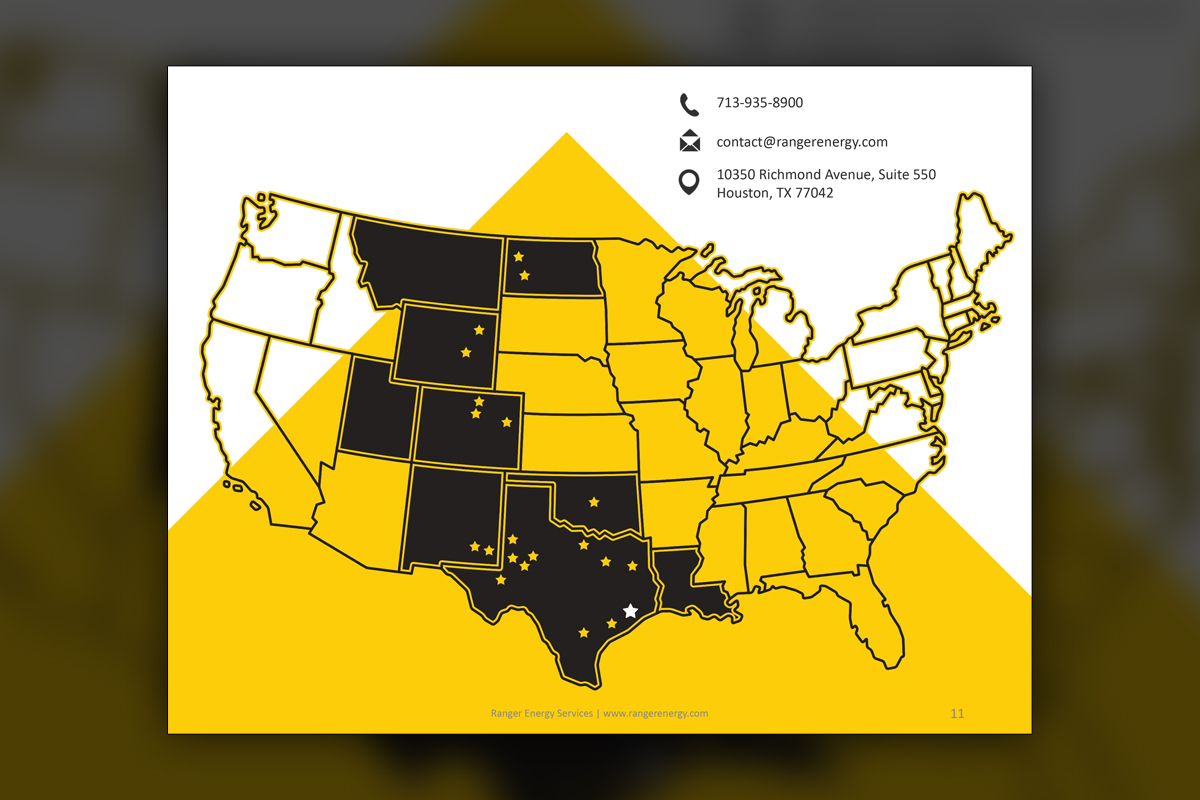
The mandate was simple, make safety memorable. Before design, we mapped how crews actually encounter risk, then translated those patterns into a honeycomb that places SIF potential at the center with six categories radiating outward. Each category needed a distinctive, instantly readable icon that works on slides, posters, and truck stickers. Yellow and black fit Ranger’s brand and signal caution clearly, so we leaned into that palette with high contrast shapes. The training deck had to feel practical so every slide ties to the closest icon showcasing one of the six most common deadly errors. Management asked for tools they could personalize by region, which led us to flexible templates, editable callouts, and a location map slide that has editable star pins for scalability as the company grows. This work sits well inside a monthly creative partnership, our design retainer keeps updates moving as observations surface from the field. For leaders who need Corporate Design Solutions without hiring full time, the model turns safety ideas into usable materials that roll out quickly and stay consistent.
Challenges
Iconography had to be unmistakable for crews with varied backgrounds, which meant clean shapes, clear actions, and no ambiguity. The honeycomb needed to show relationships without crowding, while still allowing site specific hazards around each category. Color usage had to honor brand guidelines and remain readable in poor lighting or on dusty surfaces. Two of Ranger's three brand colors are yellow and white, which aren't always ideal for legibility when placed together. Slides required enough detail for managers, yet simple enough for quick tailgate use during daily refreshers. Finally, the system had to scale across locations with different printers, formats, and adoption speeds.
Solutions
We designed a minimal stick figure style with intentional poses and negative space that read instantly at small and large sizes. The honeycomb uses consistent hex proportions, fixed label rules, and a simple ring structure that connects SIF potential to its surrounding risks. Yellow and black were tuned for contrast and accessibility. The training deck includes templated scenarios, editable callouts, and a locations map to localize delivery. Through our on demand creative services within a predictable design retainer, updates stay fast and consistent, a practical fit for teams seeking Corporate Design Solutions.
Client Reception
Ranger’s leadership praised the clarity and adoption speed, noting that crews referenced icons in tailgates and supervisors used the deck to coach consistently. Safety managers appreciated the flexibility for regional notes. The campaign became a common language for risk, and the visuals now appear across yards and presentations.


downloads
No downloads currently available.
Tags
Related Projects
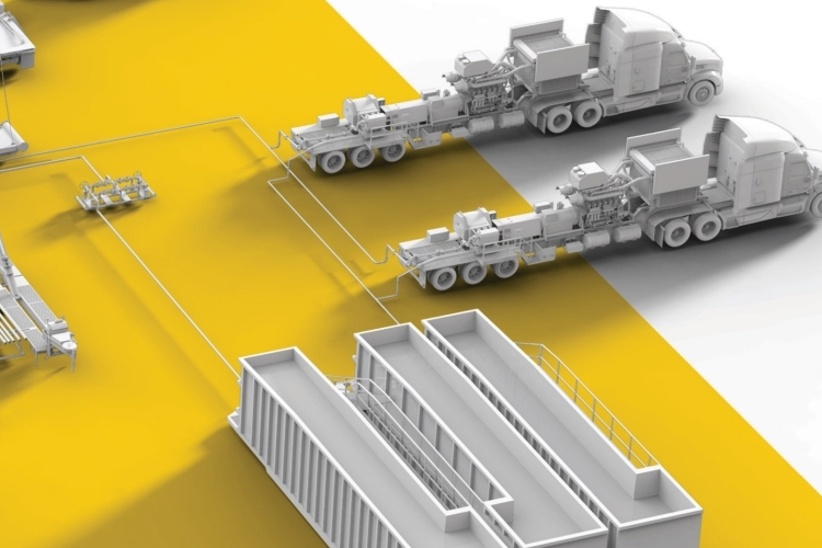 Since 2018, Predi Designs has partnered with Ranger Energy Services to provide regular design services, enhancing their marketing and operational materials. Our collaboration began with an intricate 3D animation project illustrating the fracking process and showcasing Ranger's equipment lineup. This project involved creating numerous custom 3D models, which have since been repurposed across various collateral, ensuring consistency and visual appeal. Guided by Ranger's established color scheme, we have developed a cohesive visual identity across all materials.