A Brief Look WITH
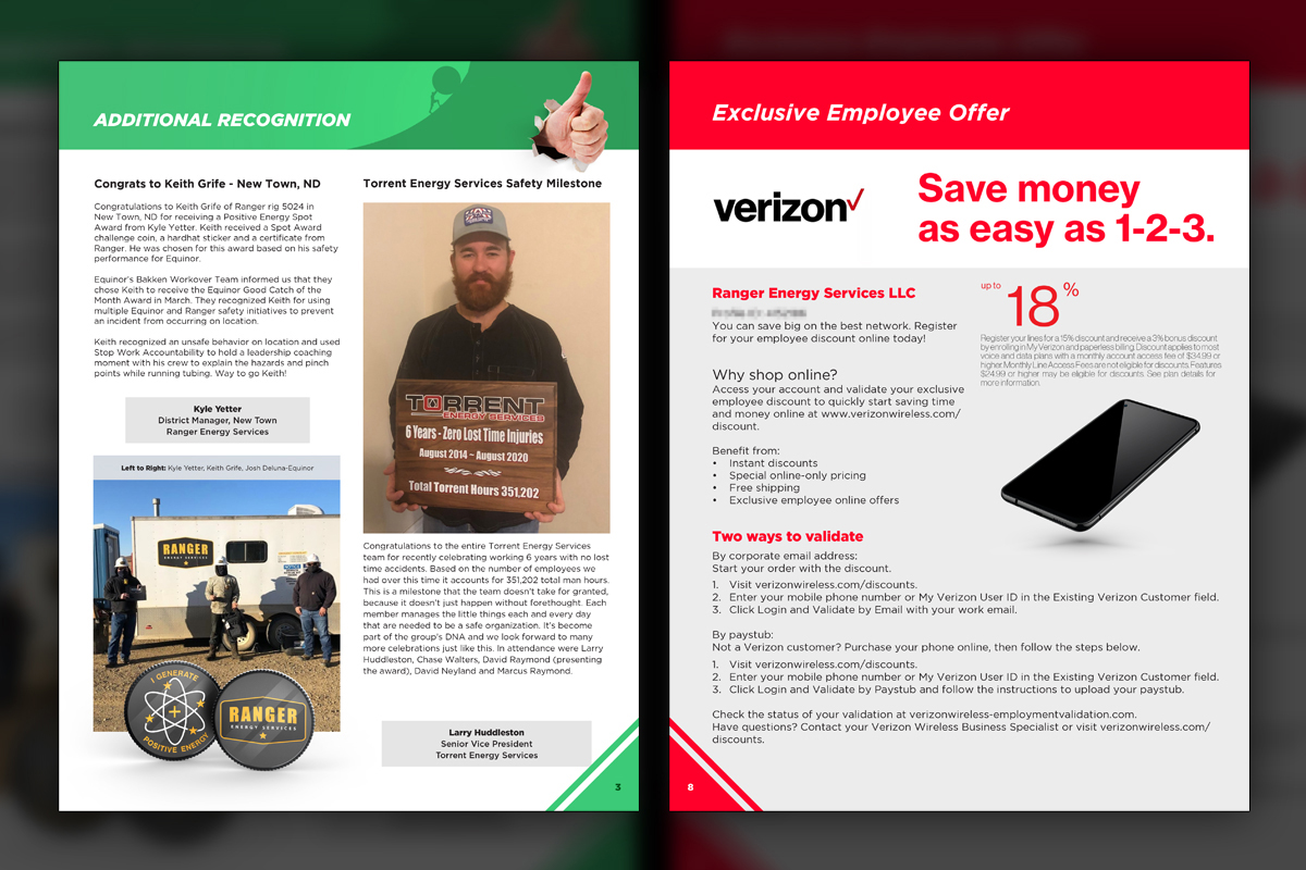
We produced bilingual quarterly newsletters for Ranger, balancing speed with quality. Simple templates, clear typography, and collaborative workflows let us publish English and Spanish editions quickly, sharing wins, safety lessons, benefits, and leadership messages companywide.
categories
Software & Skills
3D Rendering
Adobe InDesign
Adobe Photoshop
Advertising Strategy
Branding
Branding Compliance
Client Collaboration
Custom Illustration
Keyshot 3D
Photo Manipulation
Print Design
Typography
Vector Illustration
3D Rendering
Adobe InDesign
Adobe Photoshop
Advertising Strategy
Branding
Branding Compliance
Client Collaboration
Custom Illustration
Keyshot 3D
Photo Manipulation
Print Design
Typography
Vector Illustration
Color Palette
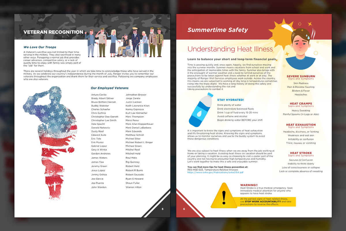
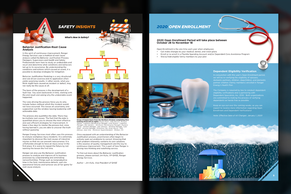
Veteran Recognition sits beside Summertime Safety tips, both with portraits and simple iconography. Every page in the newsletter had a modular header and color scheme and over time we developed a collection of eclectic pages.
Pulse
Pulse
Summary
We designed and produced Ranger’s quarterly newsletter series as a fast, bilingual publication. Uniform page grids kept production predictable, while custom headers gave each section a distinct voice. Every issue shipped in English and Spanish, carrying CEO messages, safety insights, technology updates, benefits news, and employee recognition. Small type with generous white space protected the Spanish expansion. The result was a dependable cadence that built pride, shared practical lessons, and kept distributed crews informed without slowing operations.
Project Goals & Purpose
The team needed a newsletter system that respected real-world constraints, limited content windows, and two languages without sacrificing clarity. Success looked like fast turnarounds, predictable layouts, and space for leadership notes alongside field stories and benefits. Before any design, we mapped the recurring sections most likely to appear each quarter, then developed headers that carry personality without complicating production. Spanish translation typically runs longer, we planned typographic settings and white-space buffers that preserve legibility when text expands, then exported twin editions with identical hierarchy. We also created a small library of service illustrations, safety 3D header art, and sponsor frames so special pages could feel fresh while staying inside the system. Collaboration was central, we captured feedback precisely and implemented notes faithfully, even when personal preferences differed.
This publishing rhythm works best as a monthly creative partnership, a practical form of on-demand creative services that delivers corporate design solutions without hiring additional staff. For Marketing Directors and brand managers, the value is confidence, every quarter can ship on time, read cleanly in two languages, and reflect the culture Ranger wants to reinforce across sites and departments.
Challenges
Quarterly cadence created timing hurdles around content gathering, with photos and stories arriving late from multiple regions. Spanish translation expansion consistently increased copy length, which risked cramped pages or last-minute re-layouts. Uniform layouts were necessary for speed, yet sameness could feel dull if headers lacked personality. Sponsor materials varied in quality and formats, requiring adaptation without breaking consistency. Safety visuals needed to be clear for all readers, but overly technical graphics slowed production. Finally, we had to manage two complete editions per issue, maintain identical hierarchy, and keep approvals moving despite small fonts, tight space, and frequent last-minute tweaks from many stakeholders.
Solutions
We standardized a grid and typography system and header kits that add personality without changing production effort. Spanish expansion was planned from the start with flexible line breaks and white-space buffers, allowing identical hierarchies across editions. A content intake checklist clarified photo specs, captions, and sponsor needs, while modular panels adapted partner assets quickly. Safety sections used simple iconography and occasional 3D header art for clarity. Version control kept English and Spanish synchronized through reviews. Operating as an ongoing design retainer, we maintained predictable timelines, absorbed late items gracefully, and delivered consistent, readable newsletters every quarter.
Client Reception
Ranger’s communications team praised the steady cadence and bilingual precision, noting fewer layout emergencies and faster approvals. Managers appreciated clear safety sections and engaging recognition headers. HR reported stronger awareness of benefits like Verizon discounts. Leadership valued how each issue looked polished yet familiar, and how quickly the team could publish both editions without sacrificing readability or the company’s voice.


downloads
No downloads currently available.
Tags
Related Projects
 Chaoda USA has had a longstanding subscription with Predi Designs since 2016, executing two comprehensive rebrands to enhance their presence in the American valve industry. Our collaboration has modernized their visual identity, aligning it with industry standards and unifying their brand portfolio.
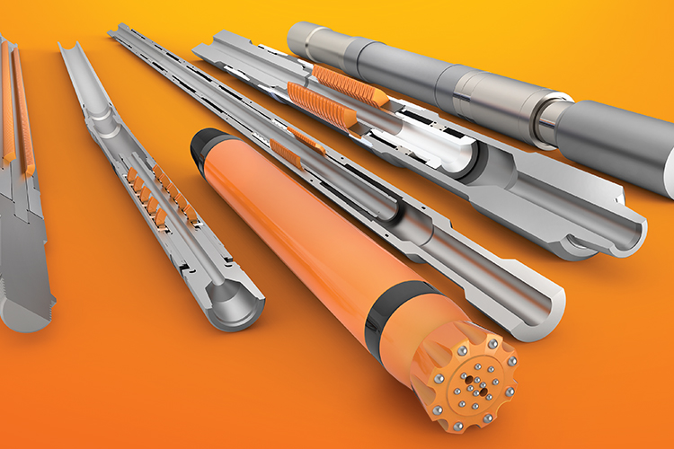 Belleville International started as a one-off client, but after experiencing how convenient and valuable our design services are, they became a long-term subscriber. Over the years, we’ve redefined their brand identity, modernized their visual presence, and rebuilt their website to position them as an industry leader.
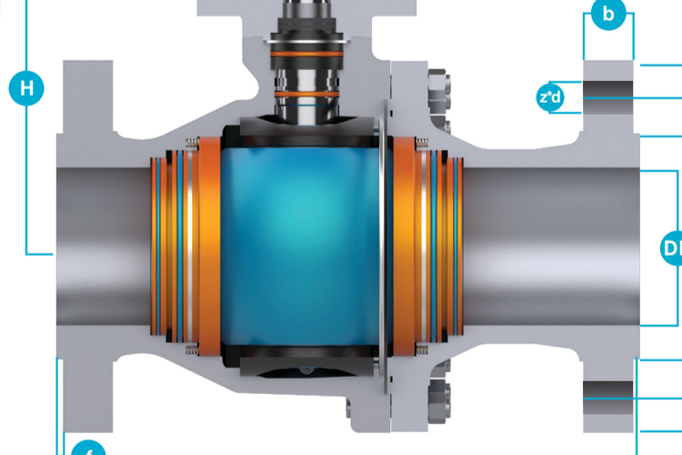
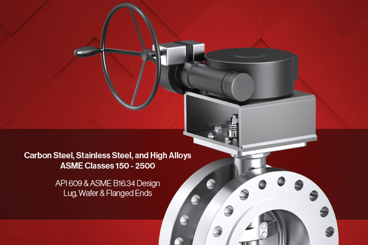 JDV USA needed a visually striking and user-friendly product catalog to replace outdated marketing materials. Predi Designs created a modernized, brand-consistent design, integrating 3D-rendered product visuals, clear technical illustrations, and a refined layout that elevated JDV’s market presence.
