A Brief Look WITH
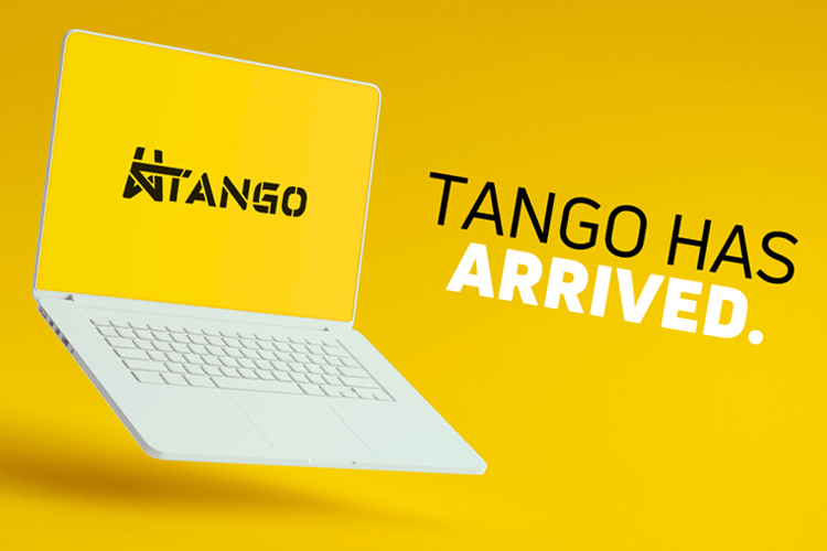
We created distinct PowerPoint template systems for Submar and Ranger, matching each brand’s voice. Clear guidance slides teach teams how to personalize layouts, ensuring faster decks, consistent visuals, and confident delivery.
categories
Software & Skills
3D Modeling
3D Rendering
Adobe Photoshop
Brand Strategy
Branding Compliance
Client Collaboration
File Export & Optimization
Keyshot 3D
Microsoft PowerPoint
Powerpoint Design
Presentation Optimization
3D Modeling
3D Rendering
Adobe Photoshop
Brand Strategy
Branding Compliance
Client Collaboration
File Export & Optimization
Keyshot 3D
Microsoft PowerPoint
Powerpoint Design
Presentation Optimization
Color Palette
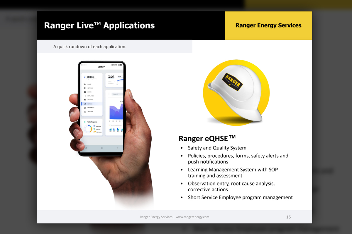
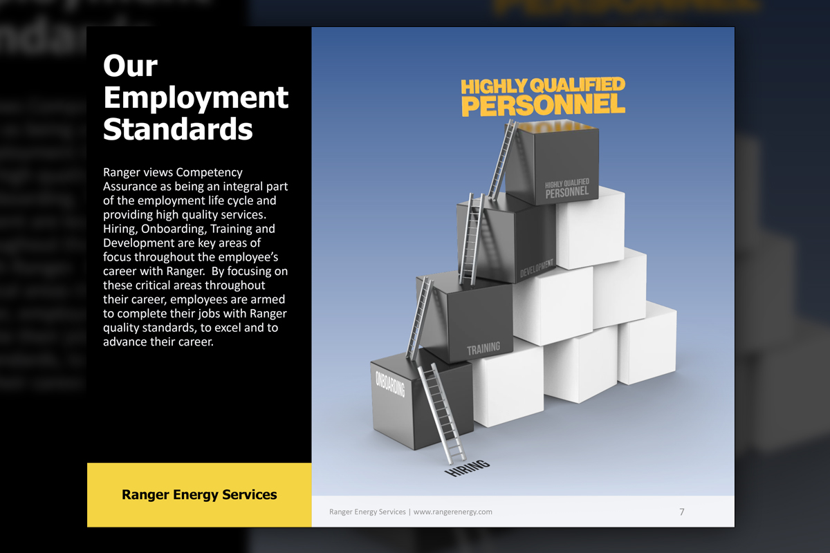
A clean, modern Ranger slide introduces the Ranger Live suite with a UI screenshot, the app icon, and concise bullets, demonstrating how the internal template balances clarity, whitespace, and quick comprehension for corporate meetings.
Versatility
Versatility
Summary
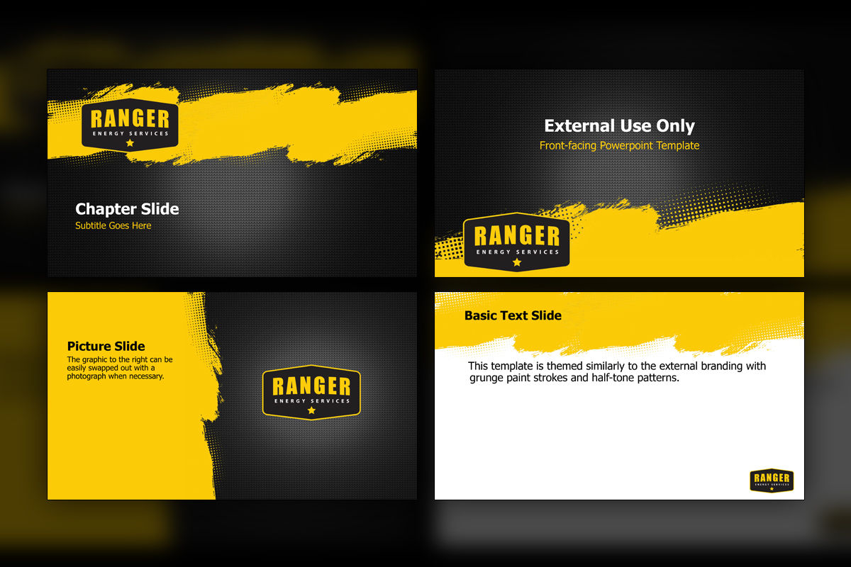
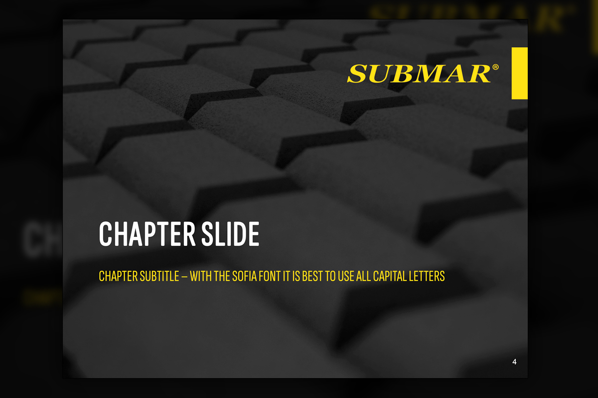
We built two modern PowerPoint systems that share strong color contrast and smart structure yet serve very different brands. Submar leans on desaturated header imagery, bold yellow accents, and crisp white titles. Ranger’s front-facing set embraces paint splatter halftones and carbon fiber texture, while internal templates preserve generous whitespace for content. Every package includes how-to slides that explain purpose, editing, and best practices. The result is faster deck creation, consistent design, and presentations that feel on brand for each audience.
Project Goals & Purpose
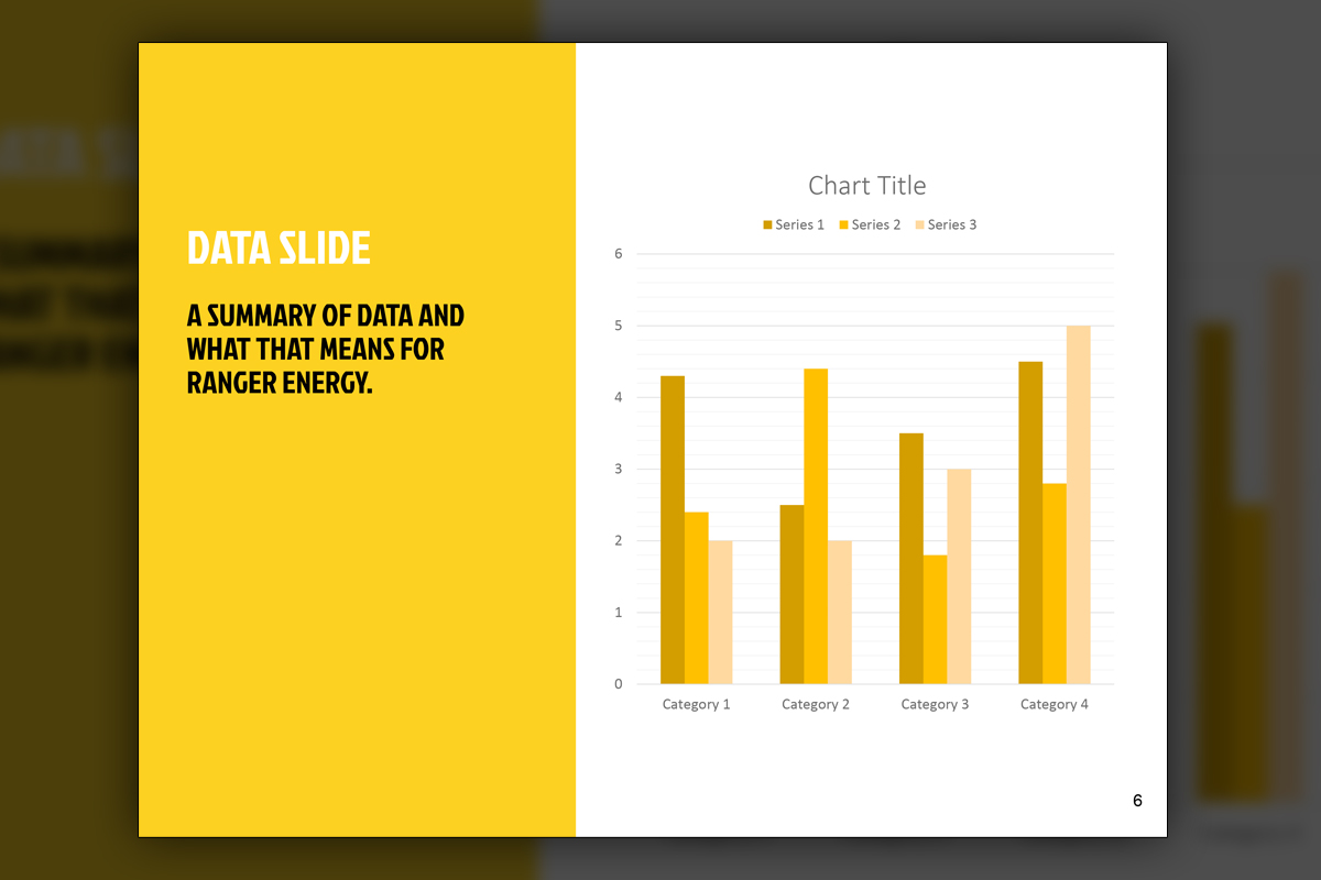
Executives told us they needed presentation kits that anyone could use well, without sacrificing brand integrity. For Submar, the goal was a template that echoes new literature, with darkened photography, a confident yellow tab, and clear typographic hierarchy that stays legible over imagery. For Ranger, we split needs into two families. Front-facing layouts showcase gritty textures that match field reality, while internal templates keep things clean for data-heavy briefings and training. We planned guidance slides that explain why each master exists, how to adapt it, and when to choose it, so users feel supported rather than constrained. Chart masters had to be flexible and readable. Content should scale from one speaker to a boardroom, and from a laptop to a large display, without rework.
To keep iterations quick, we maintain these systems through a monthly creative partnership that functions like a design retainer, combining on-demand creative services with documented standards. For teams seeking corporate design solutions, the aim is simple, reduce time to deck, increase clarity, and give presenters the confidence to focus on the story.
Challenges
Two brands shared a similar yellow and black palette, so visual systems needed to feel distinct systems without overlap. Ranger required expressive external slides alongside quieter internal ones. Submar’s dark imagery had to stay readable titles while preserving mood. Heavy data content risked cramped charts. Large screens and varied rooms demanded consistent legibility. Lastly, users with mixed design experience needed clear instructions that encouraged correct use rather than creative workarounds.
Solutions
We differentiated direction through texture and behavior. Submar’s system uses desaturated headers with a defined yellow tab and strict type hierarchy. Ranger’s external system layers paint splatter halftones and carbon fiber, while internal layouts maximize whitespace. Both kits include instruction slides, modular content blocks, and a full chart library with color semantics. Export presets keep files crisp on large displays. Supported by our Design Retainer Service and On-Demand Creative Services, these Corporate Design Solutions evolve quickly when brands add content or shift priorities.
Client Reception
Teams appreciated how fast decks came together and how clear the guidance slides felt. Ranger’s marketers liked the gritty front-facing option and the calmer internal set for training. Submar’s presenters valued readable titles over dark imagery. Leadership noted stronger consistency across meetings, while users reported fewer formatting fixes and more focus on story.


downloads
No downloads currently available.