A Brief Look WITH
We developed a consistent collateral branding that reframed brand color scope, elevated imagery with 3D renders, and clarified complex engineering topics. We are honored to see these pieces drive confident sales conversations nationally.
categories
Software & Skills
3D Modeling
3D Rendering
Adobe InDesign
Adobe Photoshop
Advertising Strategy
Brand Strategy
Branding Compliance
Cinema4D
Client Collaboration
Concept Development
Copywriting
Data Visualization
Data-Driven Design
Digital Ad Design
Keyshot 3D
Layout Design
Lighting & Texturing
Print Design
Technical Illustration
Typography
Color Palette
The final literature suite presents a unified system, featuring the logo-inspired divider between a bright orange-to-yellow gradient and a crisp white background. There's accurate 3D renders and useful engineering charts that turn complex topics into confident sales conversations.
client
Belleville International
Belleville International manufactures precision disc springs, thrust bearings, and custom washer solutions for demanding industrial, aerospace, and energy applications, pairing engineering support with responsive service and quality-driven production.
Project Year
2019+
Uplift
Uplift
Summary
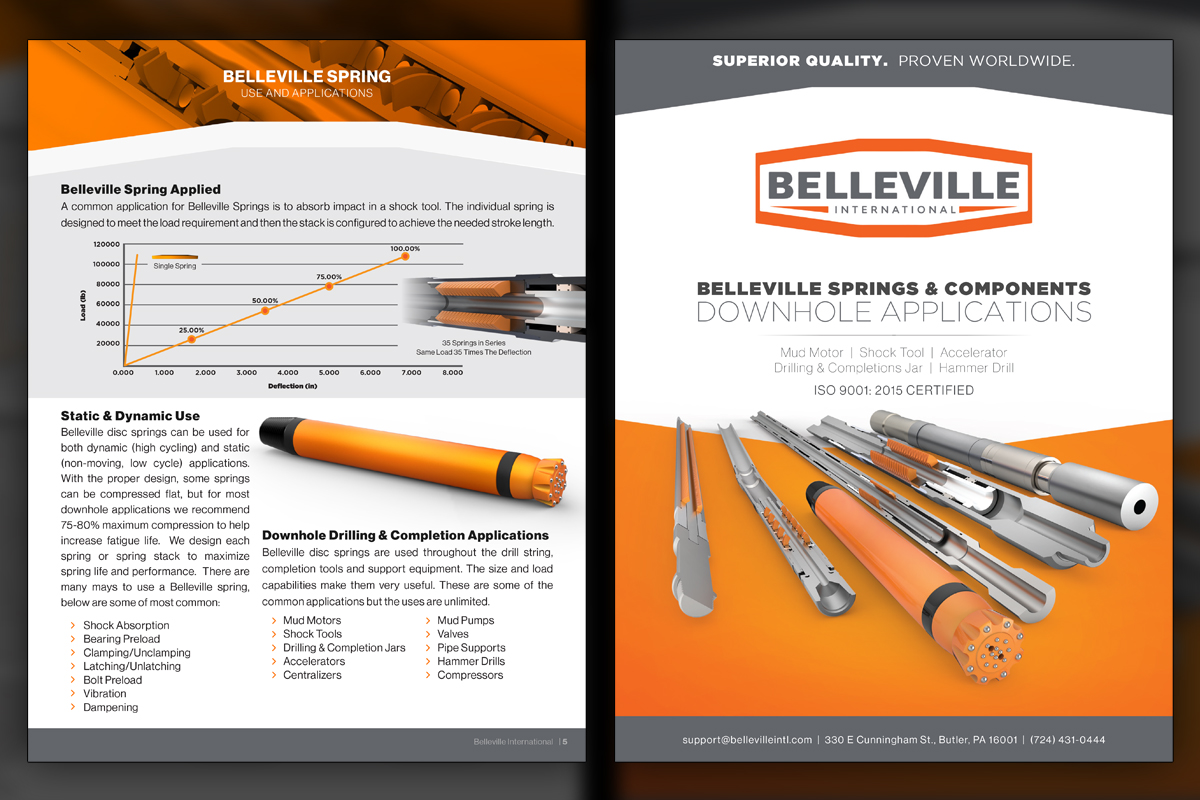
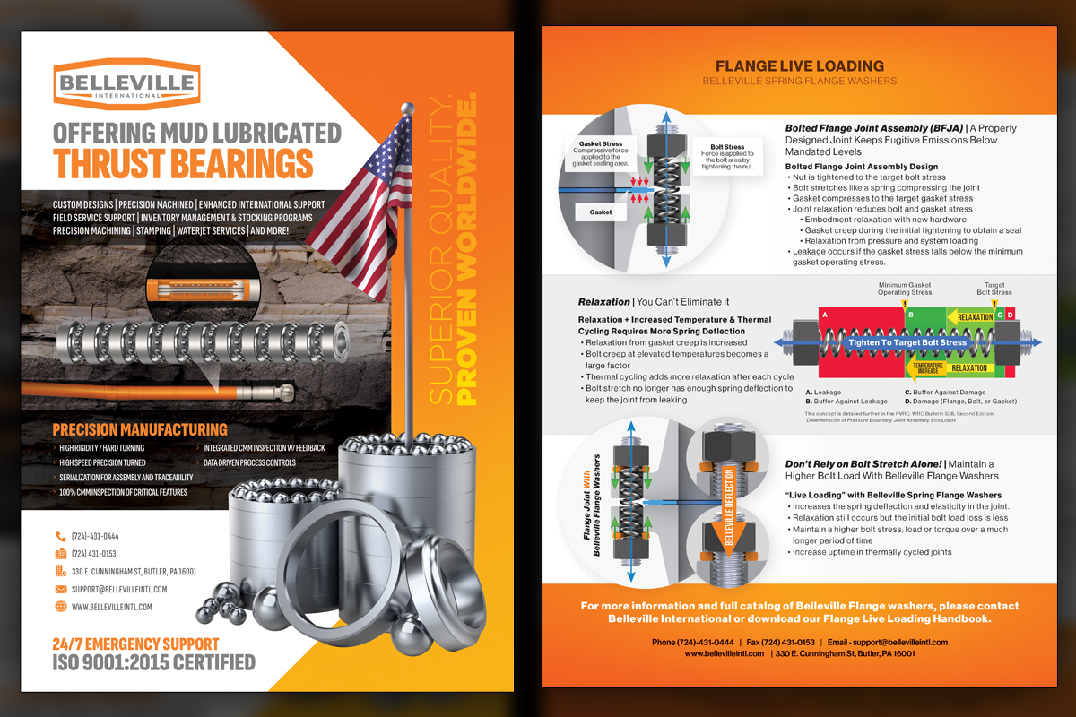
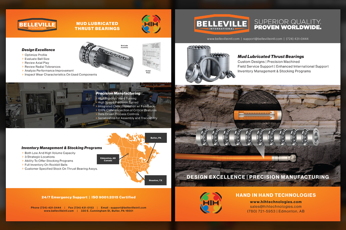
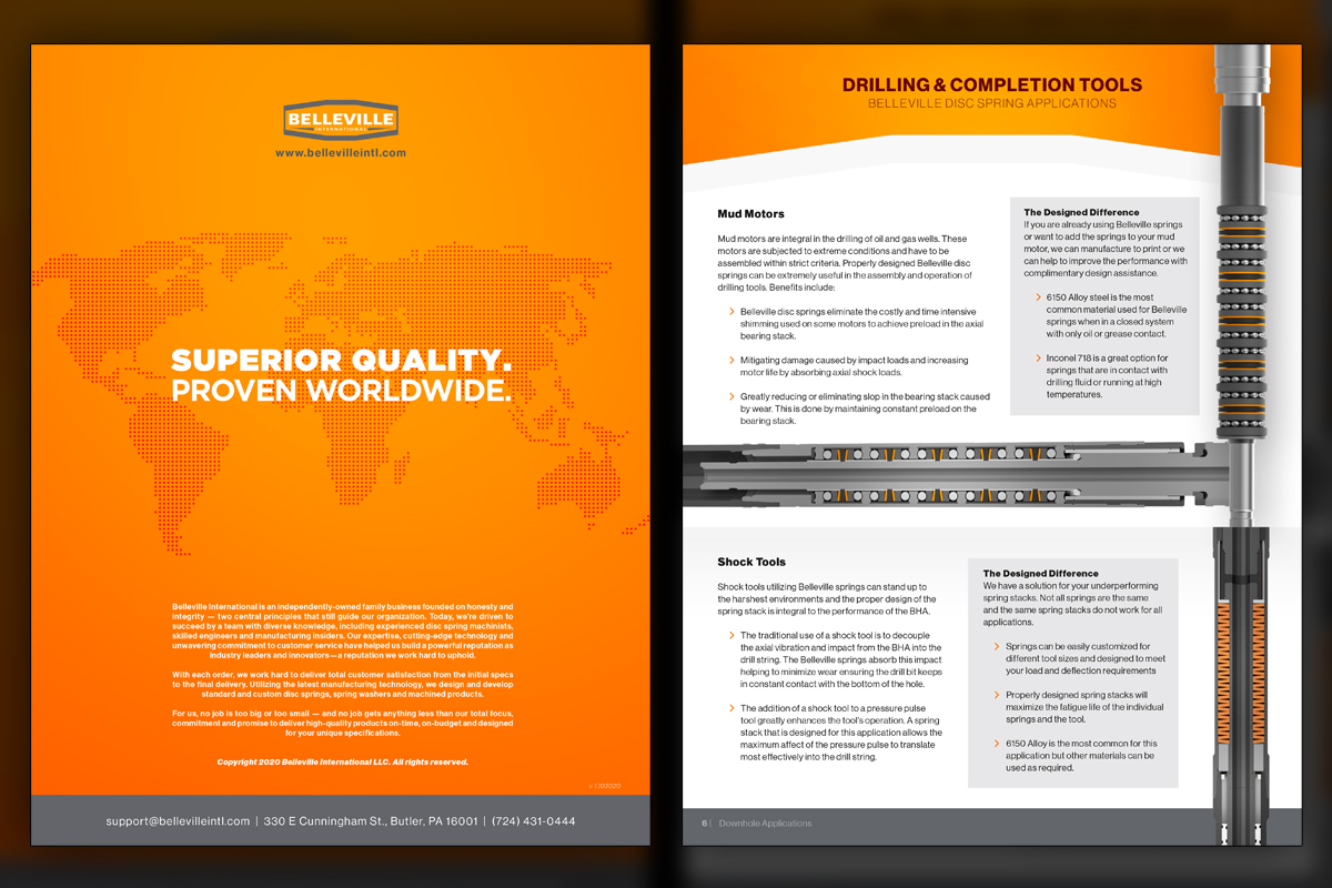
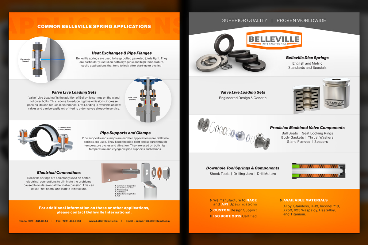
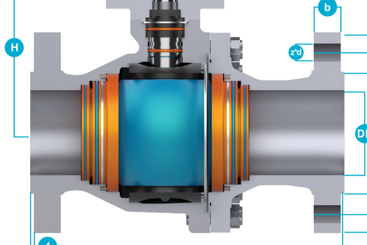
After rollout, Belleville International’s literature transformed from flat, color-limited sheets into a cohesive, persuasive system. We used the logo’s cross section as a signature divider between a brighter orange-to-yellow gradient and clean white, replacing greasy product photos with accurate 3D renders. Engineers collaborated with us on data visuals for deflection, load, temperature, and leakage. Application diagrams clarified use cases like valve flange live loading and downhole plug mill thrust bearings. The result reads consistently across brochures, spec sheets, and focused sell sheets. Remote collaboration posed no barriers, and the materials now support faster qualification, clearer storytelling, and brand confidence.
Project Goals & Purpose
From a brand evolution standpoint, the literature needed to shed a Halloween-leaning palette and communicate modern precision. Before we began, we outlined how each format, from brochures to single-page sell sheets, should work together to guide conversations, answer technical questions quickly, and present Belleville as a trustworthy manufacturing partner. The goal was not just better visuals, it was a system that helps engineers, purchasers, and executives reach the same understanding with minimal difficulty.
We proposed a brightened orange-to-yellow gradient anchored by white and very light gray, using the logo’s cross section as a recognizable divider. Clean 3D renders would replace oily photos, ensuring every spring, canister, and thrust bearing reads crisply at any size. Charts and graphs would be built hand in hand with Belleville’s engineers so numbers remain accurate while still scanning easily. As an ongoing graphic design subscription service rooted in On-Demand Creative Services, we planned fast turnarounds for hot items like mud lubricated thrust bearings, keeping sales teams stocked with targeted tools. This Design Retainer Service approach gives predictable capacity and consistent outcomes, inviting Marketing Directors and brand managers to engage for sustained momentum rather than one-off fixes.
Challenges
Early materials relied on two dark brand colors and low-quality, oily photography, which limited polish and clarity. We needed to standardize visual language across a large set of pieces, while keeping technical accuracy in charts and diagrams. Hot products, including mud lubricated thrust bearings, required quick spin-ups without sacrificing consistency. Coordinating inputs with engineers, confirming measurements, and balancing dense information with readable layouts demanded disciplined component decisions and careful typographic hierarchy.
Solutions
We established a modular grid with the logo-inspired divider, expanded the palette with bright yellow and white, and replaced photos with precise 3D renders. Charts were built from verified engineering data, using consistent scales and labels. Complex application visuals showed belleville springs within assemblies, clarifying value at a glance. Our ongoing Design Retainer Service and On-Demand Creative Services model made rapid additions easy, functioning like a dependable graphic design subscription service that preserves brand fidelity, accelerates approvals, and keeps sales stocked with focused, persuasive literature.
Client Reception
Belleville International reported stronger first impressions, smoother technical conversations, and better alignment between engineering and sales. They appreciated the patriotic visuals when relevant, the clarity of the diagrams, and the flexibility to deploy new variants quickly. Remote collaboration felt natural and dependable. The team described the literature as cohesive, confident, and measurably more useful during trade shows, sales calls, and follow-up emails.


downloads
No downloads currently available.
Tags
Related Projects

 Chaoda USA has had a longstanding subscription with Predi Designs since 2016, executing two comprehensive rebrands to enhance their presence in the American valve industry. Our collaboration has modernized their visual identity, aligning it with industry standards and unifying their brand portfolio.

