A Brief Look WITH
We created a continent wide social campaign that replaces famous landmarks with valves, blending 3D renders and photo compositing. We are honored to visualize expansion with craft, humor, and precise technical authenticity.
categories
Brand Identity & Visual Strategy
Custom Illustrations & Creative Concepts
Digital & Social Media Graphics
Packaging & Environmental Design
Software & Skills
3D Modeling
3D Rendering
Adobe Photoshop
Brand Strategy
Keyshot 3D
Photo Manipulation
Social Media Expertise
3D Modeling
3D Rendering
Adobe Photoshop
Brand Strategy
Keyshot 3D
Photo Manipulation
Social Media Expertise
Color Palette
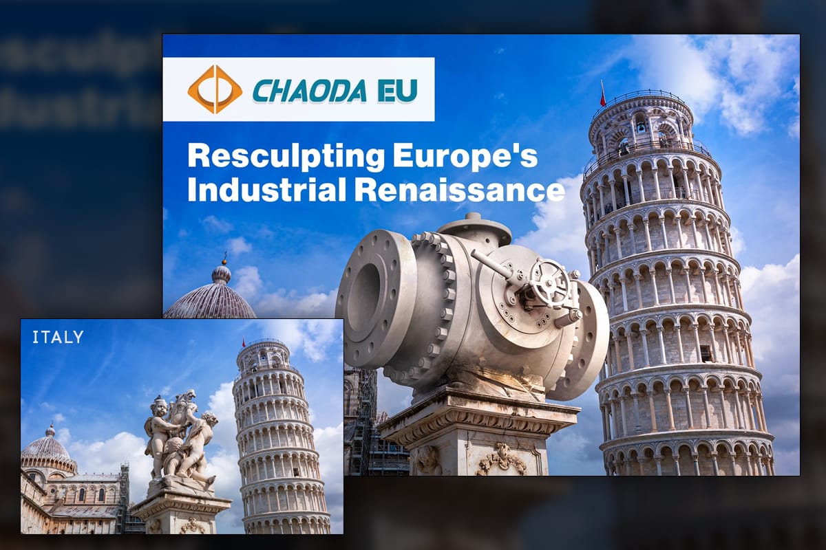
Italy, Pisa, Fontana dei Putti foreground and Leaning Tower background, with a marble like valve replacing the sculpture on the pedestal. Matching direction of light, reflectance, and soft stone wear sells the illusion without breaking architectural scale.
Renaissance
Renaissance
Summary
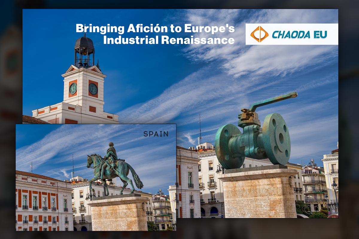
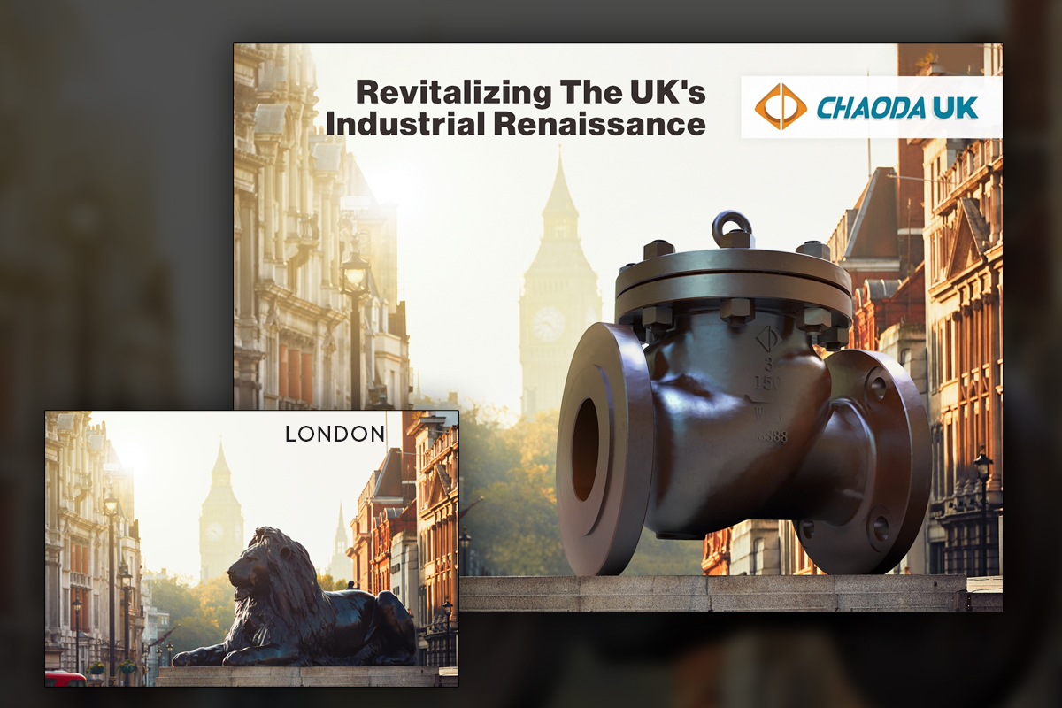
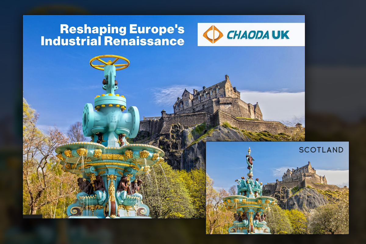
Predi Designs matched the perspective, lighting, and materials to integrate Chaoda's valves into European landmarks convincingly, from Pisa to London, Madrid, Paris, and Edinburgh. Each piece maintained consistent posing and treatment, supported by careful color work and local atmospheric cues. The result invited regional pride and industry conversation, reinforcing presence without relying on heavy copy. Comments and shares reflected genuine delight, while the visuals stayed on brand. For our team, it showcased the range of our On-Demand Creative Services and our ability to execute open-ended requests.
After release, the series delivered a playful, high craft campaign that still respected engineering truth.
Project Goals & Purpose
Our client wanted to let their customers know about a large business decision, but had no idea how to go about it. They gave Predi Designs a request and told us to "have fun with it." Boy, did we have fun with it.
From a marketing perspective, we set out to announce regional presence with concept art that Europeans would recognize instantly and enjoy sharing. Before production, we mapped a creative approach that balanced imagination with discipline. Each composition needed to look like it could truly exist on location, which meant accurate camera matching, material studies, and weather aware color grading. We also established consistency rules so that every country’s image felt like part of the same series, while leaving room for local nuance and humor.
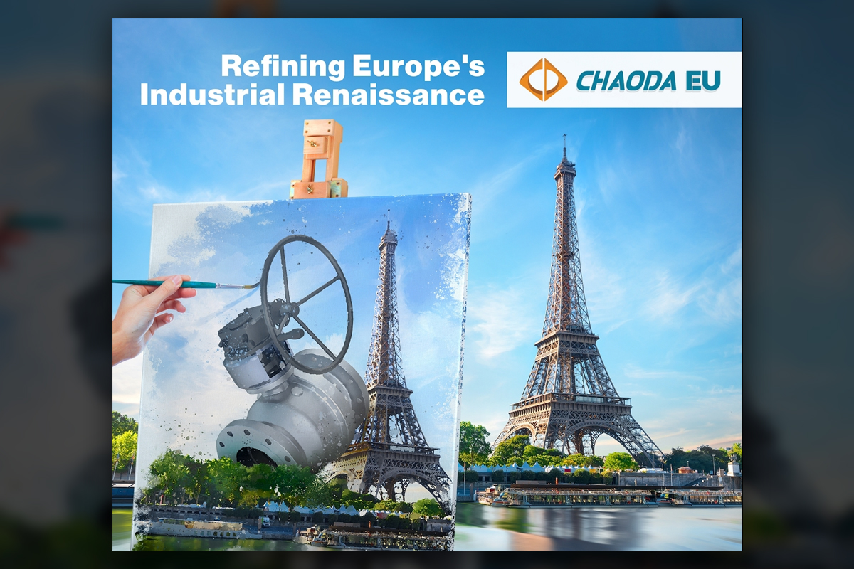
Operationally, we planned an efficient pipeline for rapid iterations, because public landmarks demand precise edits and approvals. Our graphic design subscription service supports this cadence, giving predictable access to modeling, rendering, and compositing without spinning up a new vendor each time. To drive engagement, we emphasized before and after reveals, subtle storytelling lines in captions, and a clean headline system that anchored the brand message. We chose varied creative angles, such as painterly treatment in France, to keep the carousel fresh while maintaining continuity. The goal was to spark regional excitement, earn organic reach, and present a capable industrial brand with personality, all while demonstrating the same precision expected in valve design and deployment.
Challenges
Landmark compositions leave no place to hide. The Pisa scene required replacing sculpture with a valve perched convincingly on the pedestal while keeping the Leaning Tower’s geometry honest. Matching bronze, stone, and painted metals across countries demanded careful shader work. Weathering and oxidation patterns needed restraint, and every integration had to withstand close inspection. The volume of images also required a disciplined, repeatable pipeline so quality never dipped as deadlines approached.
Solutions
We established a fixed lighting rig for renders, then matched cameras to each photograph using horizon lines and architectural cues. Material libraries covered marble, bronze, and painted steel, with subtle specular and bump detail. Weathering was hand painted to echo local wear patterns. We composited in Photoshop with contact shadows and reflection passes, plus depth aware color work. Delivered as a campaign toolkit, the series demonstrates how a Subscription-Based Design Agency can combine creative bravery with operational rigor, inviting teams to engage our Design Retainer Service for future regional stories.
Client Reception
The team loved the freedom and polish, noting how each city sparked local pride and conversation. Internal stakeholders appreciated the balance of humor and credibility, and the series performed well as a timed rollout. The craft level made the illusions feel plausible, which helped comments trend positive and brand aligned.


Additional Images


downloads
No downloads currently available.
Tags
Related Projects
 Ranger Energy Services needed a sleek, modern website that reflected their growth, innovation, and acquisitions. Predi Designs built a dynamic, content-rich platform, incorporating 3D visuals, custom icons, drone footage, and engaging multimedia to create a website that is both informative and visually impactful.
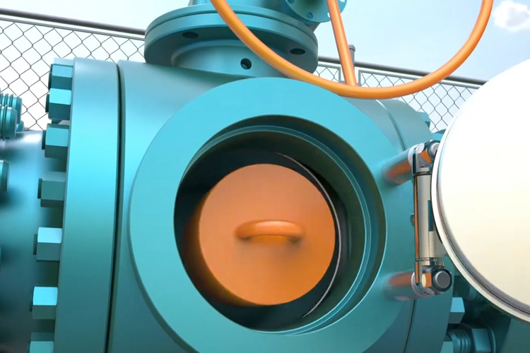 Predi Designs was tasked with creating a detailed 3D animation to demonstrate the operation and benefits of a bypass pig valve within a realistic pipeline setting. The primary objective was to illustrate the pigging process, showing how the valve facilitates maintenance, cleaning, and inspection while keeping flow uninterrupted.