A Brief Look WITH
We designed a cohesive set of brand-colored 3D culture icons and a companion customer-facing pillars graphic. We are honored to help communicate values internally while reinforcing credibility externally.
categories
Software & Skills
3D Modeling
3D Rendering
Adobe Illustrator
Adobe Photoshop
Branding Compliance
Cinema4D
Client Collaboration
Concept Development
Custom Illustration
Keyshot 3D
3D Modeling
3D Rendering
Adobe Illustrator
Adobe Photoshop
Branding Compliance
Cinema4D
Client Collaboration
Concept Development
Custom Illustration
Keyshot 3D
Color Palette

The final icon suite presents a unified family with shared lighting, materials, and camera rules, rendered in white, orange, and black so every symbol reads clearly on posters, slides, and small screens.
Values
Values
Summary
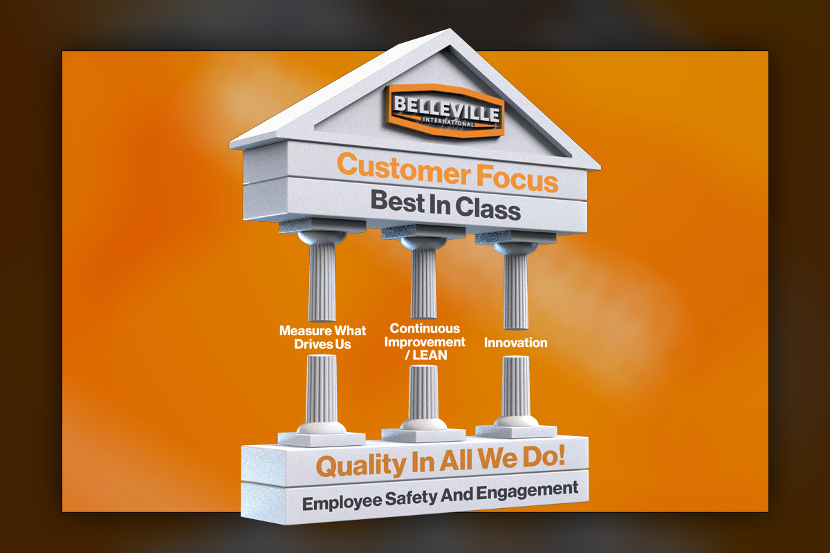
Belleville asked for unique 3D icons that could define culture across posters, presentations, and internal rollouts, with a consistent visual language and no stark contrast between pieces. We built a library in white, orange, and black, with shared lighting, materials, and camera rules so every icon belongs to one family. Several marks iterate product cues or the logo where appropriate. In parallel, we produced a customer-facing 3D graphic for three pillars, Measure What Drives Us, Continuous Improvement, and Innovation, to communicate the foundation of their success externally. The result is high resolution, print-ready, and easy for teams to deploy.
Project Goals & Purpose
From a brand evolution perspective, the purpose was to turn abstract values into recognizable symbols that employees will see often and understand quickly. Before we began, we aligned on a few operating principles, every icon must feel like it shares DNA, the palette stays pure to brand colors, and the style needs to scale from small screens to large posters without losing clarity. Operationally, this work also needed to be practical for real company rhythms, quick updates, consistent exports, and options with or without labels since different teams prefer different caption styles.
We created a production plan that balances craft and speed. A shared lighting rig, material library, and camera system keep geometry and shadows consistent across the set. Where it made sense, we incorporated the logo or product forms to anchor meaning. The customer-facing three pillars graphic required a different emphasis, still brand-true, but tuned for external clarity and impact in sales decks, site sections, and event signage. Delivered under our design retainer, the system supports ongoing additions through our graphic design subscription service, a reliable path for On-Demand Creative Services that Marketing Directors and brand managers can scale without overhead.
Challenges
The brief asked for unique icons that still look like a unified set, which can be tricky when meanings differ widely. Early concepts with strong contrast pulled the family apart, while overly similar forms blurred distinctions. Several icons required multiple iterations to feel striking without complexity. We also needed options with and without labels, since different stakeholders prefer different captioning approaches. Finally, the external three pillars graphic had to read clearly alongside product imagery without competing for attention.
Solutions
We built a style guide that governs silhouette, bevel, ambient occlusion, and highlight intensity, then locked a shared HDRI and camera angle range to maintain family resemblance. Where it served clarity, product or logo elements were integrated subtly. Icons were rendered at high resolution on square artboards with generous padding, then delivered as unlabeled finals plus a labeled template for teams that want text. The pillars piece was tuned for external use with simplified geometry and stronger hierarchy. Delivered through our On-Demand Creative Services within a dependable Design Retainer Service, the system remains easy to extend as needs evolve.
Client Reception
The team appreciated the cohesion, the polish, and the flexibility to add or remove labels. They noted that employees recognized the set quickly, and that the pillars graphic slotted cleanly into presentations and web sections. The iterative process produced sharper, more memorable marks that felt unmistakably on brand. They were pleased with the unexpected inclusion of their products and logo on several of the icons.


downloads
No downloads currently available.
Tags
Related Projects
 Predi Designs was tasked with creating two investment portfolio booklets that would communicate AFAM Capital’s balanced investment philosophy, blending conservative and growth-oriented strategies. Using a combination of serene imagery for stability and natural motifs for growth, we developed a visually engaging and informative piece.
 Predi Designs created a high-impact 3D animation that visually explained Ranger Energy Services’ drillout and flowback process. This project kicked off a long-term design subscription, where we developed a wide range of visuals for print, digital, and corporate materials utilizing the assets generated from this project.