A Brief Look WITH
We produced two concise ad visuals, a lab image with a trust message and a 3D urine cup concept that re-frames comparisons to hair testing. Honored to combine restraint and accuracy for high-risk audiences.
categories
Software & Skills
3D Modeling
3D Rendering
Adobe Photoshop
Advertising Strategy
Cinema4D
Client Collaboration
Concept Development
Copywriting
Digital Ad Design
Icon Creation
Keyshot 3D
Lighting & Texturing
Print Design
3D Modeling
3D Rendering
Adobe Photoshop
Advertising Strategy
Cinema4D
Client Collaboration
Concept Development
Copywriting
Digital Ad Design
Icon Creation
Keyshot 3D
Lighting & Texturing
Print Design
Color Palette
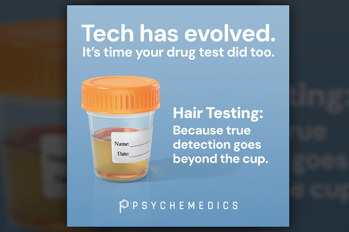
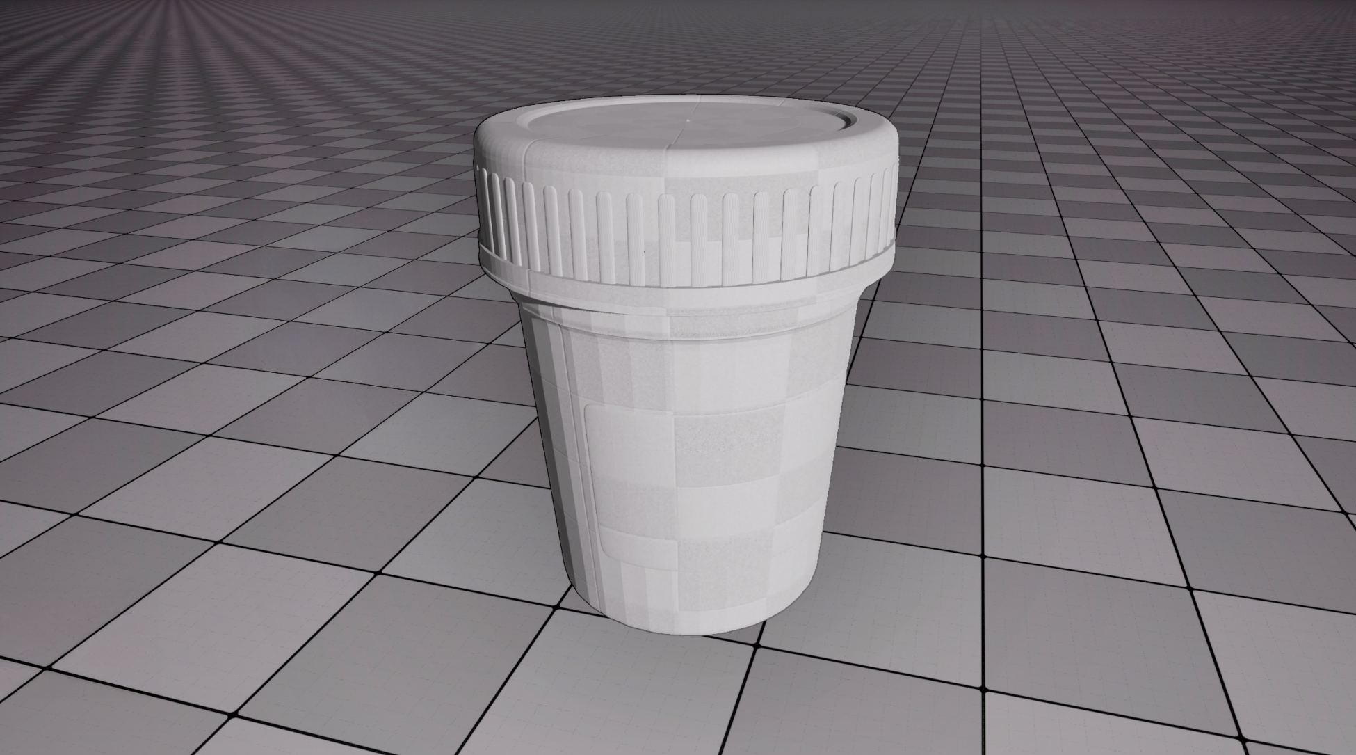
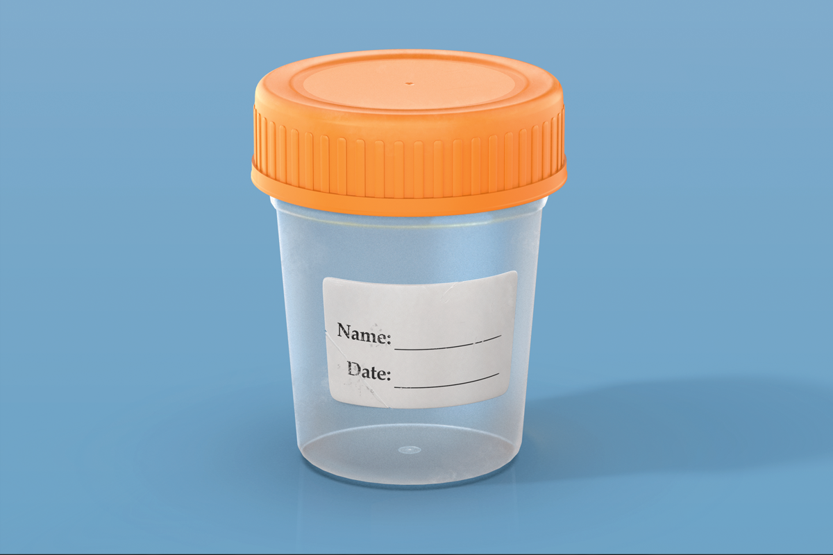
The drug testing cup render leans into recognizable imagery with a clear cap, soft plastic body, and a label carrying tiny creases and ink smudges. The intentional imperfections highlight the aging nature of urine testing and set up the pivot toward hair testing, which supports the message.
Detection
Detection
Summary
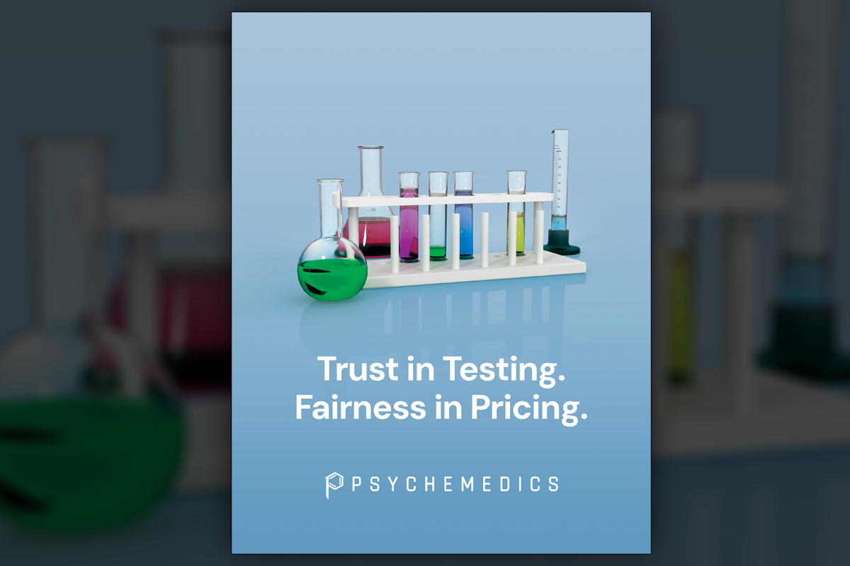
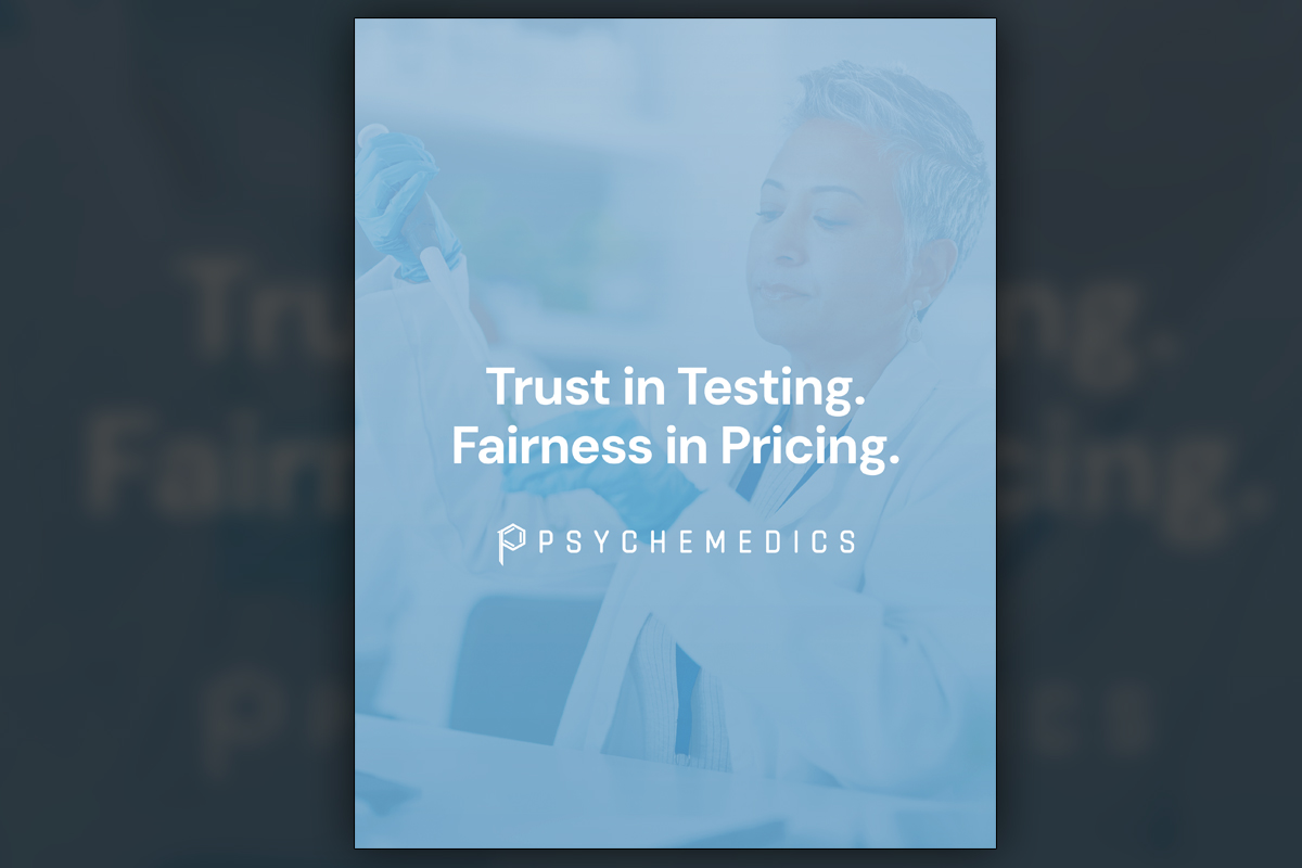
This campaign asked us to let the visuals speak. One version uses a faded laboratory scene supporting the line "Trust in Testing. Fairness in Pricing." The second, a meticulously modeled 3D urine sample, carries the statements "Tech has evolved. It is time your drug test did too." We built medically clean yet authentic details, from plastic texture to label scuffs, to make the comparison honest and memorable. A supplemental set of 3D glassware shots satisfied leadership’s preference for lab equipment. The combined system is simple to deploy across print and digital placements.
Project Goals & Purpose
Before kickoff, our purpose was to help decision makers absorb a clear truth quickly, hair testing detects more, for longer, and that difference matters in safety-critical roles. From a marketing and operations perspective, we needed a concept that would pass legal review, respect sensitivities around testing, and still cut through with busy buyers. The client wanted minimal copy and high credibility. Our approach was to build a two-track story, a confident lab image for brand trust and a visual that hints the awkward nature of urine testing while pointing to a better answer.
We framed goals in terms that speak to procurement and safety leadership, fewer accidents, fewer losses, more reliable deterrence. The urine cup would feel uncomfortably familiar by design, with real-world imperfections while hair testing is conveyed as the evolved standard. Predi modeled a small library of test tubes and flasks with vivid liquids. Delivered through our graphic design subscription service, the work can expand into additional headlines, formats, and A/B tests without reinventing the creative.
Challenges
We had to portray urine testing honestly without turning viewers away. The urine cup demanded a delicate balance between medical sterility and human realism. There was a debate between collaborators whether or not to show the urine sample. We created both versions and guided discussion with rationale about recognition, memorability, and the need to make the comparison felt, not just stated. Every word in these ads carried weight and scrutiny since they needed to do some heavy lifting. Transparent materials, glass refraction, tweaking colors, and careful shader work was vital to avoid looking synthetic.
Solutions
We built material shaders that separated plastic from glass accurately, tuned roughness, index of refraction, and micro-scuffs, and lit scenes for clinical clarity. Two ad variants resolved stakeholder concerns, an empty cup for conservative placements and a filled cup that better communicates the problem space. We added a small 3D glassware library aligned to brand preference for lab imagery. Files shipped as organized masters with ratios for print and digital. Under our Subscription-Based Design Agency model with On-Demand Creative Services, the team can request new lines and formats quickly while keeping the core message intact.
Client Reception
They appreciated the disciplined minimalism and the credibility of the materials. Leadership noted that the filled cup version tested stronger in discussions with field teams because it felt real and made the contrast with hair testing obvious. The lab equipment visuals were praised for scientific authority without needing the extra clutter.


downloads
No downloads currently available.
Tags
Related Projects
 Since 2018, Predi Designs has partnered with Ranger Energy Services to provide regular design services, enhancing their marketing and operational materials. Our collaboration began with an intricate 3D animation project illustrating the fracking process and showcasing Ranger's equipment lineup. This project involved creating numerous custom 3D models, which have since been repurposed across various collateral, ensuring consistency and visual appeal. Guided by Ranger's established color scheme, we have developed a cohesive visual identity across all materials.
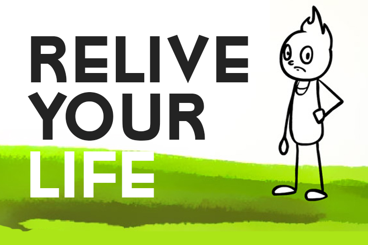 Relive Your Life is a choice-based flash game that allows players to experience multiple humorous, unpredictable storylines based on their decisions. Developed as a passion project, the game pushes the limits of interactive storytelling by offering over 30 different endings, each dictated by the player's split-second choices. Sponsored by Newgrounds, the game was widely played on various platforms, gaining recognition for its creativity and unique narrative-driven gameplay.
