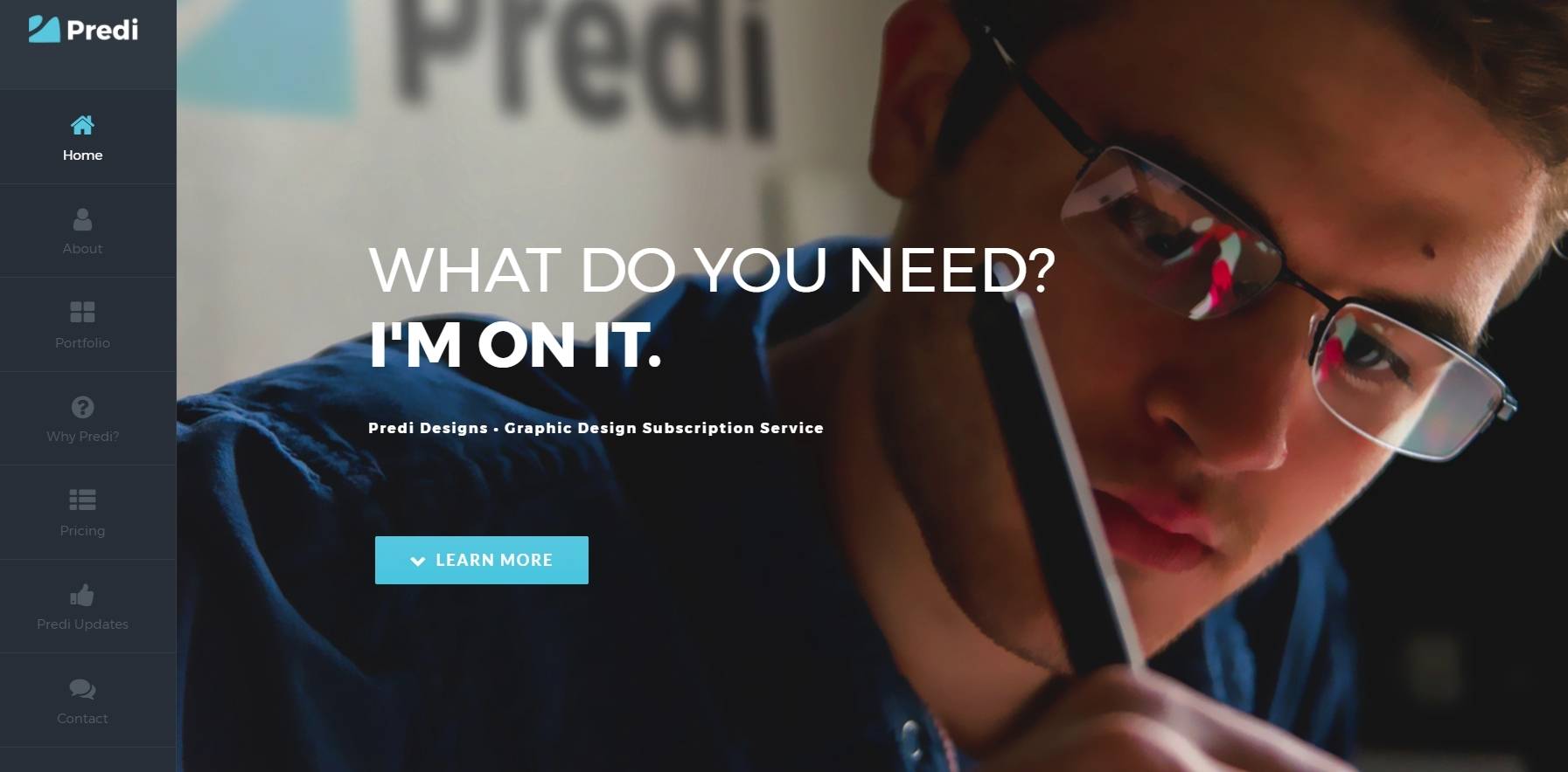
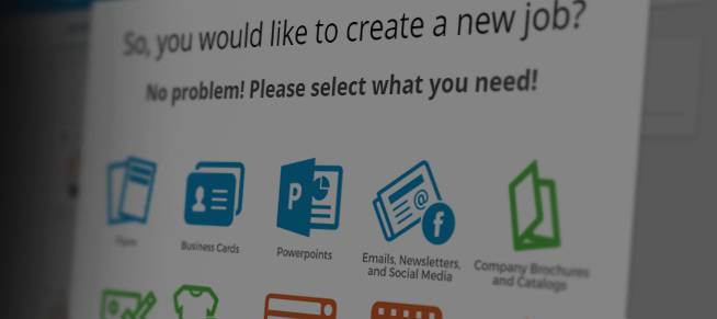
When I originally created the front page for Predi Designs, it was hastily done in order to establish the company as an actual entity. It had some coloring issues and problems with language, but the front was just a shell to login to the back-end… which no one really used anyway. Now that I’ve moved away from a project management system, all that rhetoric was useless.
I found some free time recently, so I decided it was time to make the Predi Designs website a bit more legitimate. I’ve grown more comfortable with WordPress over the past few years. When I first started working in an office three years ago, I was forced to learn Drupal as my first CMS system. Then I learned Joomla, which was even worse. Working with wordpress has been a godsend ever since. The original Predi Designs website was made entirely with CSS/HTML/PHP – which made modifying things later on to be a pain in the booty.
The new site is much more modern and easy to use. There is no back-end (outside of administrative purposes) for users to log-in anymore. It’s purely a showcase for potential subscribers. I would highly suggest looking through the projects to see what we are capable of.


