A Brief Look WITH
Chaoda USA has had a longstanding subscription with Predi Designs since 2016, executing two comprehensive rebrands to enhance their presence in the American valve industry. Our collaboration has modernized their visual identity, aligning it with industry standards and unifying their brand portfolio.
categories
Software & Skills
Adobe Illustrator
Adobe InDesign
Adobe Photoshop
Branding
Client Collaboration
Concept Development
Layout Design
Print Design
Typography
Adobe Illustrator
Adobe InDesign
Adobe Photoshop
Branding
Client Collaboration
Concept Development
Layout Design
Print Design
Typography
Color Palette
The primary objective of our collaboration with Chaoda USA was to establish a compelling and cohesive brand identity that resonates within the American valve industry.
client
Chaoda USA
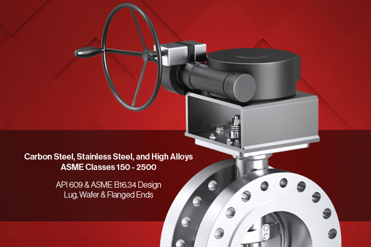
Chaoda USA is a specialized valve manufacturer with over 900 employees, offering a comprehensive range of industrial valves for sectors such as oil & gas, petrochemical, power generation, and more. With facilities worldwide, they are committed to delivering reliable products and outstanding customer service.
Project Year
2016 - Present
Evolve
Evolve
Summary
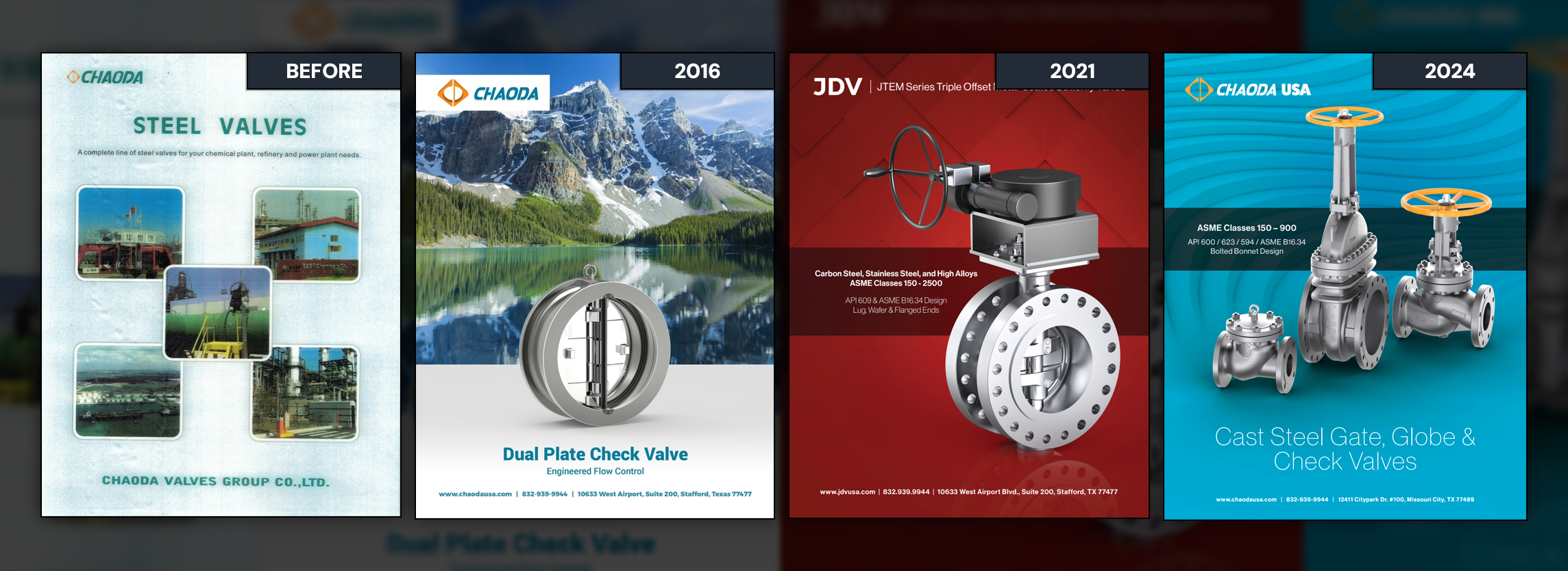
Since 2016, Predi Designs has collaborated closely with Chaoda USA, a Chinese valve manufacturer, to establish their brand identity for the American market. Our partnership commenced with an initial rebrand that transitioned Chaoda's image from a translated Chinese catalog to a professional, industry-aligned presence, incorporating motifs like mountains to symbolize stability and environmental commitment. In 2024, recognizing the need for brand cohesion among Chaoda's acquisitions, including JDV USA, we undertook a second rebrand. This effort modernized Chaoda's visuals, ensuring a unified and contemporary appearance across all subsidiaries. Our long-term subscription model has provided Chaoda USA with consistent design excellence and significant cost savings, reinforcing the value of sustained collaboration.
Project Goals & Purpose
The primary objective of our collaboration with Chaoda USA was to establish a compelling and cohesive brand identity that resonates within the American valve industry. Initially, Chaoda's materials were direct translations of Chinese catalogs, lacking the visual appeal expected by the U.S. market. Predi Designs aimed to transform this by creating a professional and relatable image, utilizing mountain motifs to convey stability and environmental consciousness without overtly emphasizing the company's Chinese origins. In 2024, as Chaoda expanded and acquired JDV USA, the need for a unified brand identity became paramount. We developed a modernized visual strategy that aligned Chaoda and its subsidiaries under a cohesive aesthetic, facilitating seamless marketing efforts and reinforcing brand recognition. This ongoing partnership exemplifies the advantages of our Design Retainer Service, offering continuous, high-quality design solutions that adapt to evolving business needs.
Challenges
One significant challenge was transforming Chaoda USA's original collateral, which consisted of translated Chinese catalogs, into materials that met American industry standards. This required not only linguistic translation but also a cultural and aesthetic adaptation to resonate with the U.S. market. Another challenge emerged in 2024 with the need to unify the branding of Chaoda USA and its subsidiary, JDV USA. Despite differing product lines and target audiences, it was essential to create a cohesive visual identity that accurately represented both entities. Balancing the preservation of Chaoda's heritage with the adoption of a modern, unified brand image required careful consideration and strategic design solutions.
Solutions
To address the initial challenge, Predi Designs conducted a comprehensive overhaul of Chaoda USA's marketing materials, moving beyond mere translation to a complete redesign that aligned with American visual and cultural expectations. We incorporated mountain imagery to symbolize stability and environmental commitment, subtly reflecting Chaoda's roots without relying on the red traditional Chinese color scheme. In 2024, to achieve brand cohesion between Chaoda USA and JDV USA, we developed a unified visual strategy that modernized Chaoda's identity, ensuring consistency across all platforms and materials. This approach facilitated seamless marketing and reinforced a strong, cohesive brand presence in the industry.
Client Reception
Chaoda USA has expressed profound satisfaction with the transformative rebranding efforts led by Predi Designs. The modernized and cohesive brand identity has significantly enhanced their market presence, aligning seamlessly with their strategic objectives. The long-term collaboration has not only elevated their marketing materials but has also provided them with substantial cost savings, reinforcing the value of their subscription-based design partnership. By successfully unifying their branding across all subsidiaries, Chaoda USA is now better positioned for continued growth and industry recognition.


Additional Images


Tags
Related Projects
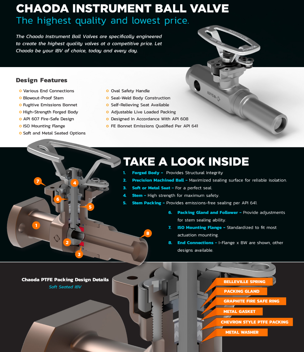
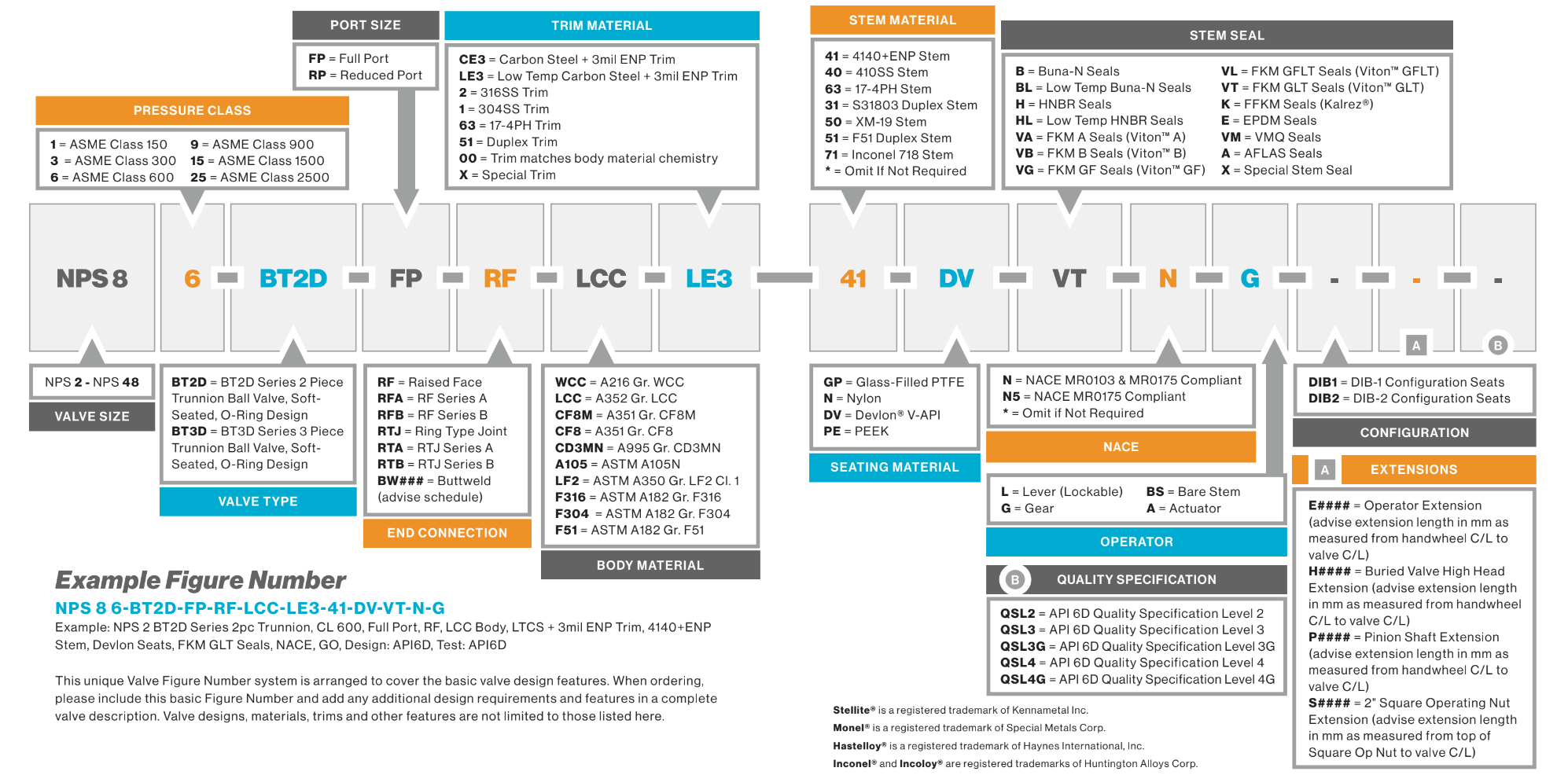
 JDV USA needed a visually striking and user-friendly product catalog to replace outdated marketing materials. Predi Designs created a modernized, brand-consistent design, integrating 3D-rendered product visuals, clear technical illustrations, and a refined layout that elevated JDV’s market presence.
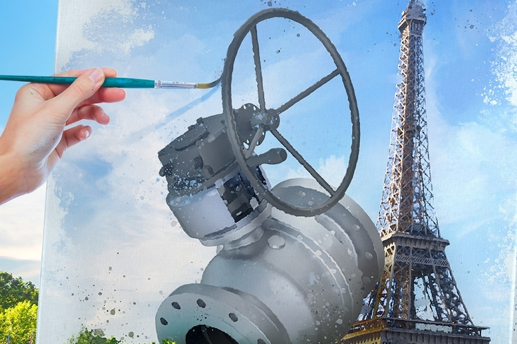
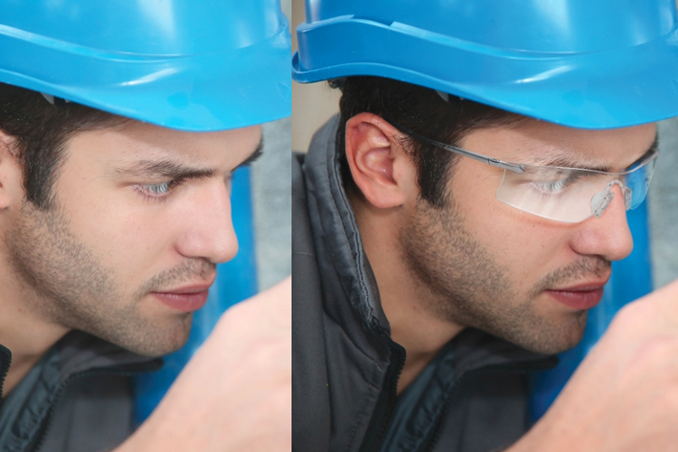 GryphonESP needed high-quality, action-based imagery of their products in use, but they lacked original photos that accurately depicted their offerings. To solve this, Predi Designs meticulously manipulated and enhanced existing images, ensuring that employees in field environments appeared with proper PPE and that the final visuals accurately represented GryphonESP’s retail products. These images were optimized for use across websites, catalogs, and marketing materials.
