A Brief Look WITH
We crafted menus, social campaigns, event graphics, and immersive media that let two sister eateries share recognizable character while preserving their unique flavors, and we are honored to fuel their culinary storytelling. Predi even put together a Redemption Square video advertisement that incorporated both establishments.
categories
Software & Skills
3D Modeling
3D Rendering
Adobe Illustrator
Adobe InDesign
Adobe Photoshop
Advertising Strategy
Brand Strategy
Branding
Branding Compliance
Cinema4D
Client Collaboration
Color Theory
Keyshot 3D
Layout Design
Logo Design
Print Design
Social Media Expertise
Typography
3D Modeling
3D Rendering
Adobe Illustrator
Adobe InDesign
Adobe Photoshop
Advertising Strategy
Brand Strategy
Branding
Branding Compliance
Cinema4D
Client Collaboration
Color Theory
Keyshot 3D
Layout Design
Logo Design
Print Design
Social Media Expertise
Typography
Color Palette
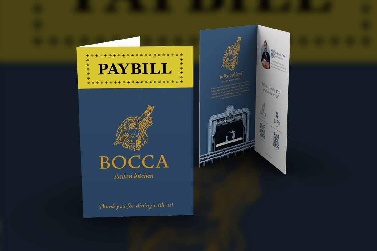
Bocca's PAYBILL demonstrates their roots in theater with that signature yellow banner, giving servers a conversation piece that doubles as brand storytelling.
Fusion
Fusion
Summary
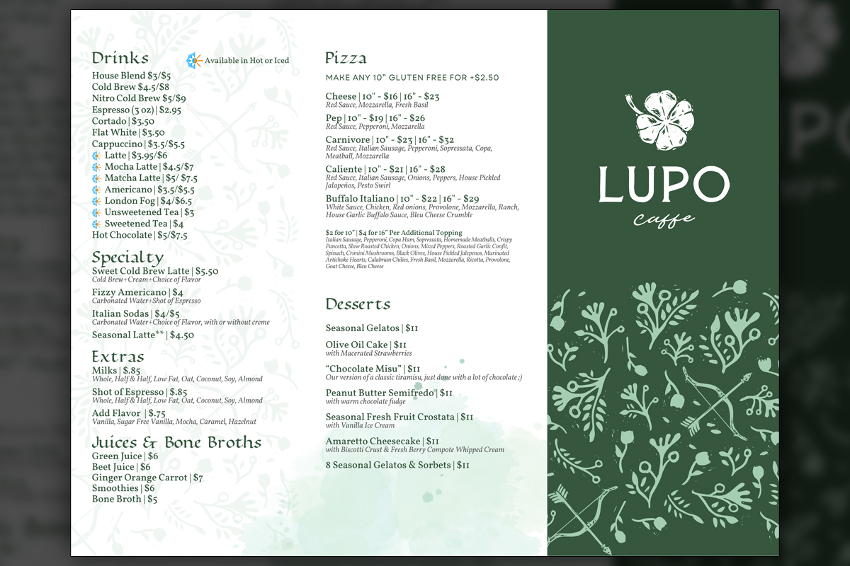
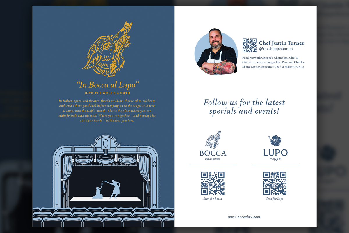
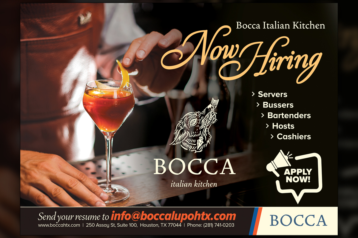
Predi Designs partnered with Bocca Italian Kitchen and Lupo Caffe to deliver unified yet distinctive visuals across menus, signage, social media, and video advertisements. Rustic logos, separate palettes, and shared saturation values informed every layout, ensuring guests immediately connect the eateries while appreciating each venue’s personality. Detailed menu systems scale from fold-out takeaways to slim wine cards, and our playful “PAYBILL” check holder became a guest-favorite touchpoint. A looping latte-steam cinemagraph expands Lupo’s online presence, while promotional videos invite residents to explore Redemption Square’s food scene. Together, these assets lift brand recognition and drive steady foot traffic.
Project Goals & Purpose
Before kickoff, we recognized the owner’s challenge, two restaurants under one roof needed related branding without sacrificing individuality. Our design retainer service model promised ongoing creative agility, letting Bocca refine seasonal menus as often as their kitchen evolves while allowing Lupo to test new digital content without extra bids. We aimed to engineer a consistent typographic grid, flexible color accents, and modular menu templates that staff could edit in-house. A playful yet refined social identity would attract weekend visitors, and photorealistic 3D renders of the PAYBILL would reassure management that the concept translated from sketch to tactile reality. By embedding cross-promotional cues, shared textures, complementary iconography, we sought to elevate Redemption Square’s dining reputation and demonstrate how our subscription-based design agency nurtures multi-brand ecosystems seamlessly.
Challenges
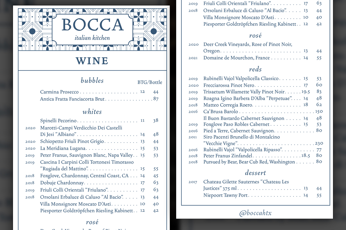
Logo complexitymade printing at small scales difficult. Narrow brand color overlap limited reuse of graphic components across venues without recoloring. Menu size variations demanded meticulous typographic scaling to maintain legibility, while the rapid menu pivots required reliable version control. Finally, video assets had to load swiftly on mobile networks to reach hungry commuters before lunchtime.
Solutions
We built a shared asset library with linked vector ornaments ensuring harmony and speed. Cloud-based menu archives tracked revisions, letting staff pull the latest file confidently without fear of losing what previously existed. Compressed MP4 exports slashed social load times, validating our corporate design solutions approach for fast-moving hospitality teams.
Client Reception

Management applauded our responsiveness, noting that real-time menu updates bolstered marketing agility. Diners praised the quirky PAYBILL, and social engagement rose after the latte-steam post, proof Predi’s thoughtful artistry fosters lasting patron excitement.


Additional Images


Watch Now!
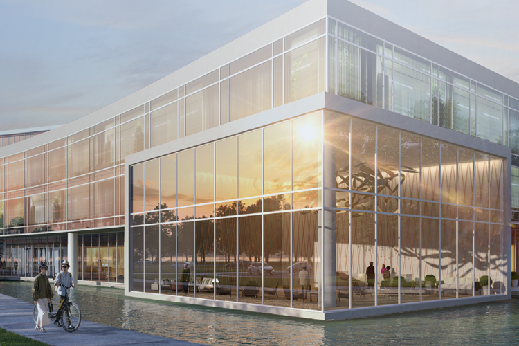
The collaborative effort between client and designer was what allowed this advertisement to sing. We incorporated lots of motion to encourage our viewers to see that the community at Redemption Square is youthful, lively, and able to thrive. This is a theme that is consistent among all Redemption Square resident-focused advertising.
Matthew Ackerman, Predi Designs
downloads
No downloads currently available.
Tags
Related Projects
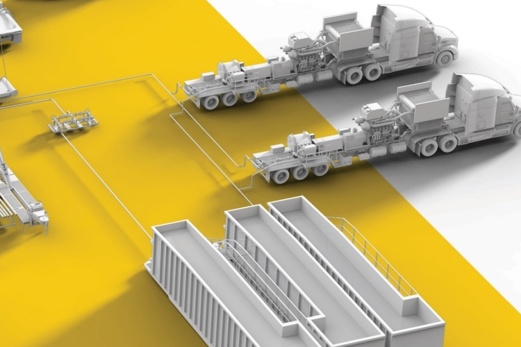 Since 2018, Predi Designs has partnered with Ranger Energy Services to provide regular design services, enhancing their marketing and operational materials. Our collaboration began with an intricate 3D animation project illustrating the fracking process and showcasing Ranger's equipment lineup. This project involved creating numerous custom 3D models, which have since been repurposed across various collateral, ensuring consistency and visual appeal. Guided by Ranger's established color scheme, we have developed a cohesive visual identity across all materials.