A Brief Look WITH
We rebuilt C&S into a true luxury presence with a booking first website, refined brand system, and clean 3D fleet renders to more closely align with their existing reputation.
categories
Software & Skills
3D Modeling
3D Rendering
Adobe InDesign
Adobe Lightroom
Adobe Photoshop
Brand Strategy
Branding
Branding Compliance
Client Collaboration
Color Correction
Color Theory
Copywriting
Keyshot 3D
Layout Design
Lighting & Texturing
Print Design
Product Photography
Social Media Expertise
Typography
Web Design
WordPress
Color Palette
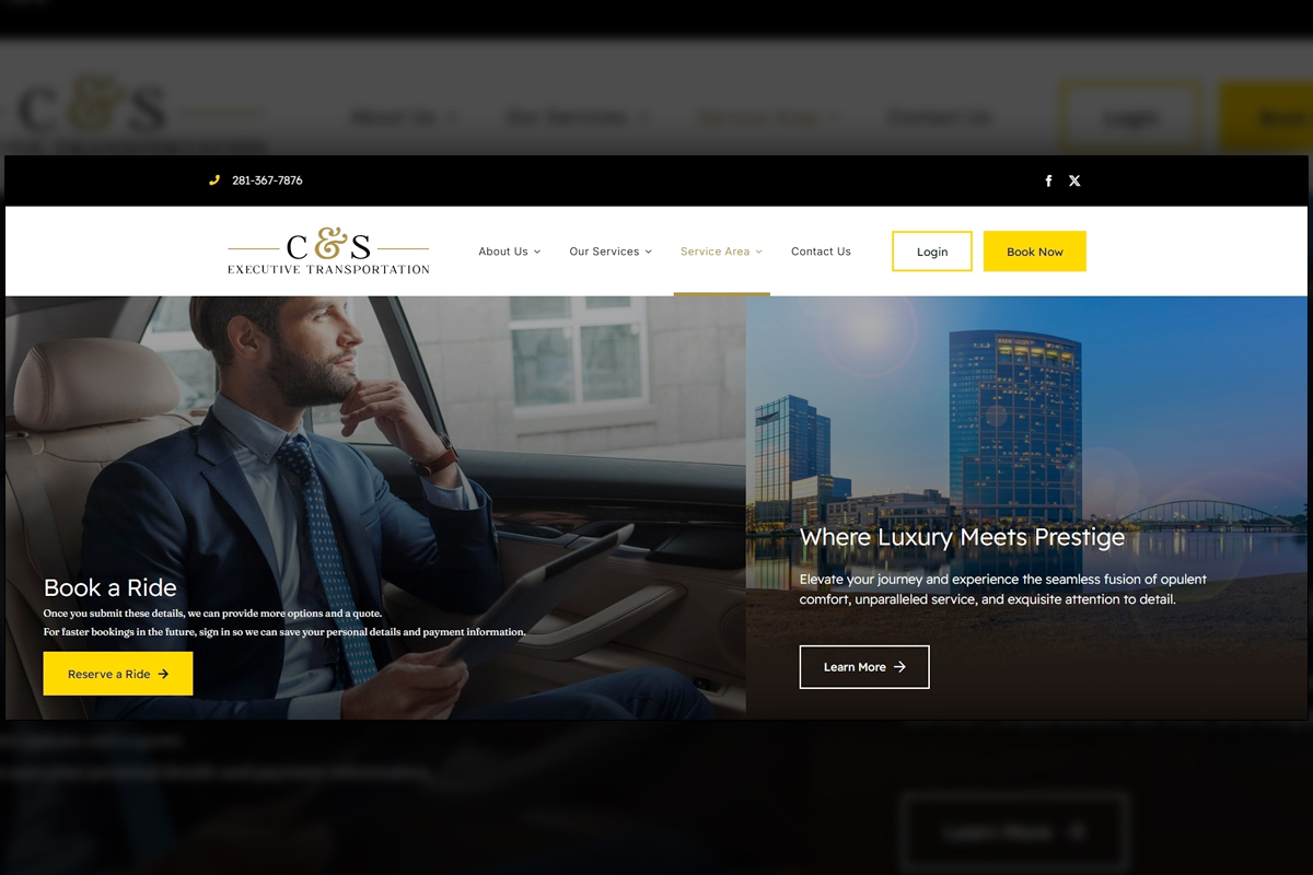
The final homepage balances dark and light with a booking first layout that keeps quick quote and reservation options visible, while refined typography to establish a premium tone that matches their real world service.
Prestige
Prestige
Summary
C&S Executive Transportation's reputation of refined luxury did not match their existing marketing materials. We replaced a low-quality website with a full experience that creates a luxurious experience through balancing dark and light, pairs serif headlines with light sans serif text, and puts booking first across the site. Clean 3D renders elevate fleet moments where scrutiny is highest, while photography supports secondary contexts. We expanded content depth with clear service pages, vehicle detail, and FAQs, then tuned performance for fast loads. The larger, better structured site improved search visibility and contributed to an uptick in organic traffic, while the overall system feels calm, credible, and easy to navigate.
Project Goals & Purpose
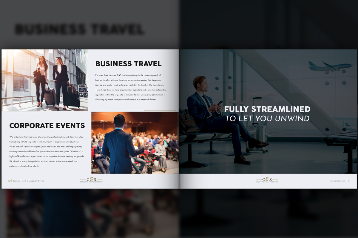
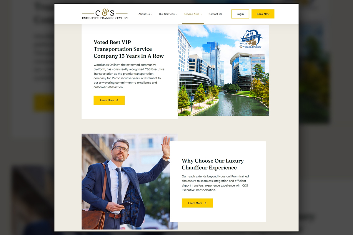
Before kickoff, our purpose was to align brand perception with the standard C&S already delivered on the road. Executives and event planners judge quality quickly, so the site needed to look refined, reduce friction to book, and explain choices without clutter. The original one pager could not support that experience. We planned a booking first structure, placing quick quote and reservation actions high on every key page, then repeating them contextually so interested visitors never search for the next step.
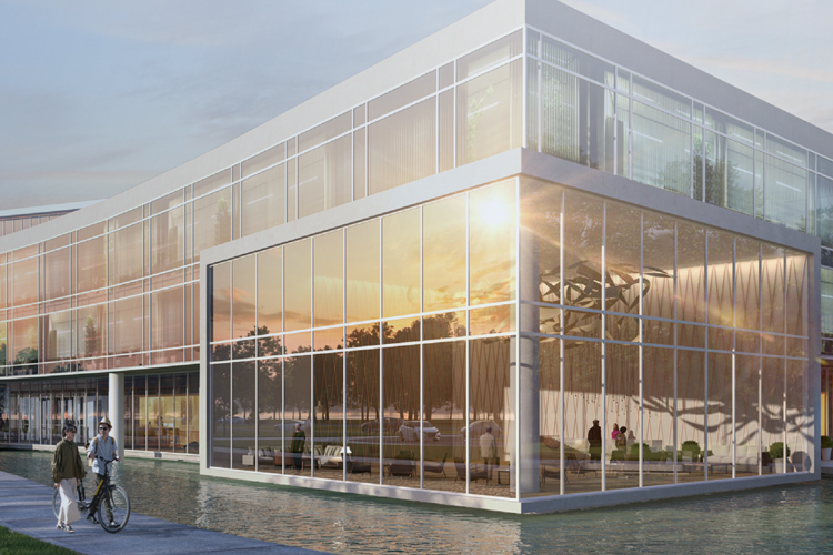
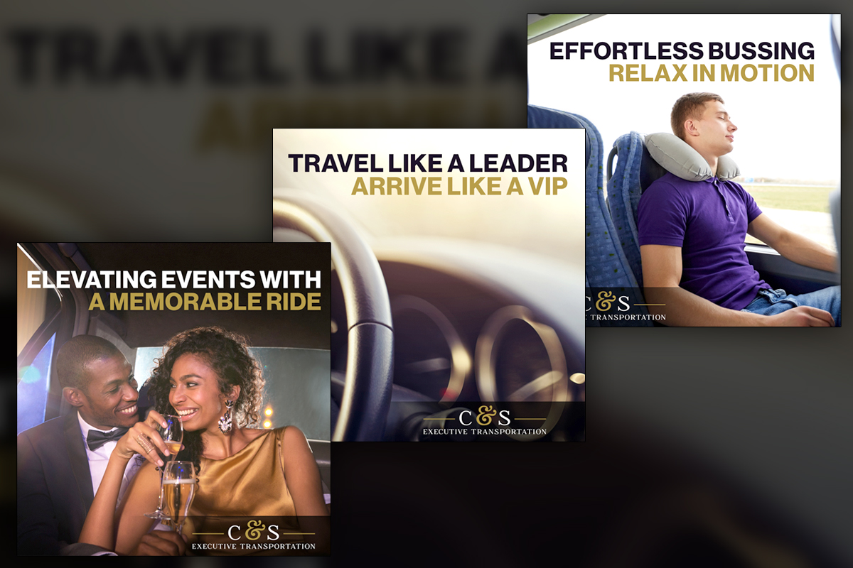
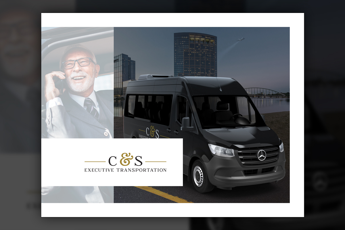
Brand tone required restraint and contrast. We kept the client’s logo, refined color application, and paired a stately serif for headlines with a light sans serif for body copy. Photographs of the luxury vehicles came with realities that took away from the desired brand identity. For example, muddy tires or splattered bugs in the front grill. Hero imagery demanded pristine perfection at large sizes, so we introduced clean 3D renders for the most visible fleet moments and retained photography where it made sense. Depth of content mattered for both audience trust and SEO, so we outlined pages for services, vehicles, and FAQs that would scale with minimal overhead. Our graphic design subscription service and Design Retainer Service approach gave C&S predictable capacity for seasonal needs, faster requests, and ongoing improvements. As Corporate Design Solutions go, the plan was simple, present a luxury experience, protect the booking path, and build a maintainable system that supports measurable growth.
Challenges
The low-quality legacy site relied on a single page with a stretched background image and visible compression artifacts, so there wasn't much content to work from. The client wished to keep the existing logo color, which often produced a muddy yellow when used broadly. Supplied fleet photos showed realistic road wear that undercut a luxury message. We needed to elevate tone without alienating an audience that expects speed, to keep booking central to the journey, and to add substantially more content in a way that improves rankings without bloating the experience.
Solutions
We centered the build on booking and structure. A modular page system organizes services, vehicles, and FAQs so visitors find answers quickly, and the same components scale cleanly across new pages. "Book Now!" is visible no matter where you are on the site. Color usage was simplified, using vivid accents only for calls to action and a soft tint for gentle section contrast, with deep neutrals carrying the luxury tone. We introduced clean 3D hero renders and kept supporting photography where appropriate. Performance and accessibility were tuned, and technical SEO foundations were implemented. Delivered through our on-demand creative services within the subscription, so any future modifications are included for the longevity of the subscription to solve any future challenges that may arise.
Client Reception

Leadership noted that their new presentation finally matched their reputation and that booking worked well within the new site. It gave them a new confidence to send clientele to their website for booking as opposed to relying on phone or email correspondence. The team praised the clarity of the site structure and that we included local attractions for the various suburbs of Houston. They also reported that the larger site and clearer structure supported improved search rankings and an uptick in organic traffic.
Additional Images


Tags
Related Projects
 Belleville International started as a one-off client, but after experiencing how convenient and valuable our design services are, they became a long-term subscriber. Over the years, we’ve redefined their brand identity, modernized their visual presence, and rebuilt their website to position them as an industry leader.