A Brief Look WITH
Predi Designs LLC developed a fresh, professional brand identity for Partnership Lake Houston, capturing the essence of community, economic growth, and the region’s vibrant energy. The design reflects unity and progress, like a confident handshake.
categories
Software & Skills
Adobe Illustrator
Adobe Photoshop
Branding
Client Collaboration
Color Theory
Concept Development
File Export & Optimization
Logo Design
Typography
Vector Illustration
Adobe Illustrator
Adobe Photoshop
Branding
Client Collaboration
Color Theory
Concept Development
File Export & Optimization
Logo Design
Typography
Vector Illustration
Color Palette
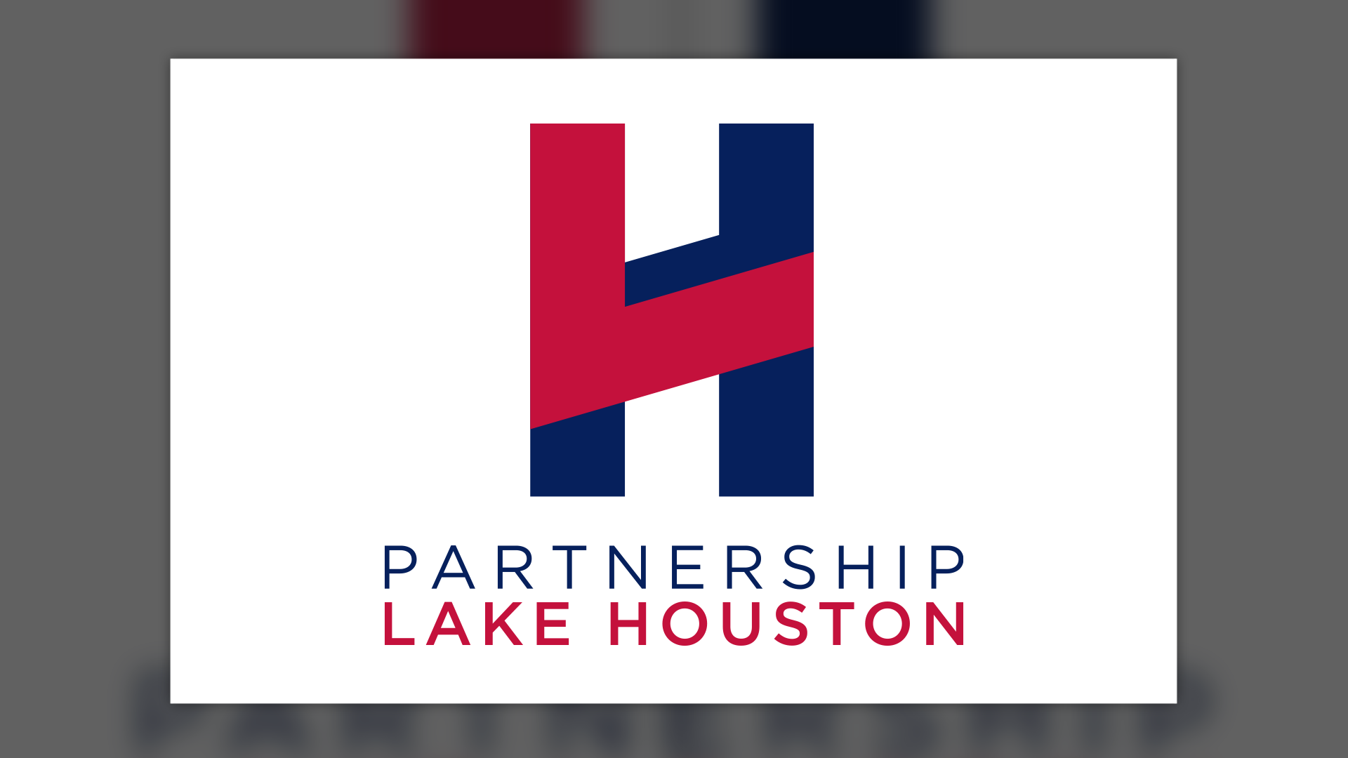
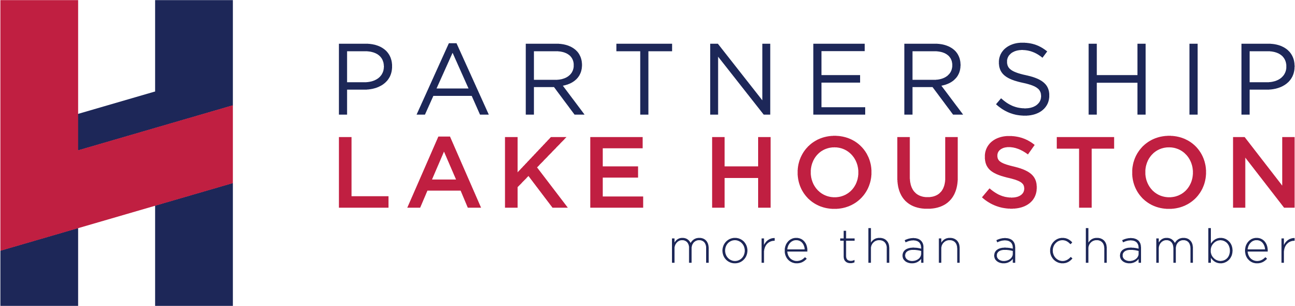
Bold and modern, this logo embodies community strength and unity, reflecting Partnership Lake Houston’s mission for growth and collaboration.
Brand
Brand
Summary
Partnership Lake Houston needed a modern, professional logo that resonated with businesses, residents, and stakeholders alike. Predi Designs LLC created a clean, contemporary brand mark that embodies the organization’s mission to promote economic development and regional collaboration. The logo balances strength and approachability, ensuring versatility across digital and print media.
Project Goals & Purpose
The primary goal of this project was to craft a recognizable, future-proof brand identity that reflects Partnership Lake Houston’s role in business advocacy, community development, and regional progress. The design had to be modern yet timeless, appealing to businesses and local leaders while remaining accessible to residents.
The logo’s visual language draws from nature and commerce, using a professional yet inviting color scheme to establish credibility and trust. The typography and iconography were carefully selected to ensure legibility and adaptability across platforms, from signage to social media. Inspiration came from the region’s landscape and the organization’s mission to strengthen local partnerships.
Challenges
One of the biggest challenges was balancing corporate appeal with community warmth. The logo needed to resonate with business professionals, government officials, and residents alike. Additionally, ensuring scalability across various mediums, such as large-scale signage, merchandise, and digital platforms, required meticulous design adjustments.
Another challenge was crafting a color palette that felt fresh yet aligned with the brand’s existing materials. The goal was to modernize the brand without straying too far from its established identity, maintaining familiarity while enhancing visual impact.
Solutions
Predi Designs LLC tackled these challenges through extensive research and iterative design refinement. The final logo features a balanced typographic structure, ensuring professionalism while remaining inviting. The chosen color scheme reflects both economic growth and Lake Houston’s natural beauty, making the brand more engaging and trustworthy.
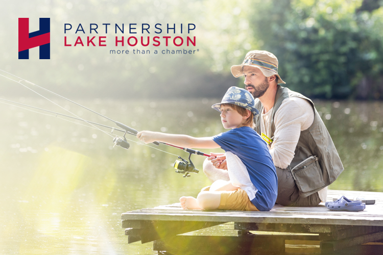
By testing the logo across different applications, including website mockups, business cards, banners, and promotional materials, we ensured scalability and legibility at all sizes. The use of clean lines and an adaptable iconography system allowed for a seamless brand experience across all touchpoints.
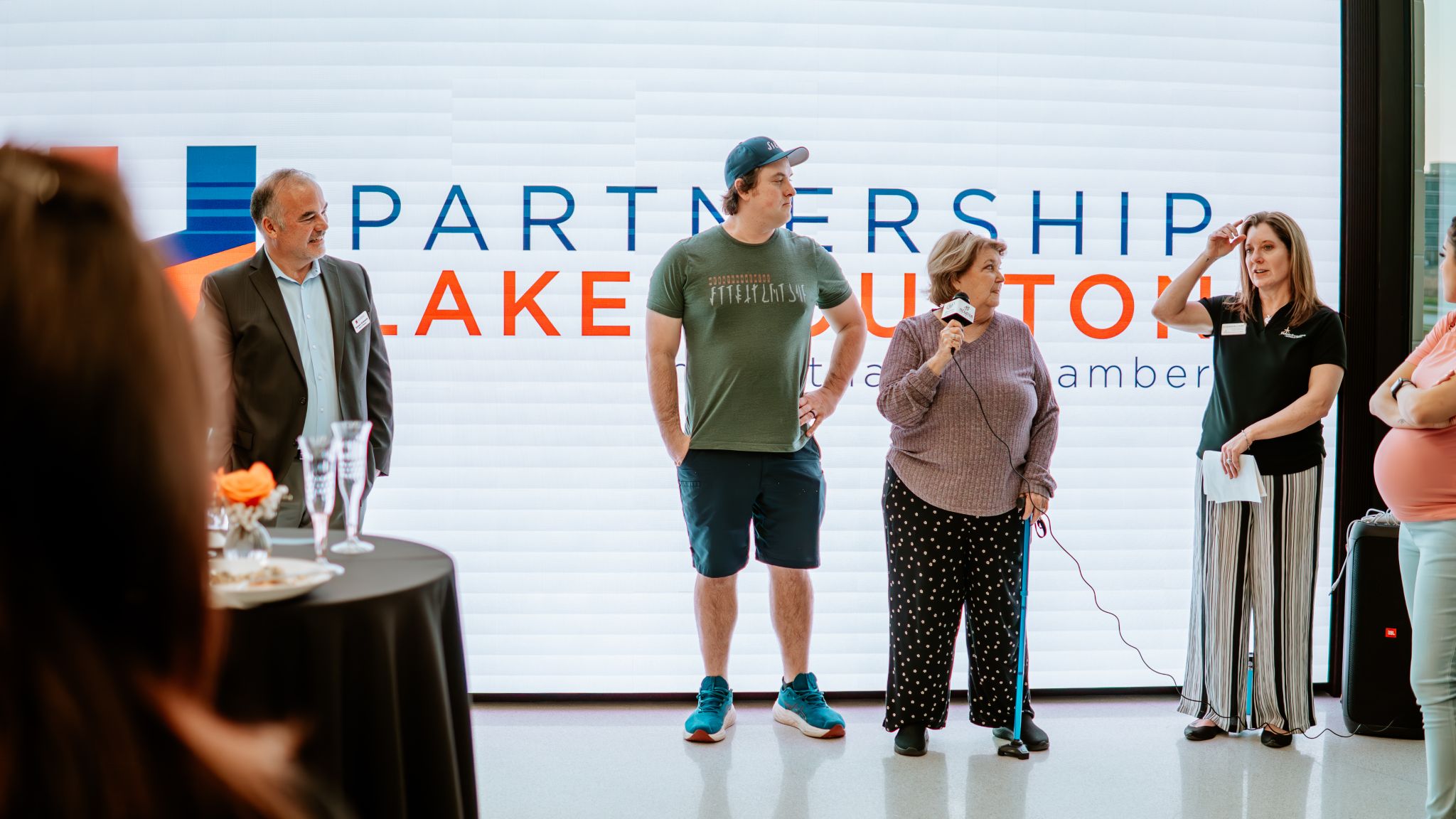
Client Reception
The Partnership Lake Houston team was thrilled with the final result, praising the logo’s modern, professional aesthetic and its ability to communicate their mission visually. They highlighted how well the design translates across platforms, enhancing their brand consistency. Feedback emphasized how the new identity brings fresh energy to their marketing efforts and strengthens their presence in the community.


Tags
Related Projects
 Chaoda USA has had a longstanding subscription with Predi Designs since 2016, executing two comprehensive rebrands to enhance their presence in the American valve industry. Our collaboration has modernized their visual identity, aligning it with industry standards and unifying their brand portfolio.
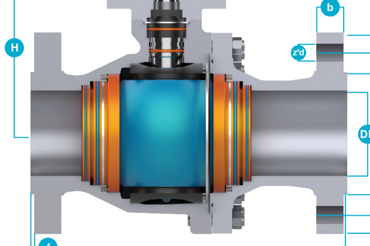
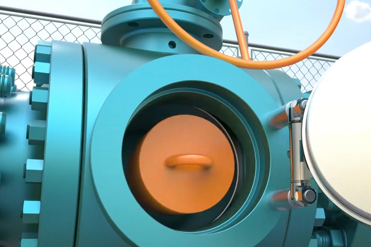 Predi Designs was tasked with creating a detailed 3D animation to demonstrate the operation and benefits of a bypass pig valve within a realistic pipeline setting. The primary objective was to illustrate the pigging process, showing how the valve facilitates maintenance, cleaning, and inspection while keeping flow uninterrupted.
