A Brief Look WITH
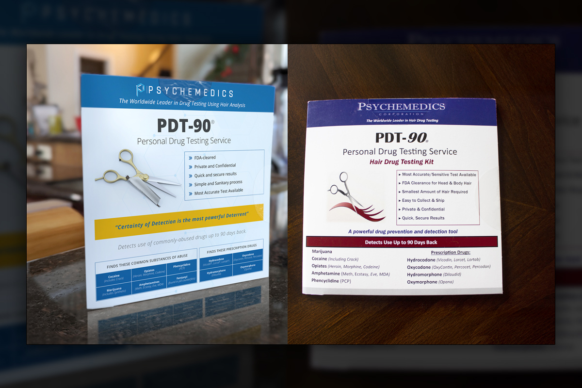
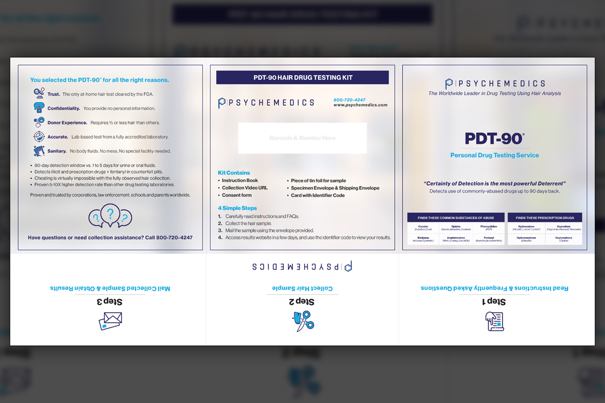
We redesigned Psychemedics’ PDT-90 packaging twice, honoring evolving leadership and strategy. The final tri-fold system prioritizes icons, clarity, and at-home confidence, aligning with corporate tastes while preserving accessibility for families and nontechnical users.
categories
Brand Identity & Visual Strategy
Marketing Collateral & Communications
Packaging & Environmental Design
Software & Skills
3D Modeling
3D Rendering
Adobe Illustrator
Adobe Photoshop
Advertising Strategy
Brand Strategy
Branding
Branding Compliance
Cinema4D
Client Collaboration
Custom Illustration
Digital Retouching
Icon Creation
Medical Illustration
Photo Manipulation
Photography
Print Design
Product Photography
3D Modeling
3D Rendering
Adobe Illustrator
Adobe Photoshop
Advertising Strategy
Brand Strategy
Branding
Branding Compliance
Cinema4D
Client Collaboration
Custom Illustration
Digital Retouching
Icon Creation
Medical Illustration
Photo Manipulation
Photography
Print Design
Product Photography
Color Palette
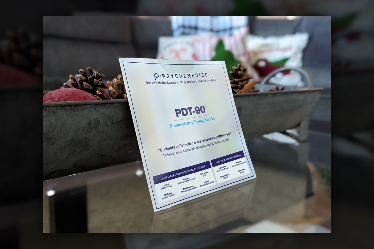
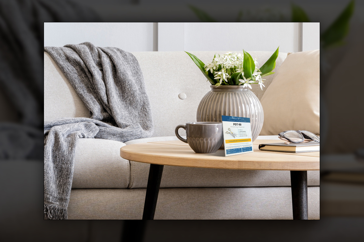
Final packaging photographed in a real living room beside seasonal decor, designed to feel approachable in a family setting, showing how icon-led steps and restrained typography build confidence for at-home users.
Package
Package
Summary
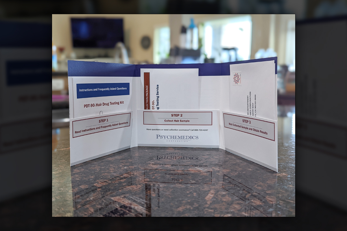
We completed a two-stage redesign of the Psychemedics PDT-90 at-home hair drug testing kit, adapting to leadership changes while protecting user trust. The first pass modernized a decade-old layout without sacrificing familiar content. The final system embraced a cleaner corporate voice, replacing dense copy with purposeful iconography and softly blurred scientific imagery. We engineered a tri-fold folder with step-by-step instructions and supporting inserts for FAQs and guidelines. Lifestyle photography placed the packaging in real homes to signal accessibility. The result is consistent, confident, and easier to use, with strong adoption across Psychemedics materials.
Project Goals & Purpose
Before beginning, we defined a clear purpose for PDT-90 packaging that met two audiences at once, corporate stakeholders and parents at home. Our mandate was to replace dated visual density with a system that communicates faster, reads cleaner, and scales across inserts, instructions, and future campaigns. As a Subscription-Based Design Agency, our role was to deliver not just a single box, but a living framework that the Psychemedics team could extend confidently. We set goals around iconography, plain-language hierarchy, and reassuring tone, all while respecting regulatory needs and the science behind hair testing. Parents needed an immediate sense of how the kit works and why hair testing helps them make informed decisions. Operations needed packaging that prints efficiently, assembles cleanly, and reduces support calls. Marketing needed assets that align with a more corporate palette and photographic style without feeling cold. To satisfy each priority, we proposed a tri-fold folder that stages the experience in three simple steps, reinforced by a library of icons and concise messaging. Because PDT-90 is often purchased by nontechnical buyers, we planned lifestyle photography in kitchens and living rooms to remove the intimidation of lab environments. That contrast would help the brand meet families where they are, build trust quickly, and position PDT-90 as a practical, affordable choice. If you need this level of strategic packaging and rollout, our Design Retainer Service gives you continuous iteration, fast turnarounds, and high standards without hiring in-house.
Challenges
Leadership transition reset long-standing brand cues, creating competing expectations between legacy stakeholders and a new, less colorful corporate direction. Content volume on the previous package was high, and much of it had internal champions, so reductions required careful alignment. We also needed to maintain regulatory clarity while reformatting instructions into a tri-fold system that printers and fulfillment could assemble reliably. Lifestyle photography introduced a tone shift from lab to home, which risked feeling off-brand if not handled thoughtfully. Finally, iconography had to be comprehensive enough to replace text without ambiguity, and still feel credible for a science-driven company.
Solutions
We aligned stakeholders through side-by-side prototypes that compared the legacy, the interim refresh, and the final corporate direction, making tradeoffs visible and measurable. A curated icon library replaced repetitive copy while preserving meaning, supported by concise headlines and plain-language microcopy. We engineered a structure with numbered steps, printer-friendly dielines, and a content map that kept regulatory details unmistakable. Lifestyle photography followed brand-safe palettes and composition rules, bridging warmth and clinical credibility. As On-Demand Creative Services, we maintained a reusable system for future inserts and campaigns. If your team needs this rigor and speed, our Design Retainer Service provides it continuously.
Client Reception
Leadership appreciated the disciplined approach, the clarity of the tri-fold instructions, and the efficiency of the new icon system. They noted fewer support questions and smoother assembly, while marketing praised the corporate alignment without losing warmth. The team adopted the system across collateral, citing faster updates, better consistency, and a stronger fit for at-home audiences, including clearer messaging for parents.


downloads
No downloads currently available.