A Brief Look WITH
We've built several corporate reporting documents for Psychemedics, replacing 3D render aesthetics with consistent iconography, vector charts, and landscape layouts that clarify trends by industry and empower executives to act quickly.
categories
Software & Skills
Adobe Illustrator
Adobe InDesign
Adobe Photoshop
Advertising Strategy
Brand Strategy
Branding Compliance
Color Theory
Data Visualization
Icon Creation
Adobe Illustrator
Adobe InDesign
Adobe Photoshop
Advertising Strategy
Brand Strategy
Branding Compliance
Color Theory
Data Visualization
Icon Creation
Color Palette
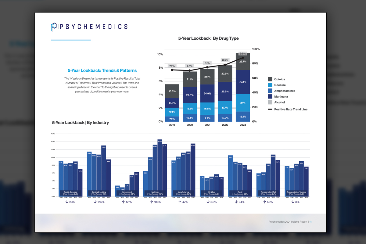
A five year lookback by industry fills the landscape page with breathing room for labels and annotations, allowing executives to compare sectors quickly without squinting or second guessing the data story.
Cohesion
Cohesion
Summary
We delivered a complete reporting system for Psychemedics that aligns with a new, more corporate directive. We replaced our previous photo-realistic 3D graphics with vector charts, icons, and a clean grid that reads fast and scales. Landscape orientation accommodates wide five year look-backs and comparative layouts across industries. Color mappings stay consistent for each substance, improving scanning and cross page connections. Subtle blurred imagery fills space without distracting from data. Over fifty documents now share one language, allowing executives to present trends with confidence and marketing to pivot quickly. The subscription model made continual refinement practical, efficient, and predictable.
Project Goals & Purpose
Before we began, our purpose was to transform scattered report styles into one disciplined system that executives could trust and teams could update regularly through us. The goal was clarity first, corporate polish second, and repeatable production always. We set foundations for typography, spacing, and page grids, then defined chart conventions that would hold across monthly refreshes and special studies by industry. Wide formats were chosen intentionally to honor complex, long horizon comparisons. Color mappings for each drug would never change, enabling faster comprehension over time. Icons would replace 3D rendering icons, while blurred soft-toned photography provided an accent without distraction.
As a Subscription-Based Design Agency, our mandate was not only to create good looking data, it was to build a living reporting framework that supports executive decisions. Reports had to help the new leadership demonstrate risk trends, target outreach where positive rates rise, and brief internal stakeholders efficiently. Our Design Retainer Service ensured the cadence, the quality control, and the flexibility to adapt quickly as new data arrived or messaging shifted. For Marketing Directors and brand managers, this approach reduces bottlenecks, keeps budgets stable, and turns analytics into assets teams can actually use.
Challenges
Two brand overhauls in five years created mixed expectations about tone, imagery, and density. Prior reports used 3D renderings and varied chart styles, which complicated updates and confused cross deck comparisons. Data tables arrived in different formats and timeframes, so alignment and error checking were essential. Several charts were unusually wide, demanding layout choices that preserved legibility without shrinking type. We also needed to keep pages visually engaging while ensuring compliance and credibility for science focused audiences. Lastly, every template had to work for both executive presentations and exported PDFs without rework.
Solutions
We formalized a reporting system anchored by landscape grids, stable color mappings by substance, and a shared icon library. Vector charts replaced 3D visuals, improving legibility and file performance. We documented standards for labels, scales, and annotations, then automated page masters for quick assembly. Subtle blurred imagery balanced space and brand tone. A QC checklist validated source ranges and calculations before export. As On-Demand Creative Services within a Design Retainer Service, we updated recurring decks and reports rapidly, keeping costs predictable. The result is corporate clarity that scales, communicates faster, and adapts easily as data and priorities evolve.
Client Reception

Leadership appreciated the consistency, the executive friendly layouts, and the speed of updates. Leadership highlighted clearer trend stories and fewer format changes between reports. Executives reported better comprehension in briefings, and marketing valued dependable color and icon standards. Stakeholders referenced the system across more than fifty documents, citing time savings and increased confidence in how results were presented.


Additional Images