A Brief Look WITH
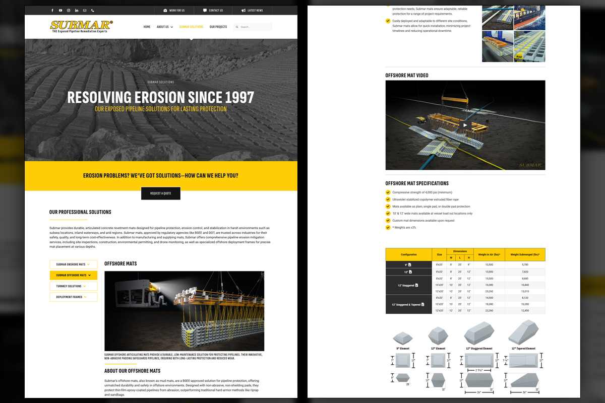
We rebuilt Submar’s site around dynamic custom fields to build out long-form, content-rich pages. This makes publishing simple for nontechnical staff while improving crawl depth, clarity, and conversion paths.
categories
Brand Identity & Visual Strategy
Digital & Social Media Graphics
Marketing Collateral & Communications
Software & Skills
3D Modeling
3D Rendering
Adobe Photoshop
Advertising Strategy
Animation
Brand Strategy
Branding
Branding Compliance
Client Collaboration
Concept Development
Copywriting
Custom Illustration
Keyshot 3D
Special Effects
Technical Illustration
Typography
Video Editing
Web Design
WordPress
3D Modeling
3D Rendering
Adobe Photoshop
Advertising Strategy
Animation
Brand Strategy
Branding
Branding Compliance
Client Collaboration
Concept Development
Copywriting
Custom Illustration
Keyshot 3D
Special Effects
Technical Illustration
Typography
Video Editing
Web Design
WordPress
Color Palette
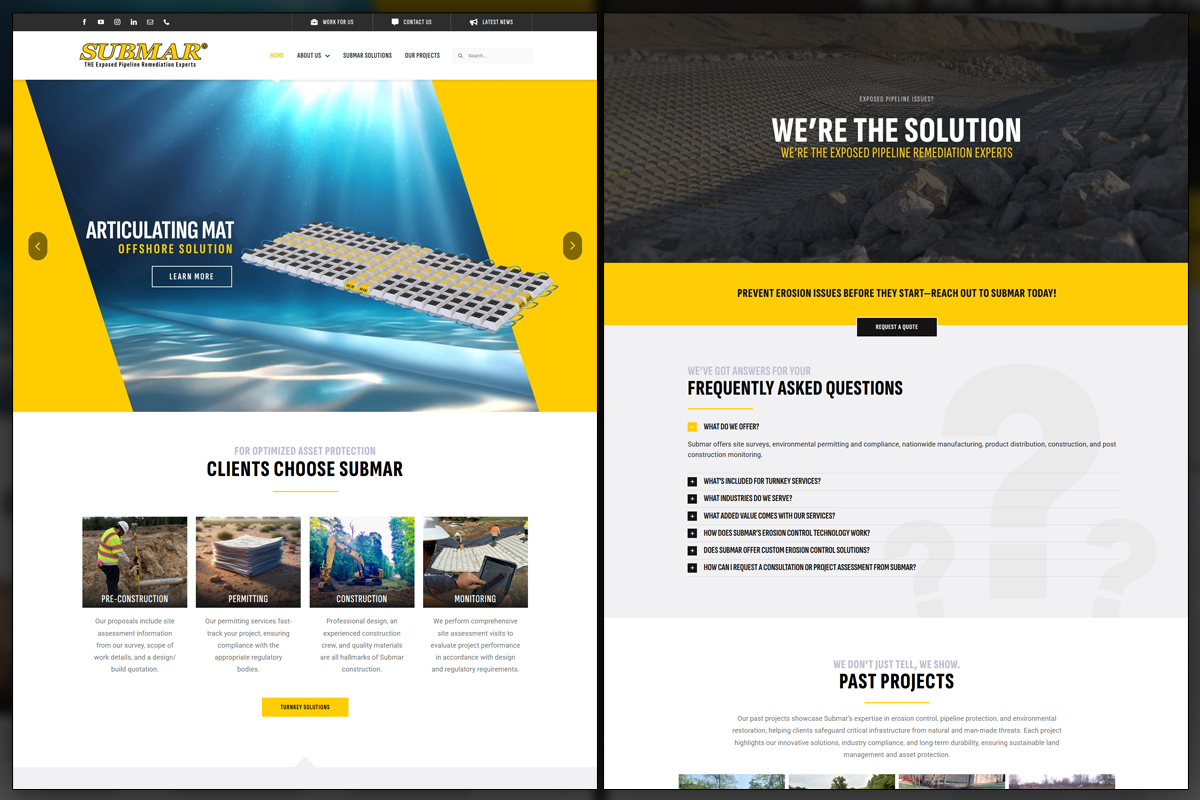
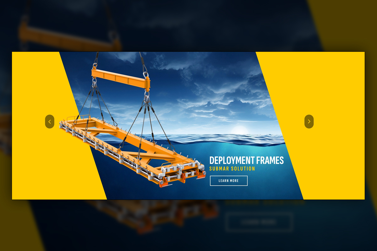
Submar's website was kept minimalistic to match their new, modern aesthetic. The simplicity of the website highlights the more interactive and complex elements that were meant to stand out and get potential customers directed exactly where they needed to go.
Dynamic
Dynamic
Summary
After launch, Submar gained a website that is easy to run and hard to outgrow. Most content is powered by dynamic custom fields, so nontechnical users can add case studies, blogs, and product details without touching layout. Products and services live together on rich, organized pages that search engines can fully crawl, supported by accordions for FAQs and more specific details on Submar's solutions. The homepage pairs a lightweight video loop with high quality product renders, while a clickable United States map on the contact page routes prospects to the correct salesperson. Form submissions honor state logic, brand elements are consistent, and existing assets slot in cleanly.
Project Goals & Purpose
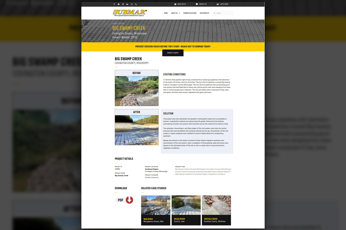
Before we began, our purpose was operational clarity and measurable visibility. Submar needed a website that busy teams could update quickly, that did not scatter information across dozens of thin pages, and that pushed the right leads to the right salesperson without manual sorting. Marketing Directors and brand managers value a system that lowers publishing friction and raises search value, so we created a template that centralizes information while allowing back-end users to simply paste in their content and publish with ease.
We planned WordPress custom fields for every recurring block, from product specs to case study metadata, so staff can post confidently. Instead of many shallow product pages, we designed deep sections that nest offerings together, then used accordions, filters, and anchors to keep reading comfortable. This creates a single source of truth for crawling, which is powerful for SEO. The homepage needed a clear first impression, so we paired several low filesize background loops with crisp renders in the foreground to set context quickly. Sales coverage matters, so we built the interactive United States map, tied state selections to the proper representative, and synced the contact form with routing rules. Due to the nature of our graphic design subscription, we were able to expedite delivery by knowing the brand and the company's preferences from the onset and repurposing assets we've already created for other projects.
Challenges
The previous approach scattered information and made updates feel risky for nontechnical staff. We needed to reduce manual pages while increasing total content, a balance that can harm performance if not structured carefully. The interactive map had to be rebuilt with accurate territory logic and resilient fallbacks. Contact routing needed to be precise, since sending a lead to the wrong person creates friction. Finally, the site had to express the newer Submar brand in a calm, credible way, without turning long pages into tedious scrolling and loading experiences.
Solutions
We defined a content model using custom fields for posts, case studies, product sections, and FAQs, then locked presentation inside reusable templates. Organized long form pages gather product families together, with accordions for depth and anchor links for navigation. The homepage hero combines a small video loop with a high fidelity render and CSS animations for presence without weight. A rebuilt United States map reads a territory data source, and the contact form routes by state to the correct salesperson. Technical SEO fundamentals, performance tuning, and accessibility checks shipped together. This subscription driven approach, consistent with a Subscription-Based Design Agency, lets teams scale content confidently.
Client Reception
The team reported that adding content became straightforward and faster. Sales appreciated that state clicks reveal the correct representative and that form routing respects territories. Leadership liked the consolidated product sections, the use of existing assets, and the brand’s steady presence. The site feels credible, useful, and aligned with how teams actually work.


Additional Images


downloads
No downloads currently available.
Tags
Related Projects

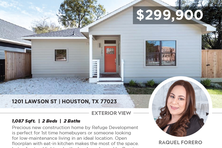 With the fast-paced nature of real estate, Refuge Real Estate needed a scalable, efficient system for producing high-quality marketing materials. We developed a custom template system that hastened flyer production, allowing agents to quickly generate open house materials with accurate listing data and personalized branding.