A Brief Look WITH
We transformed YDF Valve International into YVI Valve, building a sharper identity, a bolder wordmark, and complete overhaul of their collateral and facility branding identity in a short span of time and minimal friction due to our graphic design subscription.
categories
Brand Identity & Visual Strategy
Marketing Collateral & Communications
Packaging & Environmental Design
Software & Skills
3D Rendering
Adobe Illustrator
Adobe InDesign
Adobe Photoshop
Brand Strategy
Branding
Branding Compliance
Client Collaboration
Color Theory
Environmental Design
Keyshot 3D
Layout Design
Lighting & Texturing
Logo Design
Microsoft PowerPoint
Print Design
Technical Illustration
Typography
Web Design
3D Rendering
Adobe Illustrator
Adobe InDesign
Adobe Photoshop
Brand Strategy
Branding
Branding Compliance
Client Collaboration
Color Theory
Environmental Design
Keyshot 3D
Layout Design
Lighting & Texturing
Logo Design
Microsoft PowerPoint
Print Design
Technical Illustration
Typography
Web Design
Color Palette
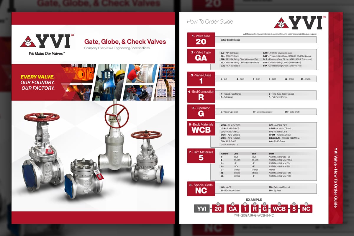
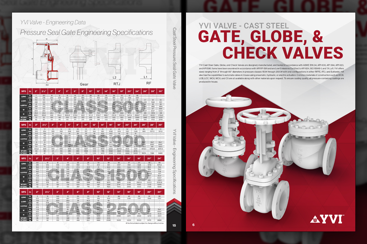
The product catalog redesign moved away from YDF's organic shapes and soft blue aesthetic to a deep red branding scheme. The cover now features real photography instead of 3D renders, signaling a confidence in available inventory. A compact, single-page how-to-order guide distills options into a clear, easy-to-follow sequence.
client
YVI Valve
YVI Valve, Inc. specializes in the manufacturing of industrial valves, including gate, globe, check, and ball valves, serving sectors such as oil, gas, chemical, and refining. With a commitment to quality and innovation, they provide reliable flow control solutions to a global clientele.
Project Year
2021
Evergreen
Evergreen
Summary
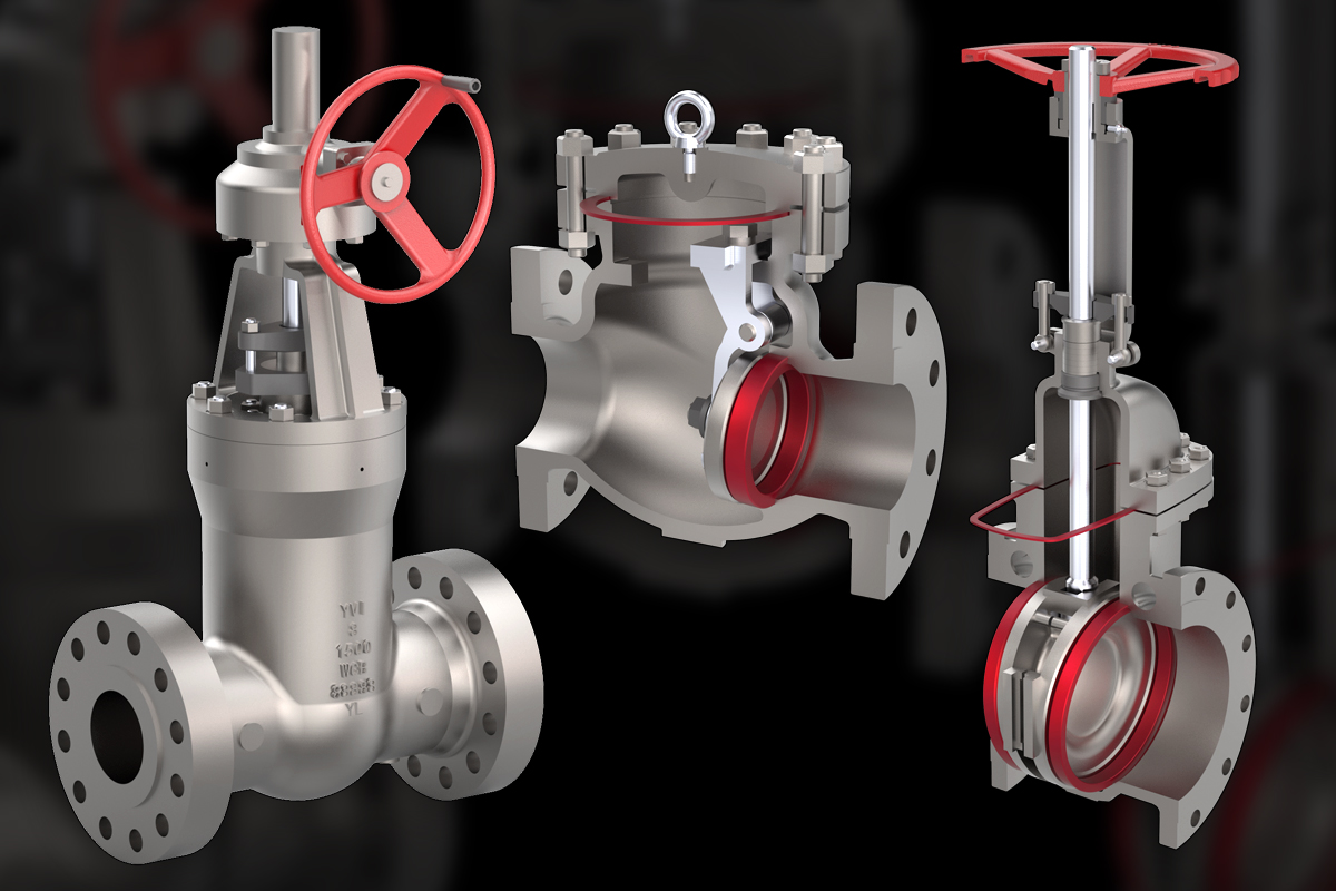
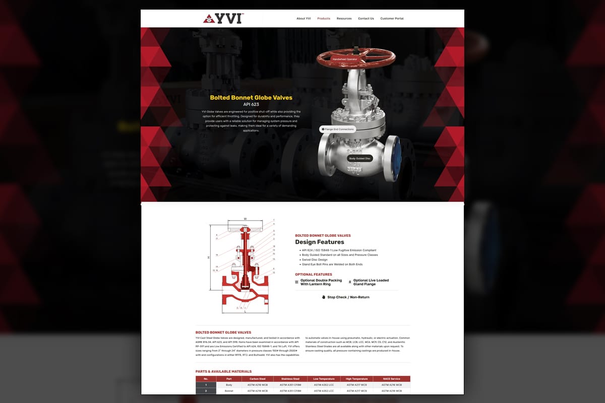
After the organizational split, YVI needed a brand that looked independent, modern, and production focused. We moved from YDF’s blue, soft forms to a confident red system with geometric, triangular patterns and an etched-ready wordmark. Thanks to our subscription service, YVI was able to keep momentum going throughout without having to price out and define project scope for each and every aspect of the re-brand, and allowed us to quickly pivot within a much shorter time-span. Leadership requested less emphasis on 3D renderings and more proof through actual photography, so we built a contingency library of 3D renders while prioritizing clean product photos that validate inventory for their FAST TRACK program. The evergreen tree-shaped icon, a nod to longevity and perseverance, anchors YVI's brand to their culture. Predi executed the full ecosystem, from facilities and uniforms to catalogs, booths, and a people-forward website that puts real manufacturing front and center.
Project Goals & Purpose
From a brand evolution and operations angle, the objective was to carry forward earned equity while signaling a new era. Before kickoff the President and Leadership teams aligned on a few non-negotiables, a wordmark bold enough to be etched or cast on hardware, a red-dominant palette that reads with confidence, and messaging that proves control from foundry to finished valve. The market needed to see a company that owns its process, communicates clearly, and delivers faster, not just another reseller with a catalog.
Photography became a strategic lever. The Executive Team wanted to minimize reliance on 3D visuals as they became commonplace, so we planned a gradual transition, clean and isolated product photos for marketing and literature, with a deep library of standardized 3D assets as backup when photography is unavailable. Content pillars highlighted owned manufacturing, FAST TRACK availability, and service in North America and Europe. YVI has its roots in China, so the icon references an evergreen tree which culturally represents resilience and longevity, while the triangular geometry reinforces precision. As a graphic design subscription service partner, Predi supplied the cadence needed to update assets continuously, adapt to regional requirements, and keep the system coherent across uniforms, tradeshow environments, catalogs, nameplates, ID cards, PowerPoints, the website, and more.
Challenges
The split required preserving useful recognition while avoiding visual echoes of YDF’s blue, organic shapes. Leadership wanted fewer 3D hero moments even as photography gaps persisted. Facilities in China needed rapid rollouts, from FR coveralls to hard-hats and line markings, without sacrificing quality checks. Global collateral had to remain consistent while accommodating regional needs and rapid product updates. Each decision balanced speed with proof, so claims about control, inventory, and responsiveness could stand up in meetings and on shop floors.
Solutions
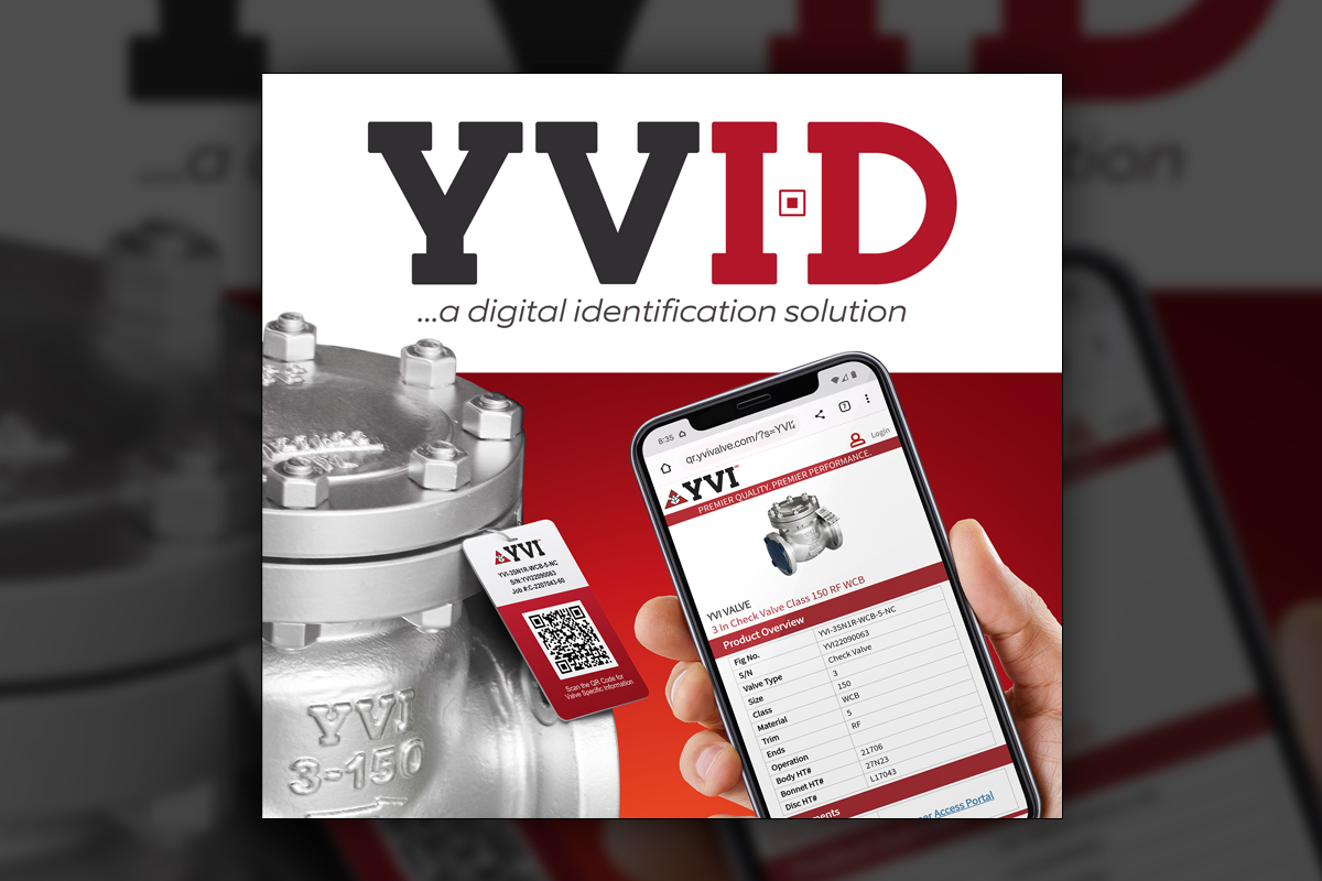
We established a consistent brand pattern with a geometric rhythm, an etched-capable wordmark, and a disciplined use of color. Photography protocols guided lighting, isolation, and retouching standards, while a comprehensive 3D backup library ensured no deliverable stalled when images were missing. The website adopted people-forward storytelling, with a homepage reel featuring training, inspection, and assembly, plus product pages that combine real photos, part highlights, and materials. Culture posters, uniforms, ID cards, and nameplates carried the same icon system. Delivered through a Brand Design Subscription Service with On-Demand Creative Services, the program kept releases frequent and measurable for Corporate Design Solutions.
Client Reception
Leadership praised the readability of the wordmark once it was implemented on real valves and the clarity of the deep red brand color across uniforms, facility graphics, and printed pieces. Sales appreciated real product photography for inventory signaling, while engineering teams appreciated the ease of updating documents with accurate specifications. The site and catalogs felt modern, proof-driven, and easy to extend should their product line expand in the future.


Additional Images


downloads
No downloads currently available.
Tags
Related Projects
 We designed a comprehensive, data-driven product catalog for Enersafe, now GryphonESP, that highlighted their top-selling safety and retail gear. By analyzing sales reports, curating high-quality product images, and implementing a dynamic layout, we helped Enersafe streamline their inventory and create an engaging, easy-to-navigate catalog.