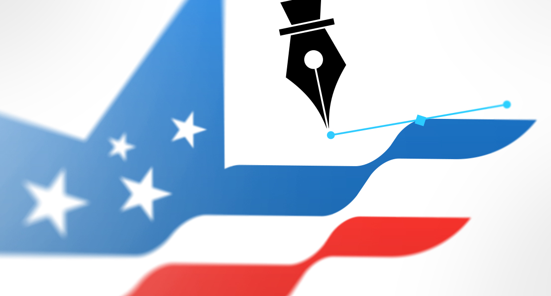
 Before we even touch sketches, fonts, or clever symbolism, it helps to admit one simple thing, logo work messes with people’s heads. It’s one of the few creative tasks where taste, ego, fear, and pride all show up to the meeting at the same time. Everyone wants a result that feels obvious, but the route to “obvious” is usually a pile of awkward drafts, second guesses, and sudden strong opinions from someone who has never cared about design until now. That emotional mix is why the process can feel slower, louder, and strangely personal compared to other projects. If you’ve ever wondered why a tiny graphic can spark a full-on committee debate, welcome, this is that part of the ride.
 Minimalism looks simple from the outside, which is why it is so often misunderstood. It asks the designer to make fewer choices and then make each choice count, which is a harder task than filling a page with decoration. Why does "minimal" work require more intent, more listening, and more discipline? Why does the best minimalist piece feel like the inevitable conclusion when you see it for the first time? If your brand leans clean and direct, or if your team is wrestling with cluttered assets, consider this my guide to doing less in a way that communicates more.
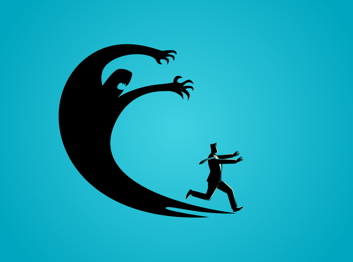 There is something challenging about being given a timeframe for a project by someone who does not fully understand the process. "Here are some quick notes. Should not take you more than 10 minutes." But how would they know?
Latest Blog Entry
 Before we even touch sketches, fonts, or clever symbolism, it helps to admit one simple thing, logo work messes with people’s heads. It’s one of the few creative tasks where taste, ego, fear, and pride all show up to the meeting at the same time. Everyone wants a result that feels obvious, but the route to “obvious” is usually a pile of awkward drafts, second guesses, and sudden strong opinions from someone who has never cared about design until now. That emotional mix is why the process can feel slower, louder, and strangely personal compared to other projects. If you’ve ever wondered why a tiny graphic can spark a full-on committee debate, welcome, this is that part of the ride.
© 2016 - 2026 • Predi Designs, LLC • All Rights Reserved • Privacy Policy