A Brief Look WITH
We developed pre-branding educational trifolds and Point of View booklets for Psychemedics, translating complex science into accessible guidance. We are honored to support parents and administrators with clear visuals, persuasive data, and compassionate messaging.
categories
Software & Skills
3D Rendering
Adobe InDesign
Adobe Photoshop
Brand Strategy
Branding
Branding Compliance
Client Collaboration
Data-Driven Design
Scientific Visualization
Technical Illustration
3D Rendering
Adobe InDesign
Adobe Photoshop
Brand Strategy
Branding
Branding Compliance
Client Collaboration
Data-Driven Design
Scientific Visualization
Technical Illustration
Color Palette
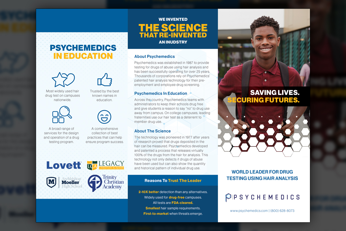
The trifold’s exterior artwork establishes the education theme with cohesive color, a hero image in the hex mask, and concise headlines. Early icon requests appear here, signaling a bridge toward later corporate preferences without sacrificing the existing branding.
Inform
Inform
Summary
We created a suite of pre-branding educational materials for Psychemedics, including a parent-focused trifold brochure and multiple Point of View booklets developed with our original contact. The system used a consistent hexagonal image mask, disciplined typography, and vibrant data visuals to turn statistics into persuasion. Content addressed student safety, faculty readiness, and hiring decisions across industries. To show scientific rigor without alienating nontechnical readers, we balanced approachable language with credible graphics such as a hair follicle cross-section. These pieces informed, reassured, and converted, setting a foundation later adapted to icon-forward preferences during leadership transition.
Project Goals & Purpose
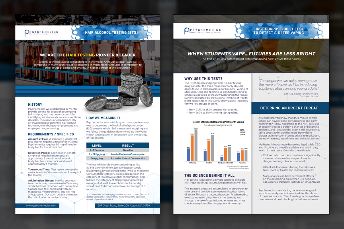
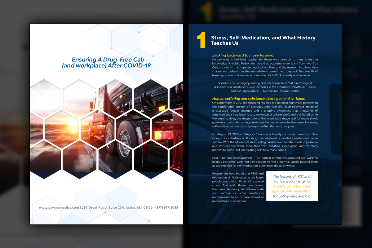
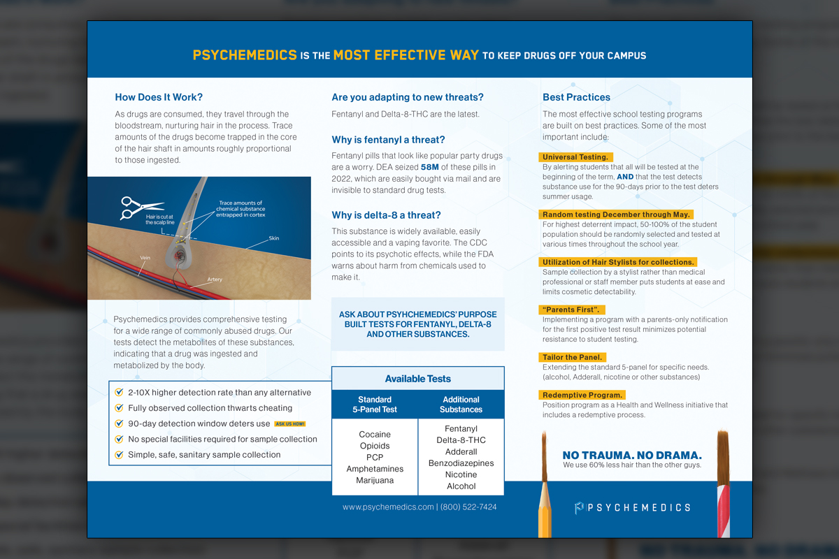
Before we began, our purpose was to help Psychemedics communicate a difficult truth clearly, hair testing reveals patterns other methods miss, and that insight helps parents, schools, and employers act responsibly. We aimed to translate complex science into practical guidance without losing authority. As a Subscription-Based Design Agency, we planned a repeatable framework that could scale from a parent trifold to Point of View booklets addressing topics like post-COVID hiring for trucking fleets and the role of onboarding programs. The visual language needed to feel human, reliable, and ready for print or digital distribution. We committed to a hexagonal image system for brand recognition, a consistent type hierarchy for scanning, and simplified charts that spotlighted key statistics. We also proposed educational graphics that demystify hair collection, including the small sample comparison and a sectional view illustrating how substances are detected. Because these documents were pre-new branding, we designed them to be modular so later revisions could introduce iconography without losing message integrity. The goal was confident comprehension in minutes, not hours, with pathways for deeper reading. If your team needs this kind of clarity at scale, our Corporate Design Solutions deliver ongoing strategy and production without the overhead of staffing a full department.
Challenges
We needed to balance scientific rigor with accessibility for parents, administrators, and hiring managers, all within pre-new branding constraints. The content spanned multiple topics, from campus safety to post-COVID hiring guidance, each with distinct sensitivities. Visualizing the tiny hair sample without trivializing the science required careful scale cues and captions. Our 3D graphics elevated understanding but needed to harmonize with the broader system. Finally, we anticipated leadership preferences, including a future shift toward icon-heavy layouts, and planned for continuity without diluting the persuasive power of the original materials.
Solutions
We established editorial standards that simplified language while preserving accuracy, then translated key statistics into focused charts and callouts. A hexagonal image mask unified photography and diagrams across trifolds and Point of View booklets. We produced 3D visuals for the follicle cross-section and alcohol theme, supported by captions that reinforced key takeaways. To future-proof system, we structured content blocks so icon sets could later replace or complement imagery with minimal reflow. As On-Demand Creative Services, we ensured templates, styles, and assets were ready for rapid iteration. For sustained quality and speed, our Design Retainer Service keeps this caliber of work continuous.
Client Reception
Psychemedics valued the clarity, the parent-appropriate tone, and the credible visual system. Teams reported easier conversations with schools and hiring managers, citing faster comprehension and fewer objections. The materials became reference pieces for outreach, while the modular structure made later icon-focused updates straightforward. Stakeholders noted that the documents consistently moved audiences from curiosity to action.