A Brief Look WITH
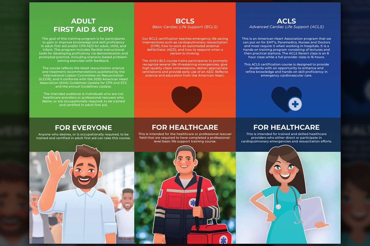
Predi Designs developed two similarly-styled brochures highlighting GryphonESP’s First Aid/CPR and Fire Extinguisher training offerings. The designs balanced clean layouts with vibrant visuals—built with limited assets and sourced content.
categories
Software & Skills
Adobe Illustrator
Adobe InDesign
Adobe Photoshop
Branding Compliance
Client Collaboration
Copywriting
Layout Design
Adobe Illustrator
Adobe InDesign
Adobe Photoshop
Branding Compliance
Client Collaboration
Copywriting
Layout Design
Color Palette
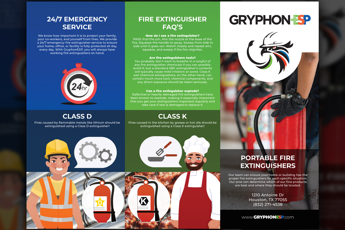
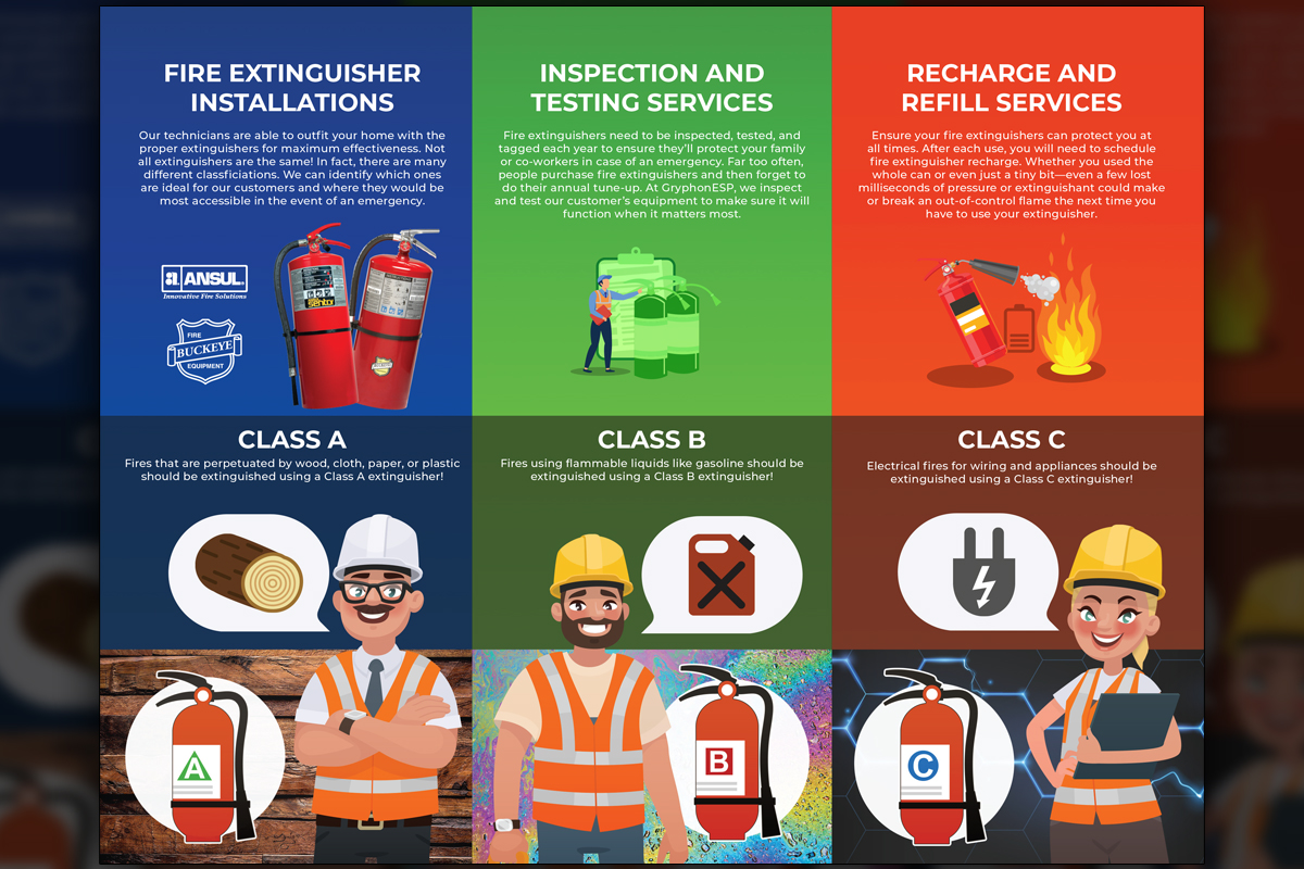
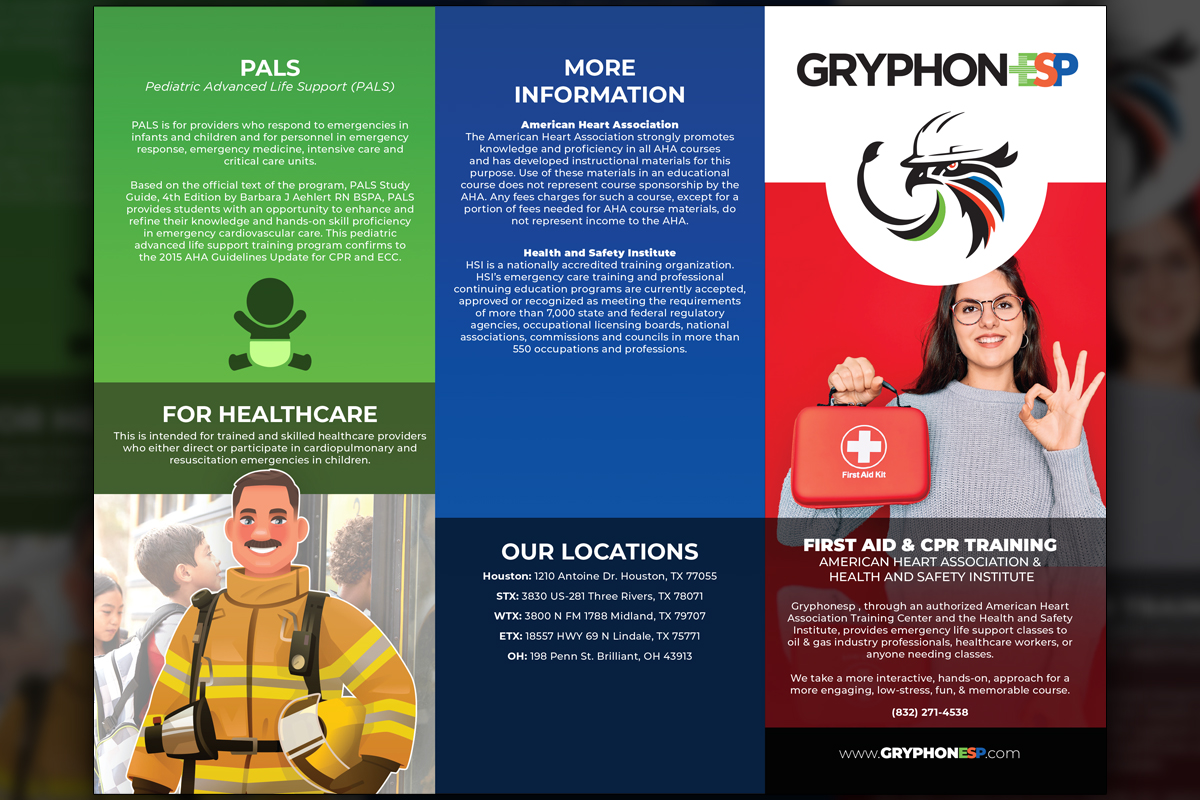
A crisp, polished look at the final trifold design, presenting safety training information with clear structure and visual hierarchy, ideal for in-person marketing handouts and client meetings.
Preparedness
Preparedness
Summary
After COVID-19 restrictions eased, GryphonESP needed print-ready collateral to promote its core safety training programs at in-person events. We developed two matching trifold brochures, one focused on First Aid & CPR, the other on Fire Extinguishers. Our layout emphasized clarity and warmth, using vibrant visuals and a modular structure to make dense content more readable. The illustrations followed a consistent, industry-neutral style that made the technical subject matter approachable. Despite a lack of client assets, we filled in content gaps with self-directed research and writing. These materials remain in active use and continue to support GryphonESP’s outreach.
Project Goals & Purpose
With on-site safety training back in action, GryphonESP needed marketing materials that instantly conveyed trust and professionalism. Like many scaling companies, they had minimal content and few brand resources. As a design subscription partner, we frequently support clients in this position, taking on both content and creative under one roof. For this project, we didn’t just design, we researched, wrote, and illustrated from scratch. Our aim was to deliver clear safety messaging with a friendly tone, pairing simple visuals and color to make critical topics more digestible. This is the power of an ongoing design subscription: flexible, proactive, and always ready to elevate.
Challenges
One of the biggest hurdles was a complete absence of finalized content or visual assets at kickoff. GryphonESP was still regaining momentum post-pandemic, and copy delays stalled the timeline. We also had to ensure that the two brochures, despite covering different subjects, maintained a shared visual language without becoming repetitive. Additionally, all sourced copy had to be thoroughly vetted to ensure it was accurate and aligned with safety regulations. The subject matter demanded precision, clarity, and a user-friendly tone, without sacrificing compliance.
Solutions
We stepped in to lead both content creation and design. Leveraging publicly available OSHA resources, we built responsible, well-structured copy tailored for field use. Our team created cohesive layouts with unified color schemes and illustrations, allowing each brochure to shine independently while still feeling like part of a larger system. This all-in-one delivery model is a cornerstone of our subscription service. By handling everything from copy to layout, we gave GryphonESP polished tools without requiring daily oversight, exactly what busy teams need when deadlines are tight.
Need event-ready brochures like these? Let’s simplify your safety messaging with a design subscription that handles content and creative from start to finish.
Need event-ready brochures like these? Let’s simplify your safety messaging with a design subscription that handles content and creative from start to finish.
Client Reception
GryphonESP’s team was grateful for our proactive role in organizing and building their training content. The finished brochures were praised for their clean design, modern feel, and usefulness in the field. Years later, they’re still using the materials at events and client meetings, a testament to the value of dependable, well-executed collateral.