Stop Adding Layers To Client Communication
When I started Predi Designs, I wanted to make the process easy for me to manage requests from several different companies at the same time, so I would not cross streams or let anything fall through the cracks. I needed one place to see every task, who it belonged to, and what it needed next. The solution that I ultimately built solved my problems, but in the process created new problems for my clients. It was a lesson learned and I wanted to share the experience and how I found a resolution that satisfied everyone.
about
We’re a high-quality, all-inclusive graphic design subscription for brands and businesses.
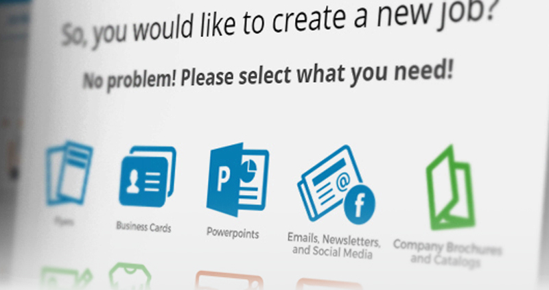
A screenshot of the old project management system that was ultimately scrapped. Creating a new project was made super simple, fields walked the user through the process to provide basic information to help us get started.
Perfect on paper, ignored in practice
My Very Own Custom PMS
With my original goal in mind, I created a Trello or Asana style portal where each client had their own private space on the back-end of the Predi Designs website to submit requests, comment, direct message, and track status, while I saw a master board with every task color coded by client. I hired developers, hosted it on my server, and we shipped a clean version with to do, doing, awaiting feedback, and done. The tool worked, privacy was solid, and the interface was clear. Then adoption stalled. Clients did not want to pause their day, remember a password, and move through a form just to say, “Can you make this one change?”
We tried lowering friction by shortening forms, sending direct links, and writing quick start guides. I even created a tutorial video that walked through all the features the system could provide. A few teams tested it for a week, then drifted back to email because that is where their conversations already lived. The reality was simple. Opening a portal felt like extra work, even when the portal was designed for ease of use. That was the moment I committed to a rule that still guides our process on How It Works, bend the system to the client, not the client to the system. The code was sound, the idea was tidy, and the verdict from real users was, “No thank you”.
Make it easy to ask for help
What Clients Actually Want
Clients want fast access to a human who can help and a record of what was said. Email is already part of every workflow, it is searchable, it travels well on phones, and it does not require training. A portal turns a ten second note into a task that needs a URL, a login, and a decision tree. By meeting clients where they are, we removed hesitation and sped up approvals. If you want to see how that choice feels from the other side of the table, the feedback is collected on our Testimonials page.
At the end of the day, my job isn’t just to create great designs. It’s to make the design process easy for my clients. And sometimes, that means letting go of what’s ideal for me in favor of what actually works for them.
Email also keeps everyone in the loop with a simple cc, which is usually all a team needs for visibility. Long threads create an instant paper trail that legal and compliance teams actually recognize. Those who get roped into the project can search past conversations and get context in minutes. Most importantly, ideas arrive while they are still fresh because nobody is wrestling with a tool before they can ask for help. Easy questions get quick answers, and complex requests get the detail they deserve without a gate in the way.
An inbox that works harder than most project management software. Color-coded email filters organizing client projects seamlessly, proving that sometimes the simplest solutions are the best.
Zero inbox, zero confusion
My Inbox As The Operations Hub
As a solution that satisfied everyone, I rebuilt the PMS master board inside my inbox using the tools available already. Each client’s company email domain is auto labeled and color coded. New emails appear as tasks. If I have a meeting, I email the notes to myself and keep momentum going. When a project has no more actionable items, I move the thread to an “Awaiting Feedback” label so the inbox remains a clean queue. Once a project is complete, it gets labeled as such and I archive it for my records.
Weekly, I scan labels, confirm priorities, and archive anything finished so the list always reflects reality. Labels mirror a simple workflow, Intake, Doing, Awaiting Feedback, Done, which gives the same clarity as a Kanban board without asking clients to touch anything but their own inbox. Rules catch common phrases like “final approval,” “go live,” or “needs edit,” and route them to the right place automatically. If you want a nuts and bolts primer on rules and labels, the Gmail filters guide is a helpful reference.
Minimize Friction and Your Productivity Skyrockets
The Lesson That Stuck
The custom tool taught me that a process truly wins when it is beneficial for the client first and foremost. Removing extra layers keeps momentum high, which fits our subscription model perfectly, cost stays predictable and the work stays focused just as it would have if the built system was being utilized to the fullest. Teams do not change habits, they just send an email and get moving.
This choice also makes onboarding simple. New clients start with the same address they would use for any vendor and get the same level of organization behind the scenes. No training, no setup, no slowdown. If this is the way you prefer to work, the studio overview on About explains our approach, and you can start a thread anytime by sending us a message through our Contact Form.
A screenshot of the old project management system that was ultimately scrapped. Creating a new project was made super simple, fields walked the user through the process to provide basic information to help us get started.
Perfect on paper, ignored in practice
My Very Own Custom PMS
With my original goal in mind, I created a Trello or Asana style portal where each client had their own private space on the back-end of the Predi Designs website to submit requests, comment, direct message, and track status, while I saw a master board with every task color coded by client. I hired developers, hosted it on my server, and we shipped a clean version with to do, doing, awaiting feedback, and done. The tool worked, privacy was solid, and the interface was clear. Then adoption stalled. Clients did not want to pause their day, remember a password, and move through a form just to say, “Can you make this one change?”
We tried lowering friction by shortening forms, sending direct links, and writing quick start guides. I even created a tutorial video that walked through all the features the system could provide. A few teams tested it for a week, then drifted back to email because that is where their conversations already lived. The reality was simple. Opening a portal felt like extra work, even when the portal was designed for ease of use. That was the moment I committed to a rule that still guides our process on How It Works, bend the system to the client, not the client to the system. The code was sound, the idea was tidy, and the verdict from real users was, “No thank you”.
At the end of the day, my job isn’t just to create great designs. It’s to make the design process easy for my clients. And sometimes, that means letting go of what’s ideal for me in favor of what actually works for them.
Make it easy to ask for help
What Clients Actually Want
Clients want fast access to a human who can help and a record of what was said. Email is already part of every workflow, it is searchable, it travels well on phones, and it does not require training. A portal turns a ten second note into a task that needs a URL, a login, and a decision tree. By meeting clients where they are, we removed hesitation and sped up approvals. If you want to see how that choice feels from the other side of the table, the feedback is collected on our Testimonials page.
Email also keeps everyone in the loop with a simple cc, which is usually all a team needs for visibility. Long threads create an instant paper trail that legal and compliance teams actually recognize. Those who get roped into the project can search past conversations and get context in minutes. Most importantly, ideas arrive while they are still fresh because nobody is wrestling with a tool before they can ask for help. Easy questions get quick answers, and complex requests get the detail they deserve without a gate in the way.
An inbox that works harder than most project management software. Color-coded email filters organizing client projects seamlessly, proving that sometimes the simplest solutions are the best.
Zero inbox, zero confusion
My Inbox As The Operations Hub
As a solution that satisfied everyone, I rebuilt the PMS master board inside my inbox using the tools available already. Each client’s company email domain is auto labeled and color coded. New emails appear as tasks. If I have a meeting, I email the notes to myself and keep momentum going. When a project has no more actionable items, I move the thread to an “Awaiting Feedback” label so the inbox remains a clean queue. Once a project is complete, it gets labeled as such and I archive it for my records.
Weekly, I scan labels, confirm priorities, and archive anything finished so the list always reflects reality. Labels mirror a simple workflow, Intake, Doing, Awaiting Feedback, Done, which gives the same clarity as a Kanban board without asking clients to touch anything but their own inbox. Rules catch common phrases like “final approval,” “go live,” or “needs edit,” and route them to the right place automatically. If you want a nuts and bolts primer on rules and labels, the Gmail filters guide is a helpful reference.
Minimize Friction and Your Productivity Skyrockets
The Lesson That Stuck
The custom tool taught me that a process truly wins when it is beneficial for the client first and foremost. Removing extra layers keeps momentum high, which fits our subscription model perfectly, cost stays predictable and the work stays focused just as it would have if the built system was being utilized to the fullest. Teams do not change habits, they just send an email and get moving.
This choice also makes onboarding simple. New clients start with the same address they would use for any vendor and get the same level of organization behind the scenes. No training, no setup, no slowdown. If this is the way you prefer to work, the studio overview on About explains our approach, and you can start a thread anytime by sending us a message through our Contact Form.

Matthew A.
Owner of Predi Designs
Matthew began as an online content creator in his teenage years, crafting Flash animations and games for internet audiences and collaborating with other young creatives worldwide. He later graduated cum laude from Texas A&M University’s Visualization Program, where he honed his skills in design, animation, and interactive media. He has owned and operated Predi Designs since 2016.
A Subscription Just Makes Sense.
Predi Designs delivers unlimited high-quality graphic design for a flat monthly rate, making top-tier branding and marketing more affordable, flexible, and efficient than traditional agencies. Plus, without salaries, benefits, or equipment costs, it’s more cost-effective than hiring in-house. No hourly fees, no scope limits. Just fast, reliable design on demand. Scale smarter, save more, and streamline creativity with Predi Designs.
blog tags
related posts
 AutoPay is basically our “keep it boring” button for billing. Your flat monthly rate drafts on the same day every month, you still get an invoice for your records, and nobody has to send the awkward overdue invoice emails. It keeps projects moving, keeps the relationship strong, and keeps your brain on design rather than due dates. Security is handled seriously, mistakes get fixed fast with a 100% guarantee, cancellation is simple, and we even apply a convenience discount as a small thanks for making the whole thing run smoothly.
 Before we even touch sketches, fonts, or clever symbolism, it helps to admit one simple thing, logo work messes with people’s heads. It’s one of the few creative tasks where taste, ego, fear, and pride all show up to the meeting at the same time. Everyone wants a result that feels obvious, but the route to “obvious” is usually a pile of awkward drafts, second guesses, and sudden strong opinions from someone who has never cared about design until now. That emotional mix is why the process can feel slower, louder, and strangely personal compared to other projects. If you’ve ever wondered why a tiny graphic can spark a full-on committee debate, welcome, this is that part of the ride.
 Predi Designs has always grown through quality work and the kind of word-of-mouth that only comes from happy clients who value collaboration. The new website is built to showcase that trust. It gathers a deep portfolio of projects and highlights client testimonials so visitors can see not only what we create but also how we work with the people behind each brand. This site is proof of the relationships and results that built the business and the standard we continue to uphold.
