 Artificial intelligence is one of those technologies I cannot afford to ignore as a business owner. ChatGPT and Claude have already changed how people write, brainstorm, organize information, and generate visuals. ChatGPT launched publicly in November 2022, and the creative industry has been adjusting ever since. That creates an obvious question for Predi Designs. Should we use AI? The honest answer is yes, carefully. Ignoring the tool completely would be stubborn. Relying on it too heavily would be irresponsible. The goal is to understand where it helps, where it creates problems, and where a human designer still needs to be the one making the final call.
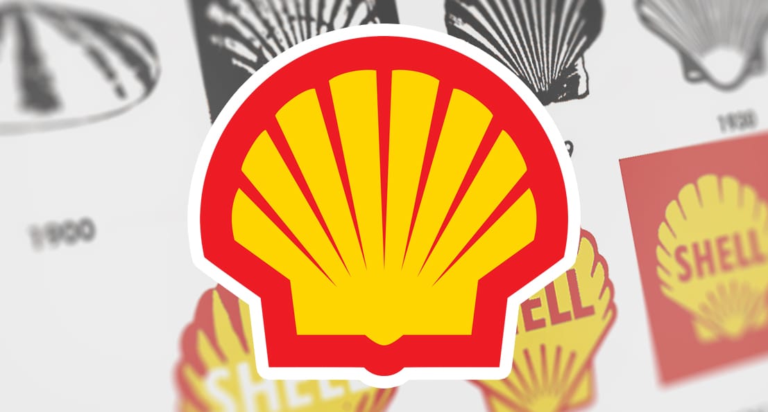 There was a time when icons looked more like illustrations than symbols. Detailed crests, layered textures, hand-drawn typography. The goal was to capture as much personality as possible in a single mark. That made sense in a world where branding mostly lived on signage, packaging, and print. You had the space, and you had the time to take it in. Today, that approach feels out of place. Most logos now live on screens, often at very small sizes. App icons, favicons, social avatars. That shift alone changes how design needs to function. What used to work at full scale no longer holds up when reduced to a tiny square.
 Rebrands always get attention, but not always for the right reasons. People notice when something familiar changes, especially when that brand has been part of their routine for years. There is a level of emotional attachment that builds over time, even with something as simple as a restaurant logo or packaging design. At the same time, staying the same forever is not an option either. An outdated brand identity makes a company feel behind, even if the product itself is still strong. The challenge is deciding what should evolve and what should stay recognizable. That balance is where most rebrands succeed or fall apart.
Latest Blog Entry
 Several people have seen the layout-troubled “Don’t Dead Open Inside” graffiti from The Walking Dead. Even if you have never watched the show, you have probably seen the meme at some point. It is one of those things that sticks because it feels so obviously wrong the second you read it. What makes it interesting is that the words themselves are not the problem. The message is clear when you finally reconfigure your mindset and wrap your head around it. The issue is the layout. The way the words are arranged causes your brain to read them in the wrong order, which turns a simple warning into something either confusing, offensive, or hilarious. That is what makes it such a useful example. It shows how quickly meaning can fall apart when visual structure does not match reading behavior.
© 2016 - 2026 • Predi Designs, LLC • All Rights Reserved • Privacy Policy