What Makes Or Breaks A Rebrand
Rebrands always get attention, but not always for the right reasons. People notice when something familiar changes, especially when that brand has been part of their routine for years. Even if someone does not think of themselves as brand-conscious, they still form emotional associations over time. A familiar logo, menu board, or package design becomes part of the experience itself. That is why change can feel disruptive even when the intent is improvement.
At the same time, staying exactly the same is not a real option. Markets shift. Technology changes. Visual languages evolve. A brand that never moves forward eventually feels outdated, even if the product quality remains strong. The tension comes from deciding what to preserve and what to evolve. Too much change risks alienating loyal customers. Too little change risks losing relevance. That balance is where most rebrands either land successfully or stumble.
about
We’re a high-quality, all-inclusive graphic design subscription for brands and businesses.
Some brands are anchored to tradition and emotionally charged memories. Their entire product experience from spotting the brand from the highway to dining to the antique market checkout are rooted in old-fashioned traditions. Modernizing this brand created a visceral reaction that left regulars of the establishment behind.
The Classic Crime
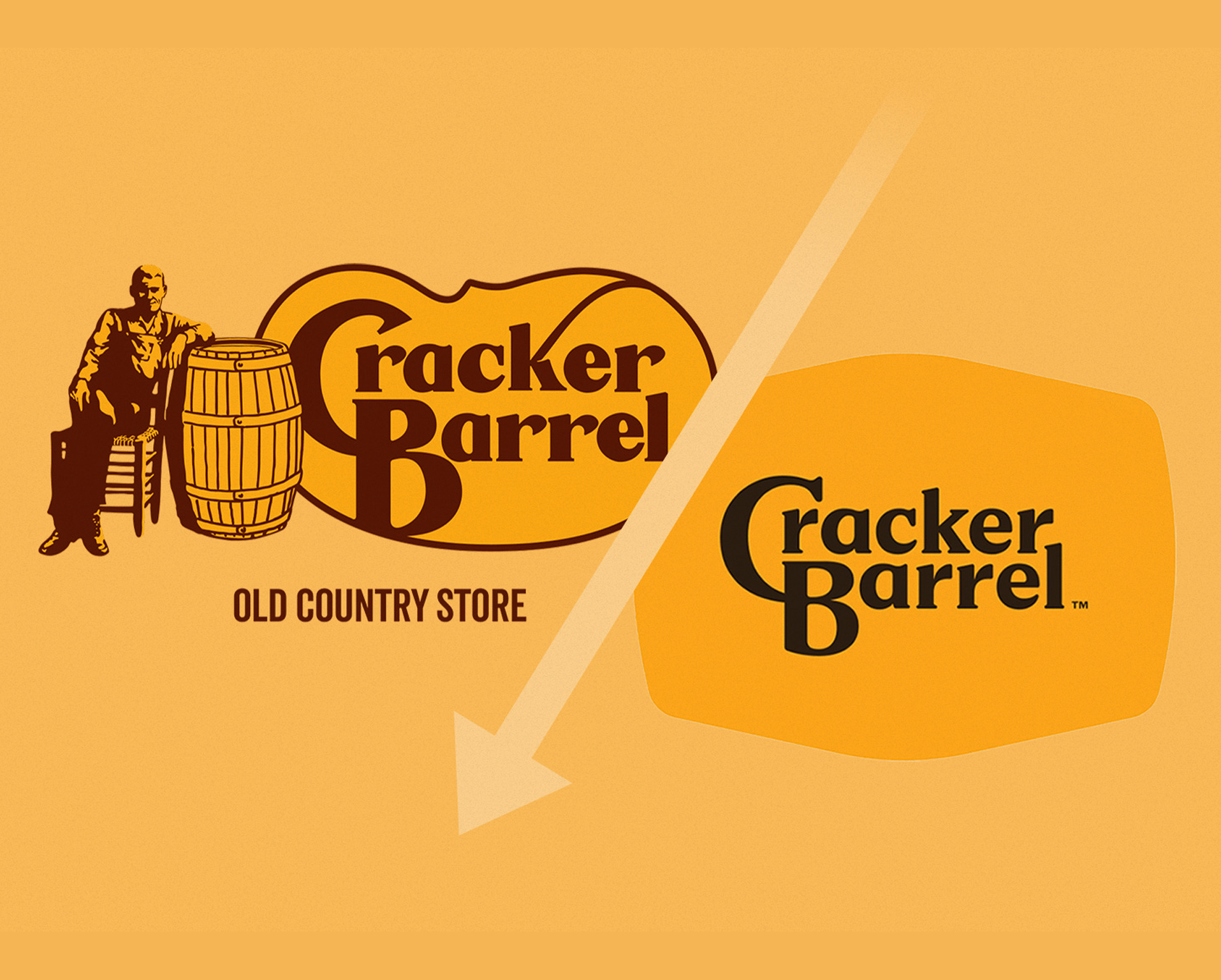
Cracker Barrel And Emotional Equity
Cracker Barrel Old Country Store has been a familiar roadside presence for decades. For many people, the brand is tied to specific sensory memories: wooden chairs on the porch, peg games on the table, and a very specific visual aesthetic. When the company rolled out a refresh that included updates to the logo, menu presentation, and interior styling, the public reaction was mixed. Some welcomed the cleaner look. Others felt that something meaningful was being diluted or abruptly taken away.
This is not surprising. When a brand becomes part of someone’s routine or nostalgia, the visual identity becomes part of the product experience. Updating it is not just a design decision, it becomes a cultural decision. The challenge here is not whether the new design is technically good, it is whether the change aligns with what people emotionally expect from the brand. That is why discussions around the refresh appeared in marketing press and consumer forums alike, including coverage by Restaurant Business. When a brand carries emotional equity, even subtle changes can feel dramatic.
System of a Domino
Domino’s And System-Level Thinking
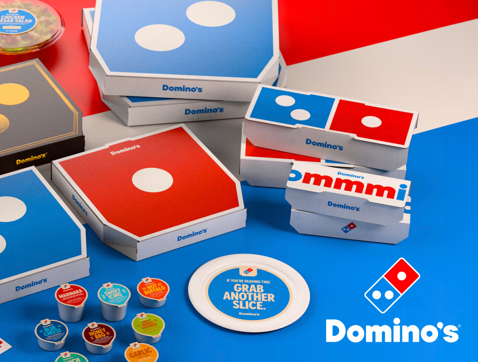
The recent brand refresh from Domino’s Pizza shows a different approach. Instead of focusing only on a logo update, the refresh expanded across the brand system. Changes included updates to color usage, typography, packaging, photography direction, and even audio branding through new sonic elements. That approach reflects an understanding that the brand is experienced across many touchpoints, not just through a single symbol.
Every aspect of the Domino's brand was approached with the same intention and care. It created a system that defines every deliverable is undeniably from the same source.
This kind of systemic thinking is easier for customers to accept because it aligns with how they actually interact with the brand. You see the brand on a website, on a pizza box, in the app interface, in advertising, and in physical signage. When all of those elements evolve together, the update feels cohesive rather than abrupt. That consistency is a hallmark of strong branding systems, a topic often discussed by organizations like the Design Management Institute. When a rebrand updates the entire system instead of only a single visual element, it feels intentional rather than superficial.
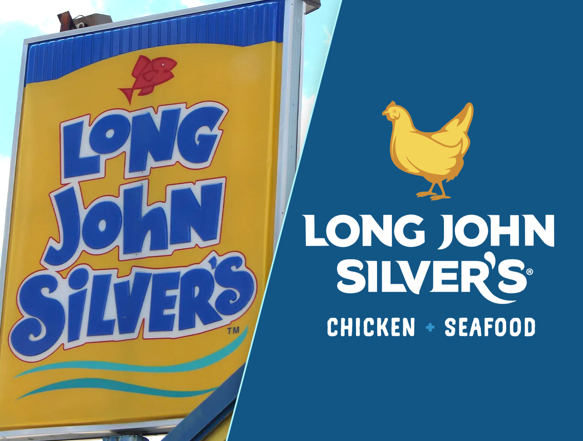
Long John Silver's was notoriously a seafood establishment, but since their inception, they've always served chicken. This branding change positioned their offerings in a way that pushed them into the public eye without betraying their loyal customers who still receive the same service.
Between Land & Sea
Long John Silver’s And Strategy Shift
Long John Silver’s took a different route entirely. The brand updated its identity by adding chicken into the brand lockup and visual language. That is not simply a stylistic choice. It communicates a shift in how the company wants to position its offerings. By changing the core iconography, the brand signals a strategic adjustment to its product focus and audience expectations.
This is an important reminder that visual identity often reflects business strategy. When the core offering evolves, the branding often needs to shift with it. A rebrand like this is not about aesthetics alone. It communicates direction, competitive positioning, and business priorities. That is why brand shifts like this attract attention beyond the design community. When design aligns with strategy, the result feels purposeful even if the change is bold.
Stuck in the Middle
The Balance Between Change And Recognition
Across all of these examples, the same tension shows up. Brands must evolve to stay relevant, but they also need to remain recognizable. If the shift is too aggressive, loyal customers may feel disconnected from the brand they remember. If the shift is too minimal, the brand risks looking outdated compared to competitors who feel more contemporary. The strongest rebrands strike a balance, updating what needs to evolve while preserving core identity elements.
Not all rebrands should be approached equally. Depending on context it's always best to treat altering established branding with the knowledge that blowback is inevitable. Often, it's the response to the blowback that can put the final nail in the coffin.
This balance is not easy. It requires understanding both the emotional and practical sides of branding. Design is not only about how something looks. It shapes perception, builds trust, and influences how people interpret a brand’s values. That is why rebrands often spark strong reactions. They are not just visual changes. They are statements about identity and direction. When done well, the updated identity strengthens recognition rather than diluting it. When done poorly, it creates confusion or backlash.
Some brands are anchored to tradition and emotionally charged memories. Their entire product experience from spotting the brand from the highway to dining to the antique market checkout are rooted in old-fashioned traditions. Modernizing this brand created a visceral reaction that left regulars of the establishment behind.
The Classic Crime
Cracker Barrel And Emotional Equity
Cracker Barrel Old Country Store has been a familiar roadside presence for decades. For many people, the brand is tied to specific sensory memories: wooden chairs on the porch, peg games on the table, and a very specific visual aesthetic. When the company rolled out a refresh that included updates to the logo, menu presentation, and interior styling, the public reaction was mixed. Some welcomed the cleaner look. Others felt that something meaningful was being diluted or abruptly taken away.
This is not surprising. When a brand becomes part of someone’s routine or nostalgia, the visual identity becomes part of the product experience. Updating it is not just a design decision, it becomes a cultural decision. The challenge here is not whether the new design is technically good, it is whether the change aligns with what people emotionally expect from the brand. That is why discussions around the refresh appeared in marketing press and consumer forums alike, including coverage by Restaurant Business. When a brand carries emotional equity, even subtle changes can feel dramatic.
Every aspect of the Domino's brand was approached with the same intention and care. It created a system that defines every deliverable is undeniably from the same source.
System of a Domino
Domino’s And System-Level Thinking
The recent brand refresh from Domino’s Pizza shows a different approach. Instead of focusing only on a logo update, the refresh expanded across the brand system. Changes included updates to color usage, typography, packaging, photography direction, and even audio branding through new sonic elements. That approach reflects an understanding that the brand is experienced across many touchpoints, not just through a single symbol.
This kind of systemic thinking is easier for customers to accept because it aligns with how they actually interact with the brand. You see the brand on a website, on a pizza box, in the app interface, in advertising, and in physical signage. When all of those elements evolve together, the update feels cohesive rather than abrupt. That consistency is a hallmark of strong branding systems, a topic often discussed by organizations like the Design Management Institute. When a rebrand updates the entire system instead of only a single visual element, it feels intentional rather than superficial.
Long John Silver's was notoriously a seafood establishment, but since their inception, they've always served chicken. This branding change positioned their offerings in a way that pushed them into the public eye without betraying their loyal customers who still receive the same service.
Between Land & Sea
Long John Silver’s And Strategy Shift
Long John Silver’s took a different route entirely. The brand updated its identity by adding chicken into the brand lockup and visual language. That is not simply a stylistic choice. It communicates a shift in how the company wants to position its offerings. By changing the core iconography, the brand signals a strategic adjustment to its product focus and audience expectations.
This is an important reminder that visual identity often reflects business strategy. When the core offering evolves, the branding often needs to shift with it. A rebrand like this is not about aesthetics alone. It communicates direction, competitive positioning, and business priorities. That is why brand shifts like this attract attention beyond the design community. When design aligns with strategy, the result feels purposeful even if the change is bold.
Not all rebrands should be approached equally. Depending on context it's always best to treat altering established branding with the knowledge that blowback is inevitable. Often, it's the response to the blowback that can put the final nail in the coffin.
Stuck in the Middle
The Balance Between Change And Recognition
Across all of these examples, the same tension shows up. Brands must evolve to stay relevant, but they also need to remain recognizable. If the shift is too aggressive, loyal customers may feel disconnected from the brand they remember. If the shift is too minimal, the brand risks looking outdated compared to competitors who feel more contemporary. The strongest rebrands strike a balance, updating what needs to evolve while preserving core identity elements.
This balance is not easy. It requires understanding both the emotional and practical sides of branding. Design is not only about how something looks. It shapes perception, builds trust, and influences how people interpret a brand’s values. That is why rebrands often spark strong reactions. They are not just visual changes. They are statements about identity and direction. When done well, the updated identity strengthens recognition rather than diluting it. When done poorly, it creates confusion or backlash.

Matthew A.
Owner of Predi Designs
Matthew began as an online content creator in his teenage years, crafting Flash animations and games for internet audiences and collaborating with other young creatives worldwide. He later graduated cum laude from Texas A&M University’s Visualization Program, where he honed his skills in design, animation, and interactive media. He has owned and operated Predi Designs since 2016.
A Subscription Just Makes Sense.
Predi Designs delivers unlimited high-quality graphic design for a flat monthly rate, making top-tier branding and marketing more affordable, flexible, and efficient than traditional agencies. Plus, without salaries, benefits, or equipment costs, it’s more cost-effective than hiring in-house. No hourly fees, no scope limits. Just fast, reliable design on demand. Scale smarter, save more, and streamline creativity with Predi Designs.
blog tags
related posts
 I have a firm stance when it comes to work-life balance. No marketing project is ever urgent enough to treat someone’s personal life as secondary. That includes mine and it definitely includes the people I work with. Marketing matters, but it is not life and death. I have worked in environments where that line gets blurred. Where everything is labeled urgent, timelines are ignored until the last minute, and the pressure gets passed down to whoever is expected to clean it up. Over time, that kind of workflow does not just hurt the quality of the work, it wears people down. It creates a culture where being available matters more than being effective. That is not something I am interested in building or participating in.
 Predi Designs has grown almost entirely through real-world recommendations. The business has thrived because former clients and colleagues continue to speak highly of their experience long after a project ends. Their confidence in our work built a steady flow of new opportunities without paid advertising or heavy online marketing. This article highlights how those offline connections and positive experiences shaped the company’s growth and inspired the testimonial features on the 2025 website.
 Trade shows have always fascinated me, especially niche or industry specific conferences where companies invest in booths as a way to stay visible within their own market. I attend many of these events alongside clients, and a familiar pattern often emerges. Booth after booth is staffed by teams speaking primarily to industry peers. Sales teams talking to competitor sales teams. Competing brand marketing teams exchanging impressions of jobs well done. Leadership walking the floor to observe how competitors are positioning themselves. Every time, I find myself asking the same question. Why spend over fifteen thousand dollars to market your business in a room filled mostly with companies that already understand your space as well as you do? The most common answer usually centers on appearances. Staying visible. Reinforcing presence. Avoiding the perception that something has changed. Maybe a platinum sponsor is peacocking for the few potential customers that made an appearance in an attempt to stand out from the pack. While I understand that reasoning, it never fully clicked for me. There are often far more cost effective ways to signal stability and relevance. For someone who tends to think a bit differently about marketing, trade shows eventually became less about criticism and more about opportunity, specifically an opportunity to rethink how visibility really works.

