Why Logos Got Simpler
There was a time when brand icons looked more like illustrations than symbols. Detailed crests, layered textures, hand-drawn typography. The goal was to capture as much personality as possible in a single mark. That made sense in a world where branding mostly lived on painted signage, physical packaging, and print. It certainly was a different time. You had the space, and you had the time to take it in.
Today, that approach feels out of place. Most logos now live on screens, often at very small sizes. App icons, favicons, social avatars. That shift alone changes how design needs to function. What used to work at full scale no longer holds up when reduced to a tiny square.
At a glance, it looks like a trend. Everything getting flatter, simpler, more geometric. But that shift did not happen randomly. It came from a mix of technology, practical constraints, and how people actually process visual information.
about
We’re a high-quality, all-inclusive graphic design subscription for brands and businesses.
Name A Worse Duo
High Fidelity & Small Canvas
A major shift came from the introduction of screens. Not just computers, but phones, tablets, watches, and everything in between. Logos now need to function in environments where space is extremely limited. When something is reduced to a tiny icon, every unnecessary detail becomes a problem.
Think about an app grid. Dozens of logos competing at the same size. The ones that stand out are not the most detailed. They are the most recognizable at a glance. That pushes design toward bold shapes, strong contrast, and minimal elements. The goal is instant recognition. A visual punch to the face. Designed to be the loudest visual in a crowd of attention-grabbers.
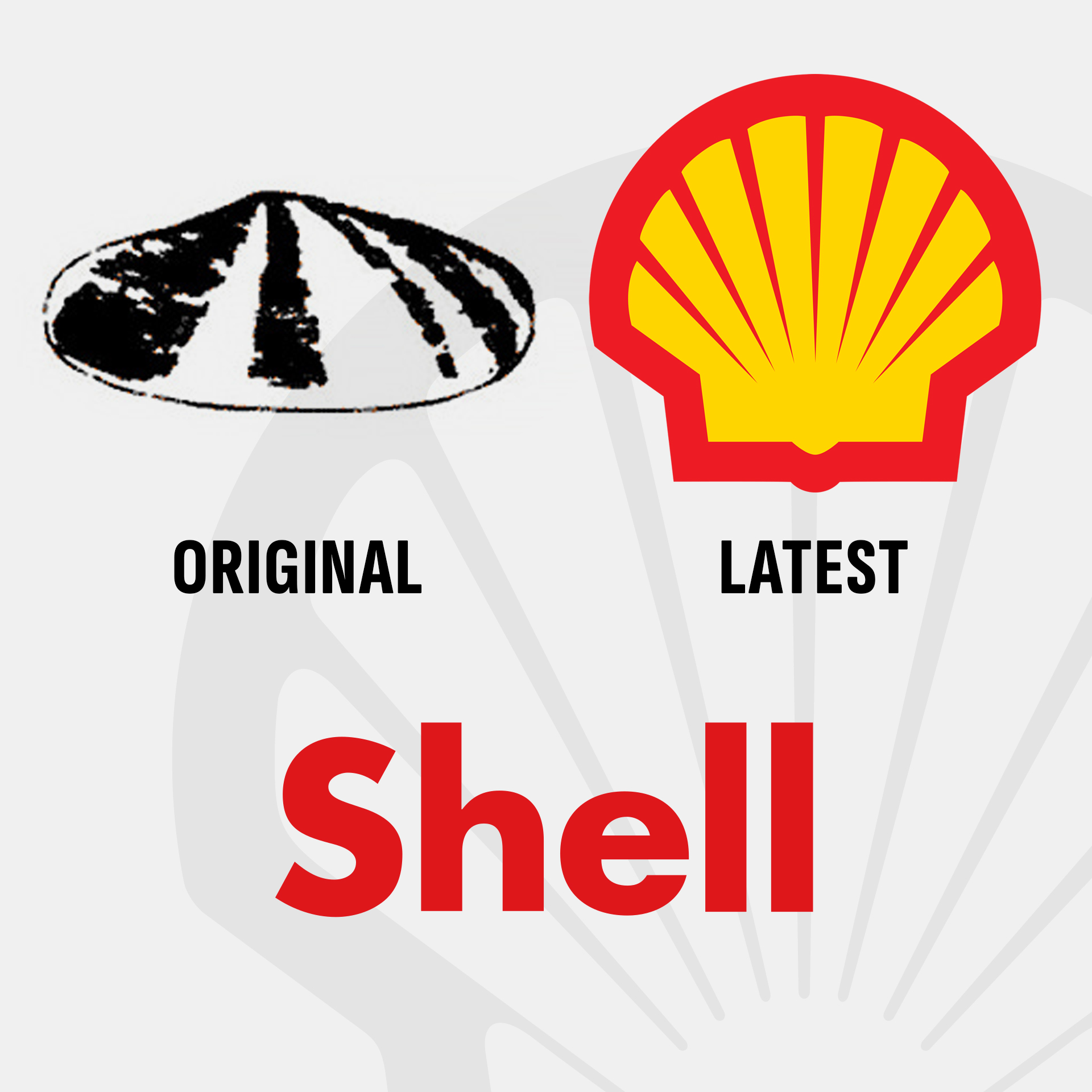
This is also where minimalist design took hold. Flat color, simple forms, and clear silhouettes perform better across different screen types and resolutions. Not only does it look modern, it’s readable in modern conditions. Typically, if it can work small, it is built to work in any condition. Shell’s original logo wasn’t too complex, but it had grit and detail that didn’t read well on a small scale. Over the years the icon has minimized its edges, smoothed out the kinks, and cleaned up its act.
Shell's original logo wasn't too complex, but it had grit and detail that didn't read well on a small scale. Over the years the icon has minimized its edges, smoothed out the kinks, and cleaned up its act.
There have been several studies that show complex iconography takes longer to register in the mind. Whether or not that's good or bad for the brand depends on the viewer. Some prefer a more modern style while others enjoy a traditional approach.
Different Strokes. Different Folks.
Clarity Vs. Complexity
There is also a psychological side to this. The brain processes simple visuals faster than complex ones. When a logo is overloaded with detail, it takes longer to understand and even longer to remember. Simpler marks reduce the noise and make recognition almost instantaneous.
This is not a new idea. Designers like Paul Rand were pushing for simplicity long before digital constraints made it necessary. Movements like Bauhaus and De Stijl were built around the same principle. Remove what is unnecessary, keep what communicates clearly. Technology just accelerated something designers already knew.
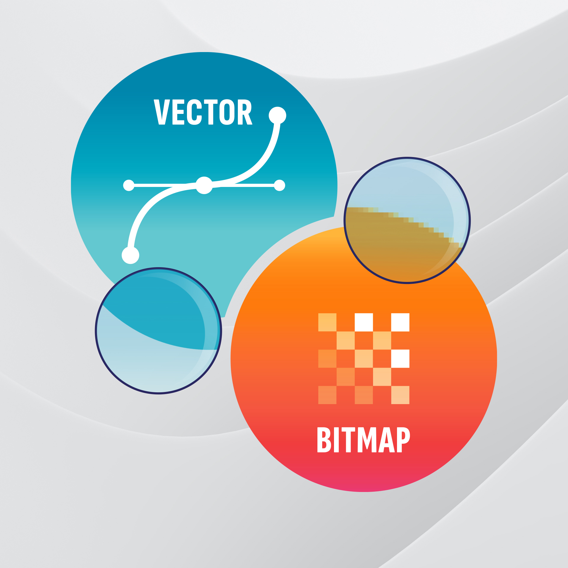
That said, simplicity is not a rule for everything. Logos and icons benefit from vector clarity because they need to be flexible. Supporting visuals often benefit from bitmap depth because they rely on texture, lighting, and detail. There are many situations in which vector art is the inferior choice. Trying to force everything into one format usually makes the work worse.
I’ve been asked to “vectorize a photo” before, so that it could be printed at high resolution with crisp details. It’s difficult to explain clearly why that’s an almost impossible ask. It was usually easier to show them what their photo would look like when “vectorized”. Unless the photo is an artsy silhouette, the final result won’t closely resemble the original.
Math-based art wasn't new, but access to a user-friendly tool to create it introduced a whole new generation of sleeker, sharper design. It's not the best kind of digital art for every scenario, but vector art comes with major perks that businesses find useful.
Technology Led To Simplicity
How Vector Software Changed The Game
One of the biggest turning points was the shift to vector-based design. Unlike bitmap images, which rely on a fixed grid of pixels on a screen, vector graphics are built from mathematical paths. That means they can scale to any size without losing clarity. A logo can go from a business card to a billboard without needing to be redrawn or adjusted. This type of artwork has been around well before computers, but it was behind a high skill threshold and not many had the meticulous nature to manually calculate directions and magnitudes.
The accessibility of vector design software changed how designers think. Instead of building something that works at one size, the goal became creating something that works at every size. That naturally favors simpler shapes, cleaner lines, and fewer details. Intricate textures and fine detail do not survive that kind of scaling very well, so they started disappearing from core brand marks.
It also made distribution easier. One file could now live everywhere, be it printed literature, websites, mobile apps, or large-scale signage. That pushed brands toward designs that could perform consistently across all those environments. Simplicity was an aesthetic choice, sure, but it also became a practical one.
Minimal logos are not just a trend. It’s been a process over several decades, the result of how design had to evolve. Technology made scaling easier. Screens made clarity more important. And human perception favors simplicity over detail when speed matters. The next time you see a logo redesign that feels almost too simple, there is a good chance it was designed that way on purpose. Not to remove personality, but to make sure it works everywhere as the company modernizes.
Shell's original logo wasn't too complex, but it had grit and detail that didn't read well on a small scale. Over the years the icon has minimized its edges, smoothed out the kinks, and cleaned up its act.
Name A Worse Duo
High Fidelity & Small Canvas
A major shift came from the introduction of screens. Not just computers, but phones, tablets, watches, and everything in between. Logos now need to function in environments where space is extremely limited. When something is reduced to a tiny icon, every unnecessary detail becomes a problem.
Think about an app grid. Dozens of logos competing at the same size. The ones that stand out are not the most detailed. They are the most recognizable at a glance. That pushes design toward bold shapes, strong contrast, and minimal elements. The goal is instant recognition. A visual punch to the face. Designed to be the loudest visual in a crowd of attention-grabbers.
This is also where minimalist design took hold. Flat color, simple forms, and clear silhouettes perform better across different screen types and resolutions. Not only does it look modern, it’s readable in modern conditions. Typically, if it can work small, it is built to work in any condition. Shell’s original logo wasn’t too complex, but it had grit and detail that didn’t read well on a small scale. Over the years the icon has minimized its edges, smoothed out the kinks, and cleaned up its act.
There have been several studies that show complex iconography takes longer to register in the mind. Whether or not that's good or bad for the brand depends on the viewer. Some prefer a more modern style while others enjoy a traditional approach.
Different Strokes. Different Folks.
Clarity Vs. Complexity
There is also a psychological side to this. The brain processes simple visuals faster than complex ones. When a logo is overloaded with detail, it takes longer to understand and even longer to remember. Simpler marks reduce the noise and make recognition almost instantaneous.
This is not a new idea. Designers like Paul Rand were pushing for simplicity long before digital constraints made it necessary. Movements like Bauhaus and De Stijl were built around the same principle. Remove what is unnecessary, keep what communicates clearly. Technology just accelerated something designers already knew.
That said, simplicity is not a rule for everything. Logos and icons benefit from vector clarity because they need to be flexible. Supporting visuals often benefit from bitmap depth because they rely on texture, lighting, and detail. There are many situations in which vector art is the inferior choice. Trying to force everything into one format usually makes the work worse.
I’ve been asked to “vectorize a photo” before, so that it could be printed at high resolution with crisp details. It’s difficult to explain clearly why that’s an almost impossible ask. It was usually easier to show them what their photo would look like when “vectorized”. Unless the photo is an artsy silhouette, the final result won’t closely resemble the original.
Math-based art wasn't new, but access to a user-friendly tool to create it introduced a whole new generation of sleeker, sharper design. It's not the best kind of digital art for every scenario, but vector art comes with major perks that businesses find useful.
Technology Led To Simplicity
How Vector Software Changed The Game
One of the biggest turning points was the shift to vector-based design. Unlike bitmap images, which rely on a fixed grid of pixels on a screen, vector graphics are built from mathematical paths. That means they can scale to any size without losing clarity. A logo can go from a business card to a billboard without needing to be redrawn or adjusted. This type of artwork has been around well before computers, but it was behind a high skill threshold and not many had the meticulous nature to manually calculate directions and magnitudes.
The accessibility of vector design software changed how designers think. Instead of building something that works at one size, the goal became creating something that works at every size. That naturally favors simpler shapes, cleaner lines, and fewer details. Intricate textures and fine detail do not survive that kind of scaling very well, so they started disappearing from core brand marks.
It also made distribution easier. One file could now live everywhere, be it printed literature, websites, mobile apps, or large-scale signage. That pushed brands toward designs that could perform consistently across all those environments. Simplicity was an aesthetic choice, sure, but it also became a practical one.
Minimal logos are not just a trend. It’s been a process over several decades, the result of how design had to evolve. Technology made scaling easier. Screens made clarity more important. And human perception favors simplicity over detail when speed matters. The next time you see a logo redesign that feels almost too simple, there is a good chance it was designed that way on purpose. Not to remove personality, but to make sure it works everywhere as the company modernizes.

Matthew A.
Owner of Predi Designs
Matthew began as an online content creator in his teenage years, crafting Flash animations and games for internet audiences and collaborating with other young creatives worldwide. He later graduated cum laude from Texas A&M University’s Visualization Program, where he honed his skills in design, animation, and interactive media. He has owned and operated Predi Designs since 2016.
A Subscription Just Makes Sense.
Predi Designs delivers unlimited high-quality graphic design for a flat monthly rate, making top-tier branding and marketing more affordable, flexible, and efficient than traditional agencies. Plus, without salaries, benefits, or equipment costs, it’s more cost-effective than hiring in-house. No hourly fees, no scope limits. Just fast, reliable design on demand. Scale smarter, save more, and streamline creativity with Predi Designs.
blog tags
related posts
 My workflow is heavily dependent on my collaborator, and every collaborator is different. Over time, you start to notice patterns. Not good or bad, just different ways people approach collaboration. Some styles lead to fast, effective results. Others take a little more navigation to get there. This is just part of the job. My role is not just to design, it is to adapt. Every client comes with their own habits, expectations, and communication style, and the better I understand that, the better the work tends to be. If anything, this is more of a field guide. If you see yourself in one of these, you will probably recognize how it affects the process. And if you are looking to get the most out of a subscription like Predi, some of these approaches will naturally get you there faster.
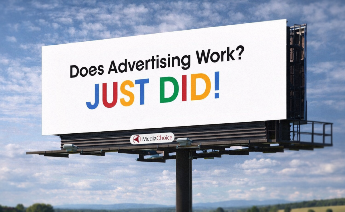 If you have driven anywhere over the past decade, you have probably seen this billboard. The one that says “Does Advertising Work? JUST DID!” It is everywhere, and more importantly, it sticks. You notice it, you remember it, and you might even bring it up later without realizing why. That alone puts it ahead of most billboards, which tend to disappear the second you pass them. What is interesting is how little it is actually doing. There is no product image, no long explanation, and no list of features. Just a question, an answer, and a phone number. That simplicity is doing a lot of work, and it is a good example of how strong ideas tend to carry more weight than layered design. Here is why it lands.
 Clients chose email, and the work moved faster when I listened. I once built a polished project system with boards, colors, and real time updates that solved my problems, not theirs. Ultimately, this is why Predi kept the project management organization in email, so clients can request work in the simplest way possible. If your team wants to communicate without yet another software and login, no worries! With Predi Designs, we solved the problem on our end so you don't have to.
