
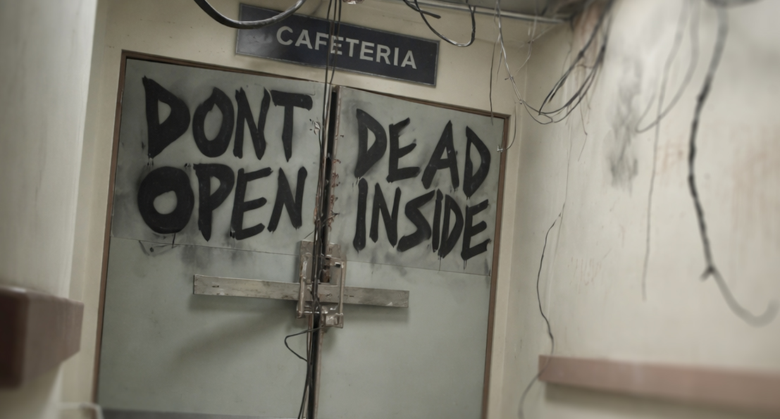
 Several people have seen the layout-troubled “Don’t Dead Open Inside” graffiti from The Walking Dead. Even if you have never watched the show, you have probably seen the meme at some point. It is one of those things that sticks because it feels so obviously wrong the second you read it. What makes it interesting is that the words themselves are not the problem. The message is clear when you finally reconfigure your mindset and wrap your head around it. The issue is the layout. The way the words are arranged causes your brain to read them in the wrong order, which turns a simple warning into something either confusing, offensive, or hilarious. That is what makes it such a useful example. It shows how quickly meaning can fall apart when visual structure does not match reading behavior.
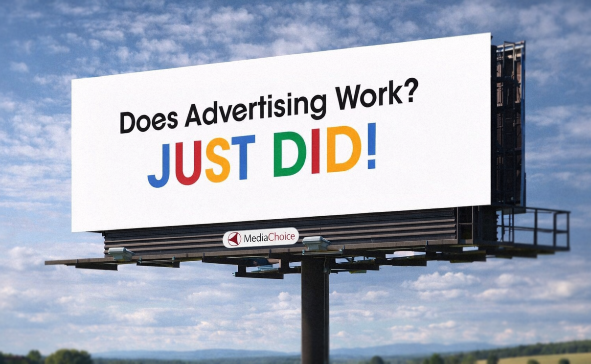 If you have driven anywhere over the past decade, you have probably seen this billboard. The one that says “Does Advertising Work? JUST DID!” It is everywhere, and more importantly, it sticks. You notice it, you remember it, and you might even bring it up later without realizing why. That alone puts it ahead of most billboards, which tend to disappear the second you pass them. What is interesting is how little it is actually doing. There is no product image, no long explanation, and no list of features. Just a question, an answer, and a phone number. That simplicity is doing a lot of work, and it is a good example of how strong ideas tend to carry more weight than layered design. Here is why it lands.
 Rebrands always get attention, but not always for the right reasons. People notice when something familiar changes, especially when that brand has been part of their routine for years. There is a level of emotional attachment that builds over time, even with something as simple as a restaurant logo or packaging design. At the same time, staying the same forever is not an option either. An outdated brand identity makes a company feel behind, even if the product itself is still strong. The challenge is deciding what should evolve and what should stay recognizable. That balance is where most rebrands succeed or fall apart.
Latest Blog Entry
 Artificial intelligence changed more than the tools. It changed how people look at creative work. A polished composite, a surreal product image, or a heavily manipulated photo now gets a different reaction than it would have a few years ago. People see something impressive and immediately wonder if it was generated, even when the work was created long before ChatGPT was publicly released in November 2022. OpenAI’s original ChatGPT announcement is a useful timestamp for how recent this shift really is.
© 2016 - 2026 • Predi Designs, LLC • All Rights Reserved • Privacy Policy