Why Text Layout Matters
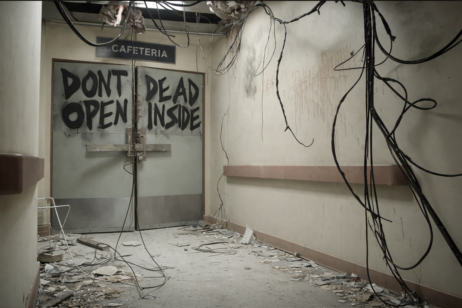
Most people have seen the “Don’t Dead Open Inside” graffiti from AMC’s The Walking Dead television series. Even if you have never watched the show, you have probably seen the meme at some point. It is one of those things that sticks because it feels so obviously wrong the second you read it.
What makes it interesting is that the words themselves are not the problem. Once reordered, the intended warning is perfectly clear. The confusion comes entirely from how the words are arranged, causing the brain to follow the wrong reading order. It is a useful example of how quickly meaning can break down when visual structure conflicts with normal reading behavior.
about
We’re a high-quality, all-inclusive graphic design subscription for brands and businesses.
English readers are trained to scan left to right first. The “Don’t Dead Open Inside” sign became a meme because the layout fights that natural reading flow instead of guiding it. It points to a real design problem that shows up constantly in signage, posters, packaging, and advertising.
Left To Right, Next Line
The Brain Follows Layout First
The Walking Dead sign is a classic case of a stacked two-column layout. The intended message is “Don’t open, dead inside,” but people read English left to right first, which turns it into “Don’t dead, open inside.” That happens because the eye follows alignment and grouping before it fully processes meaning.
The real issue is that layout creates instructions, whether the designer means to or not. When words are placed in columns, rows, blocks, or evenly spaced stacks, the reader treats those decisions as clues for what should be read together. A bad layout does not just make something look awkward, it gives the reader the wrong set of directions. That is why a message can be technically correct and still fail in practice. The words may all be there, but if the structure points the eye in the wrong order, the reader has to do extra work to rebuild the meaning.
This shows up all over the place. You will see posters that split phrases like “SAVE YOUR / TIME MONEY,” signs that accidentally connect words from separate thoughts, and advertisements where several possible reading paths compete with one another.
In each case, the problem started before anyone read the sentence. The design failed to establish which words belonged together.
This is not a unique issue. In fact, there has been a long-functioning reddit community dedicated to showcasing real life examples of this phenomenon since 2014. The subreddit name? r/dontdeadopeninside.
Word Order Isn't The Only Consideration
When Weight Creates Confusion
Even when the words appear in the correct order, the message can still go wrong.
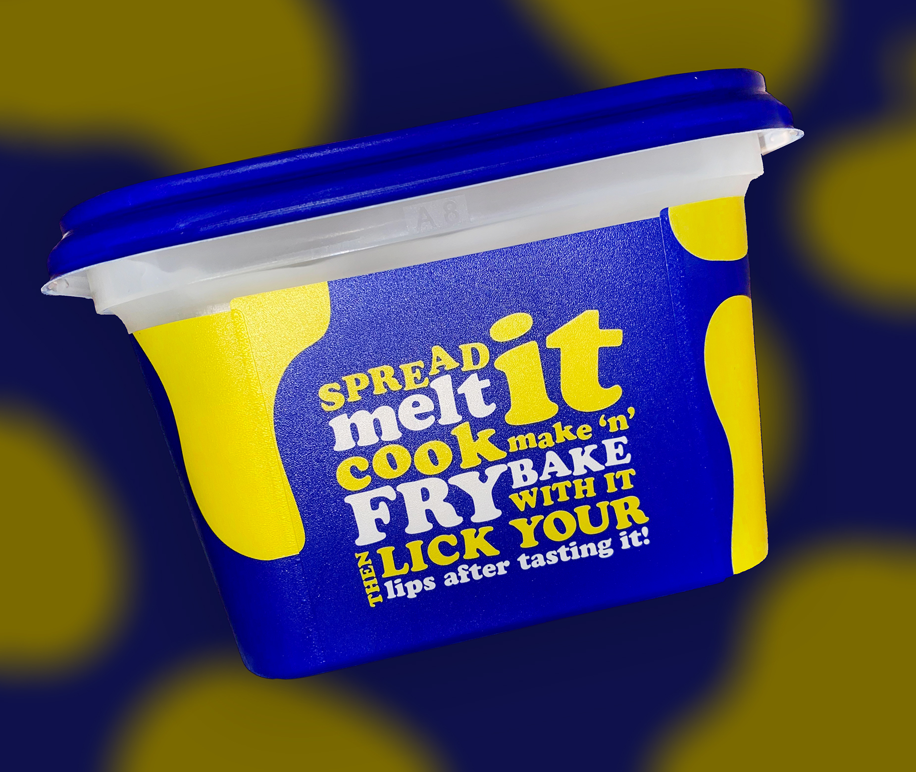
Font weight, size, color, and contrast determine which parts of a message feel most important. Readers do not give every word equal attention. Their eyes move toward whatever appears most dominant, which means hierarchy can change the impression of a sentence without changing its actual wording. That can be helpful when the emphasis supports the meaning.
It becomes a problem when the design highlights the wrong information or creates relationships between words that were never meant to be read together.
In this example, not only is word order a little wonky, the vast differences in font weight make your eyes jump around erratically instead of following a clear and decisive path.
Think of a sale sign that reads, “SALE ENDS SUNDAY EVERYTHING 50% OFF SELECT ITEMS ONLY.” The words may appear in the proper sequence, but the design can still make “EVERYTHING 50% OFF” dominate while “SELECT ITEMS ONLY” disappears into the background.
The problem is the impression created before the full sentence has been read. The design makes the broadest claim feel immediate and the qualification feel secondary, even though the qualification completely changes the offer.
You see the same thing in packaging, posters, menus, and event graphics. Product names get broken into awkward groupings, disclaimers blend into the main offer, and event details compete with the headline instead of supporting it.
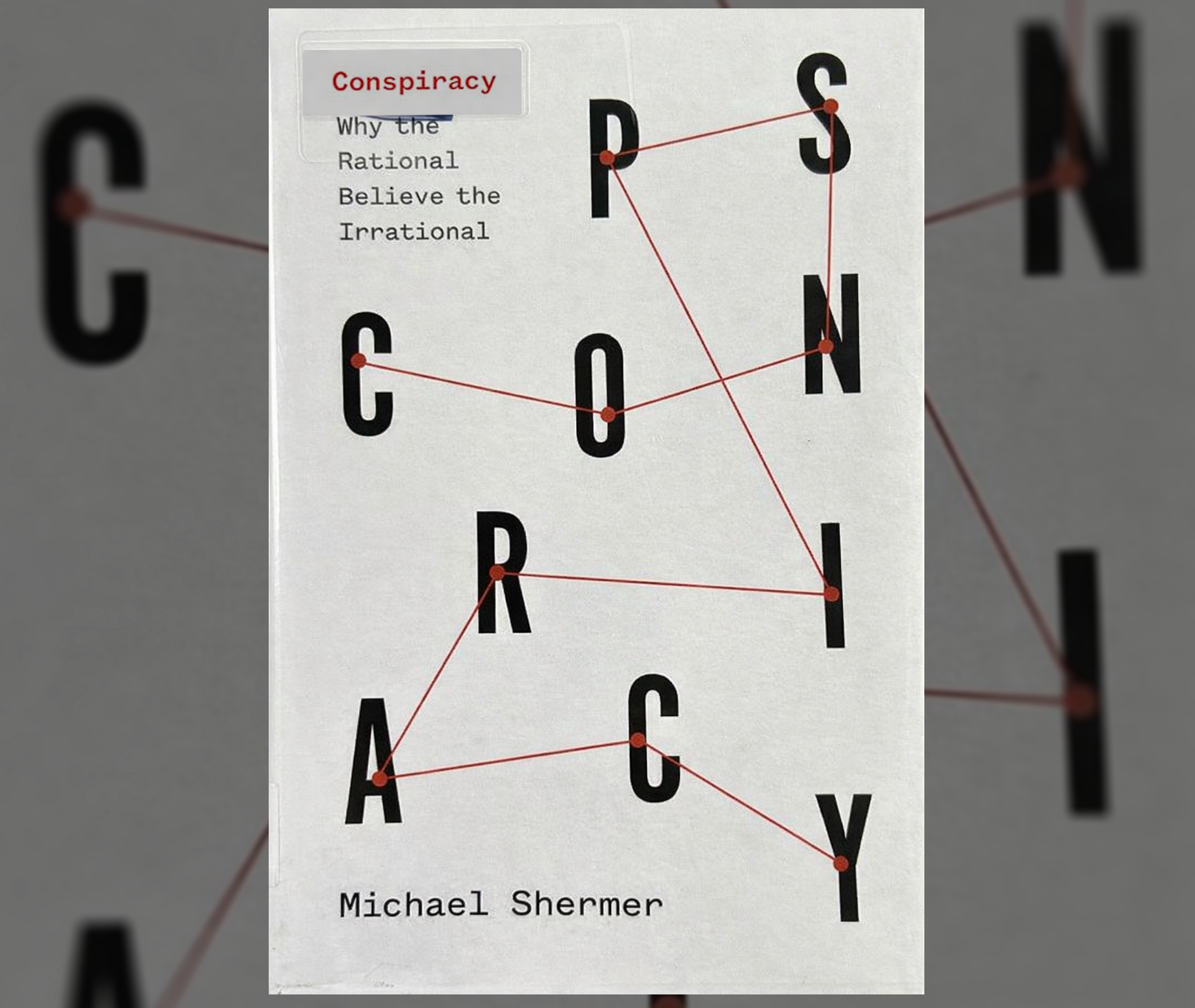
The cover turns the reader into an investigator before the story even begins, using disorder, tension, and discovery to make the title feel like evidence instead of decoration.
Sometimes the effort helps messages stick
Not All Confusion Is Bad
Here is where it gets more interesting. Confusion is not always a design failure. Sometimes a small moment of visual resistance makes the viewer spend more time with the piece, and that extra second of attention can make the idea more memorable. The key difference is whether the confusion feels intentional, rewarding, and connected to the message.
The cover of Michael Shermer’s book CONSPIRACY has the title written in scattered letters, with a pinned red string line connecting them in the correct order. It is a strong example of layout improving message retention. At first glance, the title may not read instantly. Your eyes have to follow the red thread, piece the letters together, and assemble the word. But that effort is the point. The act of reading the title mimics the act of following clues, connecting evidence, and building a theory. The layout does not just decorate the subject. It behaves like the subject.
That is when this sort of intentional slowdown becomes useful. The design halts you on purpose, but it gives you a payoff that reinforces the message. You are briefly challenged because the designer built the experience around the message. The viewer gets a small “wait, what?” followed by “oh, I get it,” and that shift can be far more memorable than a perfectly mundane title treatment.
But that only works when people have the time and willingness to engage with it. A book cover, poster, album cover, or editorial spread can ask for a little interpretation because the audience is more likely to stop and look. A safety sign, menu, website button, billboard, form, or product label usually cannot. In those cases, the viewer is not there to solve a clever visual puzzle. They need the information to land immediately.
The difference is simple. If the pause leads to curiosity and resolution, it can help retention. If the pause leads to hesitation, it weakens the message. Good design knows when to make the viewer think and when to get out of the way.
So the question is not, “Is this confusing?” The better question is, “Does the confusion create meaning, or does it get in the way of it?”
English readers are trained to scan left to right first. The “Don’t Dead Open Inside” sign became a meme because the layout fights that natural reading flow instead of guiding it. It points to a real design problem that shows up constantly in signage, posters, packaging, and advertising.
Left To Right, Next Line
The Brain Follows Layout First
The Walking Dead sign is a classic case of a stacked two-column layout. The intended message is “Don’t open, dead inside,” but people read English left to right first, which turns it into “Don’t dead, open inside.” That happens because the eye follows alignment and grouping before it fully processes meaning.
The real issue is that layout creates instructions, whether the designer means to or not. When words are placed in columns, rows, blocks, or evenly spaced stacks, the reader treats those decisions as clues for what should be read together. A bad layout does not just make something look awkward, it gives the reader the wrong set of directions. That is why a message can be technically correct and still fail in practice. The words may all be there, but if the structure points the eye in the wrong order, the reader has to do extra work to rebuild the meaning.
This shows up all over the place. You will see posters that split phrases like “SAVE YOUR / TIME MONEY,” signs that accidentally connect words from separate thoughts, and advertisements where several possible reading paths compete with one another.
In each case, the problem started before anyone read the sentence. The design failed to establish which words belonged together.
This is not a unique issue. In fact, there has been a long-functioning reddit community dedicated to showcasing real life examples of this phenomenon since 2014. The subreddit name? r/dontdeadopeninside.
In this example, not only is word order a little wonky, the vast differences in font weight make your eyes jump around erratically instead of following a clear and decisive path.
Word Order Isn't The Only Consideration
When Weight Creates Confusion
Even when the words appear in the correct order, the message can still go wrong.
Font weight, size, color, and contrast determine which parts of a message feel most important. Readers do not give every word equal attention. Their eyes move toward whatever appears most dominant, which means hierarchy can change the impression of a sentence without changing its actual wording. That can be helpful when the emphasis supports the meaning.
It becomes a problem when the design highlights the wrong information or creates relationships between words that were never meant to be read together.
Think of a sale sign that reads, “SALE ENDS SUNDAY EVERYTHING 50% OFF SELECT ITEMS ONLY.” The words may appear in the proper sequence, but the design can still make “EVERYTHING 50% OFF” dominate while “SELECT ITEMS ONLY” disappears into the background.
The problem is the impression created before the full sentence has been read. The design makes the broadest claim feel immediate and the qualification feel secondary, even though the qualification completely changes the offer.
You see the same thing in packaging, posters, menus, and event graphics. Product names get broken into awkward groupings, disclaimers blend into the main offer, and event details compete with the headline instead of supporting it.
The cover turns the reader into an investigator before the story even begins, using disorder, tension, and discovery to make the title feel like evidence instead of decoration.
Sometimes the effort helps messages stick
Not All Confusion Is Bad
Here is where it gets more interesting. Confusion is not always a design failure. Sometimes a small moment of visual resistance makes the viewer spend more time with the piece, and that extra second of attention can make the idea more memorable. The key difference is whether the confusion feels intentional, rewarding, and connected to the message.
The cover of Michael Shermer’s book CONSPIRACY has the title written in scattered letters, with a pinned red string line connecting them in the correct order. It is a strong example of layout improving message retention. At first glance, the title may not read instantly. Your eyes have to follow the red thread, piece the letters together, and assemble the word. But that effort is the point. The act of reading the title mimics the act of following clues, connecting evidence, and building a theory. The layout does not just decorate the subject. It behaves like the subject.
That is when this sort of intentional slowdown becomes useful. The design halts you on purpose, but it gives you a payoff that reinforces the message. You are briefly challenged because the designer built the experience around the message. The viewer gets a small “wait, what?” followed by “oh, I get it,” and that shift can be far more memorable than a perfectly mundane title treatment.
But that only works when people have the time and willingness to engage with it. A book cover, poster, album cover, or editorial spread can ask for a little interpretation because the audience is more likely to stop and look. A safety sign, menu, website button, billboard, form, or product label usually cannot. In those cases, the viewer is not there to solve a clever visual puzzle. They need the information to land immediately.
The difference is simple. If the pause leads to curiosity and resolution, it can help retention. If the pause leads to hesitation, it weakens the message. Good design knows when to make the viewer think and when to get out of the way.
So the question is not, “Is this confusing?” The better question is, “Does the confusion create meaning, or does it get in the way of it?”
Matthew A.
Owner of Predi Designs
Matthew began as an online content creator in his teenage years, crafting Flash animations and games for internet audiences and collaborating with other young creatives worldwide. He later graduated cum laude from Texas A&M University’s Visualization Program, where he honed his skills in design, animation, and interactive media. He has owned and operated Predi Designs since 2016.
A Subscription Just Makes Sense.
Predi Designs delivers unlimited high-quality graphic design for a flat monthly rate, making top-tier branding and marketing more affordable, flexible, and efficient than traditional agencies. Plus, without salaries, benefits, or equipment costs, it’s more cost-effective than hiring in-house. No hourly fees, no scope limits. Just fast, reliable design on demand. Scale smarter, save more, and streamline creativity with Predi Designs.
blog tags
related posts
 Artificial intelligence is one of those technologies I cannot afford to ignore as a business owner. ChatGPT and Claude have already changed how people write, brainstorm, organize information, and generate visuals. ChatGPT launched publicly in November 2022, and the creative industry has been adjusting ever since. That creates an obvious question for Predi Designs. Should we use AI? The honest answer is yes, carefully. Ignoring the tool completely would be stubborn. Relying on it too heavily would be irresponsible. The goal is to understand where it helps, where it creates problems, and where a human designer still needs to be the one making the final call.
 When people talk about branding, they usually point to the most visible piece. The ad, the logo, the booth, the hero graphic. That is the part everyone sees first, so it gets most of the credit. What matters more is what happens beyond those visuals. The structure that keeps everything consistent across dozens of touchpoints, over time, without falling apart. The companies that get this right are not relying on one standout moment. They are building something repeatable. Something that works whether you are looking at a website, opening a shrink-wrapped box, or walking past a booth. That level of consistency rarely comes from one person or one team working in isolation. It is usually a couple of marketing teams with their external partners working together toward the same system. That collaboration is what allows the brand to scale without losing itself.
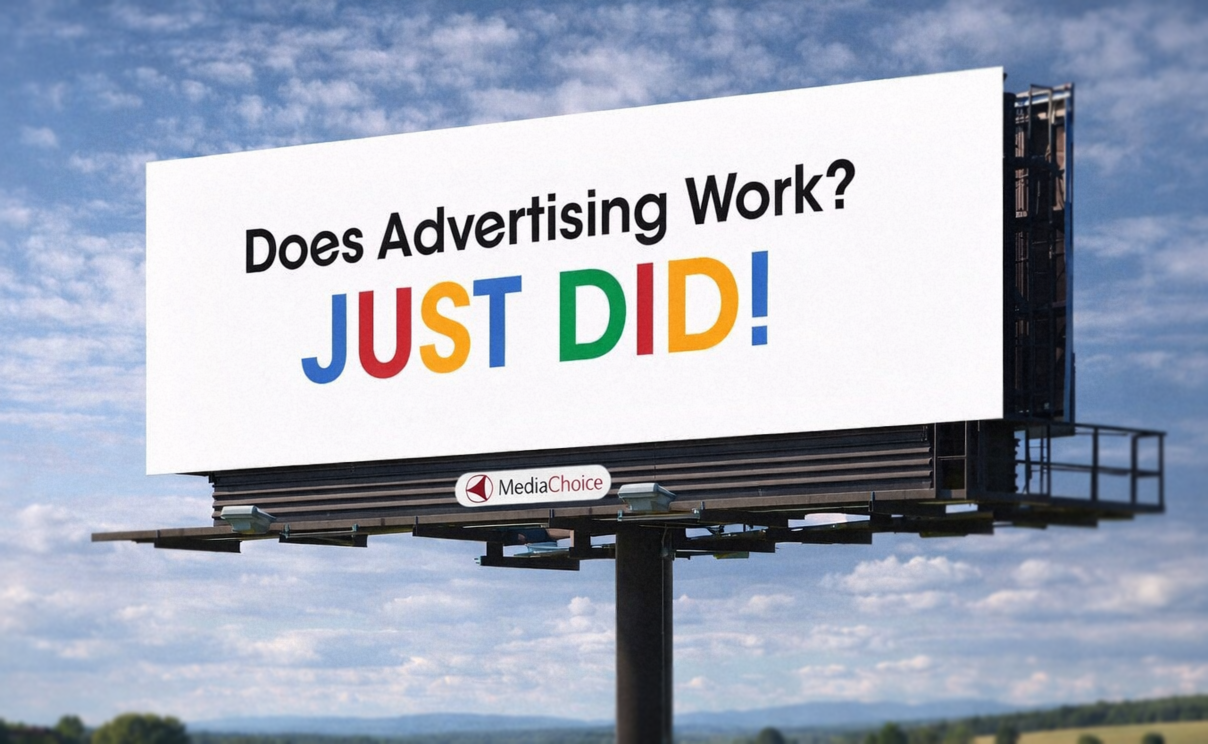 If you have driven anywhere over the past decade, you have probably seen this billboard. The one that says “Does Advertising Work? JUST DID!” It is everywhere, and more importantly, it sticks. You notice it, you remember it, and you might even bring it up later without realizing why. That alone puts it ahead of most billboards, which tend to disappear the second you pass them. What is interesting is how little it is actually doing. There is no product image, no long explanation, and no list of features. Just a question, an answer, and a phone number. That simplicity is doing a lot of work, and it is a good example of how strong ideas tend to carry more weight than layered design. Here is why it lands.