The Power of Restraint
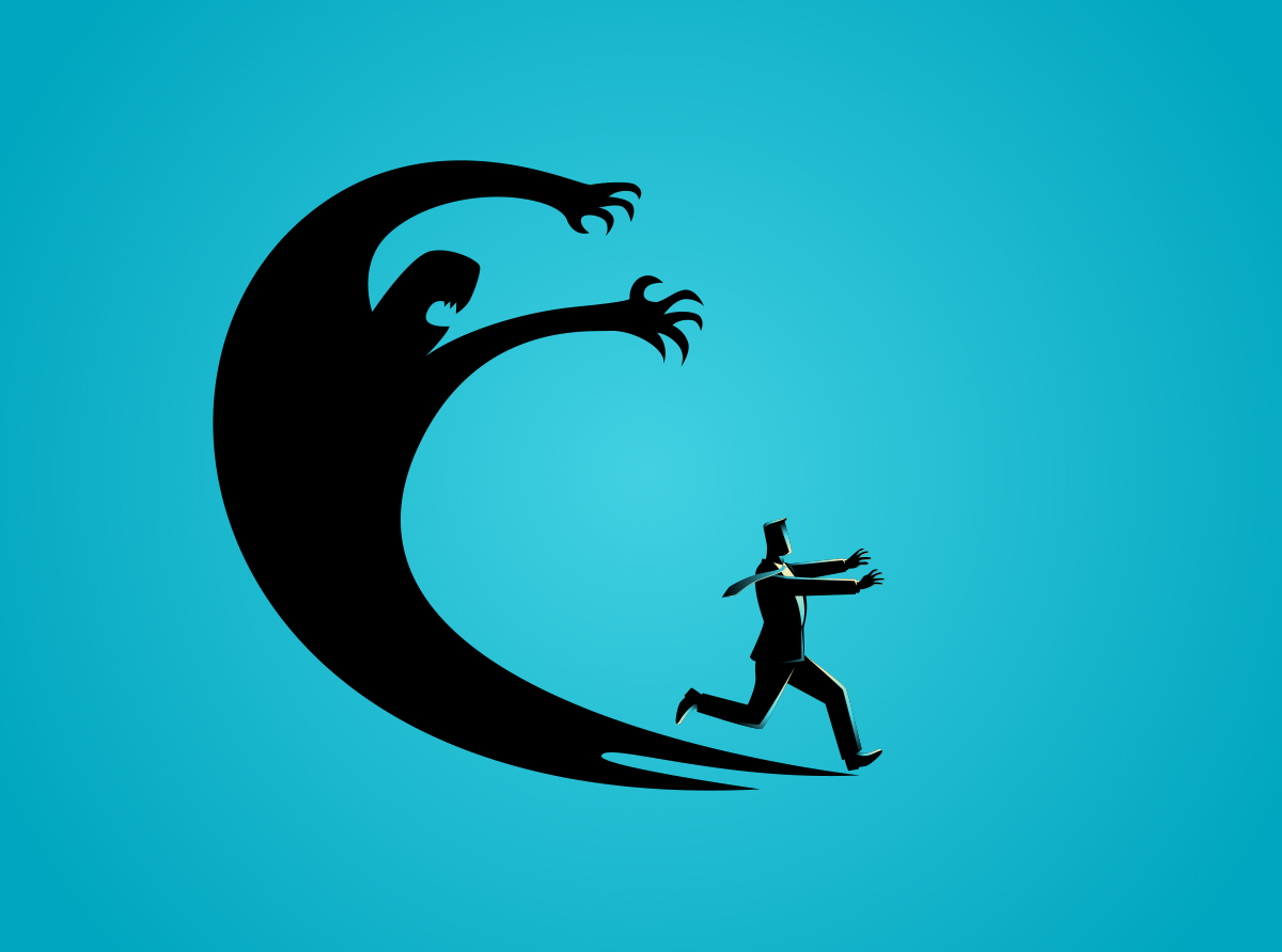
Minimalism looks simple from the outside, which is why it is so often misunderstood. It asks the designer to make fewer choices and then make each choice count, which is a harder task than filling a page with decoration. Why does “minimal” work require more intent, more listening, and more discipline? Why does the best minimalist piece feel like the inevitable conclusion when you see it for the first time? If your brand leans clean and direct, or if your team is wrestling with cluttered assets, consider this my guide to doing less in a way that communicates more.
about
We’re a high-quality, all-inclusive graphic design subscription for brands and businesses.
"I was still learning that a design could potentially be most effective when the designer's instincts get out of the way."
When subtraction beats sparkle
The Billboard That Changed My Perspective
Over a decade ago I designed a billboard with almost no direction beyond one request, make the message the star. My instinct was to add a small amount of energy, a few textures, a hint of depth, and enough visual framing to catch eyes on a busy highway. With every revision the client removed an element of what I felt made this billboard interesting. First the texture went away, then the accents, then the framing. What remained was a flat brand blue background with large white type set as large as possible.
They loved it. “We love this design! Thank you!” I did not expect that reaction. My first thought was, “What design?” I was still learning that a design could potentially be most effective when the designer’s instincts get out of the way. That board did not feel like a design to me at first, it felt like the absence of design. What it really was, a clear decision about hierarchy, color, and type size that honored the brief. The lesson stayed with me. When a message is the hero, the environment should not compete for attention, it should support the words and get out of the lane.
Precision, not absence
What Minimalism Really Demands
Despite what people think, minimalism is not about doing less work, it is about doing the right work. Each element must earn a place on the page and then carry real weight once it is there. That level of intent asks for strong hierarchy, confident typography, and a clear idea of what the audience needs to see first. It also asks for courage, because removing comfort elements can feel risky in the moment. The reward is a message that lands faster and sticks longer.
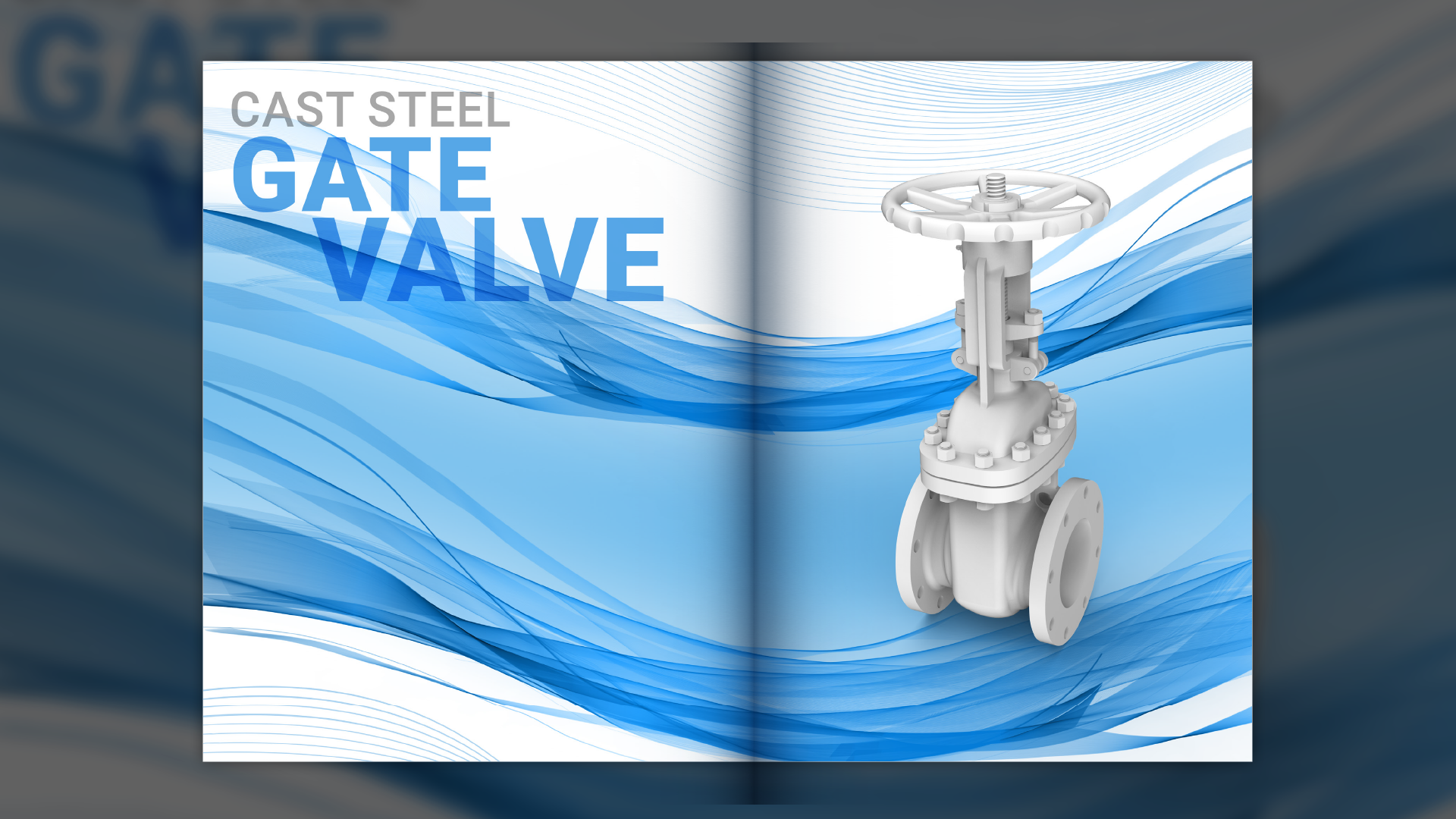
This document spread could carry a wall of data. Instead, it carries focus using scale, contrast, and space to introduce the section and prepare the reader for the product features and specifications ahead.
A minimalist piece is a series of specific choices, type scale that sets the voice, line lengths that protect readability, spacing that creates rhythm, and color that guides attention without shouting. Negative space is not empty, it is the scaffold that holds the idea up. If you want a thoughtful primer on why fewer cues can improve comprehension, Nielsen Norman Group’s work on visual simplicity for web design is useful reading, see NN/g on visual minimalism. In practice, the test is simple. Remove an element and ask, does the meaning change or the reading experience degrade. If the answer is no, the element was decoration, not communication.
Complex ideas, distilled into icons with minimal copy to preserve both clarity and white space. Using consistent iconography with short supporting blurbs reduces cognitive load. The result is a calmer page rhythm, stronger emphasis on key messages, and visuals that guide attention to what matters most.
Let the message breathe
Designing With Space And Silence
Space is a tool that many teams under-use because it does not announce itself the way graphics do. White space creates rest stops for the eye, which makes dense information feel approachable. In presentations and long-form documents it can be the difference between skimming and understanding. When you give content room, you create a rhythm, headline, pause, point, pause, that helps readers stay oriented. This rhythm is one reason minimalist layouts feel calm even when the content is important.
Start with a grid that respects margins and line length, then set a typographic scale that makes differences obvious at a glance. Use one primary type family and one weight for body copy to avoid visual noise, then let contrast come from size and spacing. Bring color in sparingly to mark actions and data points. In production work, this approach pays off, assets localize more easily, content adapts to new channels, and last minute changes are less risky because there are fewer dependent parts. If you want to see how this philosophy shows up in real projects, the portfolio includes examples where space does the heavy lifting.
Clarity that moves decisions
How Clients Benefit From Less
Minimalist work helps busy teams decide faster because the signal reaches them without extra interpretation. It reduces feedback time in reviews/edits, it clarifies what approval actually means, and it keeps brand assets consistent across many hands. It also respects budgets and timelines because there are fewer pieces to adjust when scope changes. For subscription clients, this matters, the work ships regularly and needs to be reliable, readable, and easy to expand.
On the practical side, minimalist systems scale well. A campaign can move from a slide to a one sheet to a landing page with fewer design compromises, and the message stays consistent because the core elements do not shift. Collaborators who are not design fluent can still feel the intent, which speeds sign off. If you want to understand how we structure the process behind that outcome, the overview on How It Works explains the subscription model that keeps the focus on results rather than rounds. To hear how this plays out from the client’s side of the table, the testimonials capture that experience in their words. Minimalism is not a style choice for its own sake, it is a delivery choice that respects attention and time.
"I was still learning that a design could potentially be most effective when the designer's instincts get out of the way."
When subtraction beats sparkle
The Billboard That Changed My Perspective
Over a decade ago I designed a billboard with almost no direction beyond one request, make the message the star. My instinct was to add a small amount of energy, a few textures, a hint of depth, and enough visual framing to catch eyes on a busy highway. With every revision the client removed an element of what I felt made this billboard interesting. First the texture went away, then the accents, then the framing. What remained was a flat brand blue background with large white type set as large as possible.
They loved it. “We love this design! Thank you!” I did not expect that reaction. My first thought was, “What design?” I was still learning that a design could potentially be most effective when the designer’s instincts get out of the way. That board did not feel like a design to me at first, it felt like the absence of design. What it really was, a clear decision about hierarchy, color, and type size that honored the brief. The lesson stayed with me. When a message is the hero, the environment should not compete for attention, it should support the words and get out of the lane.
This document spread could carry a wall of data. Instead, it carries focus using scale, contrast, and space to introduce the section and prepare the reader for the product features and specifications ahead.
Precision, not absence
What Minimalism Really Demands
Despite what people think, minimalism is not about doing less work, it is about doing the right work. Each element must earn a place on the page and then carry real weight once it is there. That level of intent asks for strong hierarchy, confident typography, and a clear idea of what the audience needs to see first. It also asks for courage, because removing comfort elements can feel risky in the moment. The reward is a message that lands faster and sticks longer.
A minimalist piece is a series of specific choices, type scale that sets the voice, line lengths that protect readability, spacing that creates rhythm, and color that guides attention without shouting. Negative space is not empty, it is the scaffold that holds the idea up. If you want a thoughtful primer on why fewer cues can improve comprehension, Nielsen Norman Group’s work on visual simplicity for web design is useful reading, see NN/g on visual minimalism. In practice, the test is simple. Remove an element and ask, does the meaning change or the reading experience degrade. If the answer is no, the element was decoration, not communication.
Complex ideas, distilled into icons with minimal copy to preserve both clarity and white space. Using consistent iconography with short supporting blurbs reduces cognitive load. The result is a calmer page rhythm, stronger emphasis on key messages, and visuals that guide attention to what matters most.
Let the message breathe
Designing With Space And Silence
Space is a tool that many teams under-use because it does not announce itself the way graphics do. White space creates rest stops for the eye, which makes dense information feel approachable. In presentations and long-form documents it can be the difference between skimming and understanding. When you give content room, you create a rhythm, headline, pause, point, pause, that helps readers stay oriented. This rhythm is one reason minimalist layouts feel calm even when the content is important.
Start with a grid that respects margins and line length, then set a typographic scale that makes differences obvious at a glance. Use one primary type family and one weight for body copy to avoid visual noise, then let contrast come from size and spacing. Bring color in sparingly to mark actions and data points. In production work, this approach pays off, assets localize more easily, content adapts to new channels, and last minute changes are less risky because there are fewer dependent parts. If you want to see how this philosophy shows up in real projects, the portfolio includes examples where space does the heavy lifting.
Clarity that moves decisions
How Clients Benefit From Less
Minimalist work helps busy teams decide faster because the signal reaches them without extra interpretation. It reduces feedback time in reviews/edits, it clarifies what approval actually means, and it keeps brand assets consistent across many hands. It also respects budgets and timelines because there are fewer pieces to adjust when scope changes. For subscription clients, this matters, the work ships regularly and needs to be reliable, readable, and easy to expand.
On the practical side, minimalist systems scale well. A campaign can move from a slide to a one sheet to a landing page with fewer design compromises, and the message stays consistent because the core elements do not shift. Collaborators who are not design fluent can still feel the intent, which speeds sign off. If you want to understand how we structure the process behind that outcome, the overview on How It Works explains the subscription model that keeps the focus on results rather than rounds. To hear how this plays out from the client’s side of the table, the testimonials capture that experience in their words. Minimalism is not a style choice for its own sake, it is a delivery choice that respects attention and time.

Matthew A.
Owner of Predi Designs
Matthew began as an online content creator in his teenage years, crafting Flash animations and games for internet audiences and collaborating with other young creatives worldwide. He later graduated cum laude from Texas A&M University’s Visualization Program, where he honed his skills in design, animation, and interactive media. He has owned and operated Predi Designs since 2016.
A Subscription Just Makes Sense.
Predi Designs delivers unlimited high-quality graphic design for a flat monthly rate, making top-tier branding and marketing more affordable, flexible, and efficient than traditional agencies. Plus, without salaries, benefits, or equipment costs, it’s more cost-effective than hiring in-house. No hourly fees, no scope limits. Just fast, reliable design on demand. Scale smarter, save more, and streamline creativity with Predi Designs.
blog tags
related posts
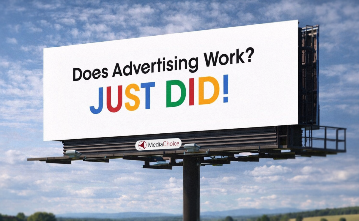 If you have driven anywhere over the past decade, you have probably seen this billboard. The one that says “Does Advertising Work? JUST DID!” It is everywhere, and more importantly, it sticks. You notice it, you remember it, and you might even bring it up later without realizing why. That alone puts it ahead of most billboards, which tend to disappear the second you pass them. What is interesting is how little it is actually doing. There is no product image, no long explanation, and no list of features. Just a question, an answer, and a phone number. That simplicity is doing a lot of work, and it is a good example of how strong ideas tend to carry more weight than layered design. Here is why it lands.
