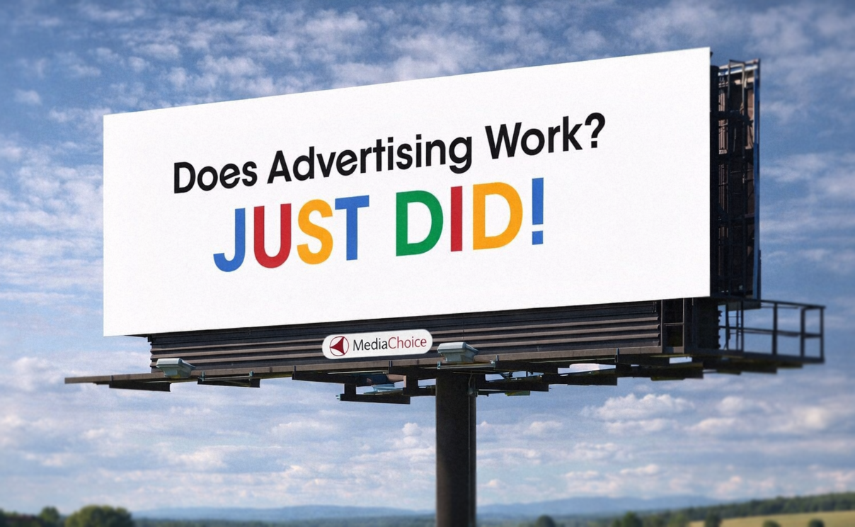
Why This Billboard Works On Everyone
If you have driven anywhere over the past decade, you have probably seen this billboard. The one that says “Does Advertising Work? JUST DID!” It is everywhere, and more importantly, it sticks. You notice it, you remember it, and you might even bring it up later without realizing why. That alone puts it ahead of most billboards, which tend to disappear the second you pass them.
What is interesting is how little it is actually doing. There is no product image, no long explanation, and no list of features. Just a question, an answer, and some form of contact. That simplicity is doing a lot of work, and it is a good example of how strong ideas tend to carry more weight than layered design. Here is why it lands.
about
We’re a high-quality, all-inclusive graphic design subscription for brands and businesses.
A quick interaction, not just a statement
It Pulls You In And Pays It Off
“Does Advertising Work?” creates a small pause that your brain wants to resolve. Even at highway speed, that question is easy to process and naturally pulls your attention in because it feels familiar and open-ended. It sets up a moment where you expect an answer, even if you are only looking at it for a second or two.
“JUST DID!” The setup and payoff happen almost at the same time, which makes the billboard feel active instead of passive. This forces you to complete the idea yourself as you move past it, and that small interaction makes it far more memorable. You can’t argue with it.
Well played, billboard. You got us.
Everyone has fallen for these highway-side billboards at least once. They are simple and effective. This post breaks down why.
You. Complete. Me.
The Idea Proves Itself
Most ads make a claim and expect you to believe it. This one demonstrates the claim while you are looking at it. The fact that you noticed the billboard, read the message, and remembered it becomes the proof that the statement is true, which makes the concept feel more convincing without needing any supporting explanation. The product being sold is the billboard itself, furthering the ingenuity of it all.
That alignment between the idea and the execution is what makes it feel clever without trying too hard. The billboard is not explaining why advertising works, it is showing you in real time. That kind of self-contained concept tends to stick because it removes the gap between what is being said and what is being experienced.
Love it or hate it, this billboard is the equivalent of playing “The Game.” The second you read it, you are already in it, and by the time your brain catches up, you have lost in the most entertaining way possible. That is what makes it so effective. Like The Game, the trick is not in forcing participation, it is in making you aware of something that instantly changes your relationship to it. Now you are thinking about advertising working, which means the advertising is working, which means you got got. There is something annoyingly brilliant about that. It turns your own attention into the punchline and makes the viewer part of the mechanism. You complete the billboard. That little moment of realization, whether it makes you laugh or roll your eyes, is exactly the point.
Fast, clear, and readable at speed
It Respects How Billboards Work
Billboards are not meant to be studied, they are meant to be understood almost instantly. This one respects that constraint by limiting the amount of information to only what is necessary. A question, an answer, and a phone number. That is all your brain needs to process in a few seconds while driving.
Adding more content would slow it down and reduce its effectiveness. Extra words, additional visuals, or competing elements would make it harder to read at speed. The restraint here is what makes it work, and it highlights a common issue in outdoor design where too much information is treated as better, when in reality it muddies the message.
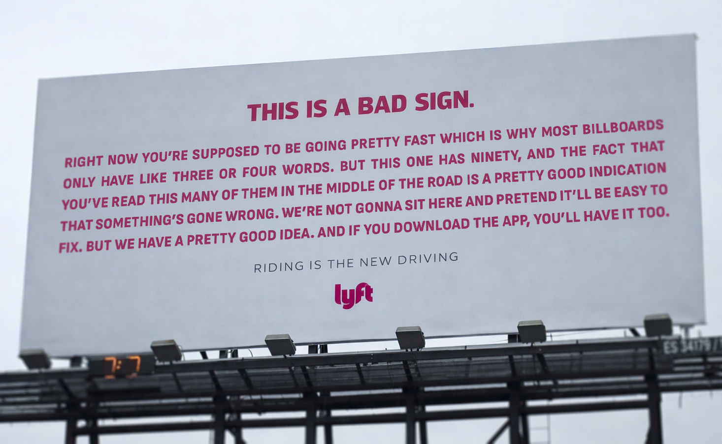
Lyft confidently broke all the rules to craft this clever billboard which is designed purposely poorly to encourage Lyft's services be used in order to fully absorb the information without sacrificing safety.
Nothing is competing for attention
The Execution Feels Confident
The layout guides your eye without effort. Left to right, top to bottom. Classic and simple. That reading order happens naturally because the hierarchy is clear and intentional, which removes any need for the viewer to figure out where to look. Confidence in design is powerful. Even poorly designed billboards can be confident when done in clever ways.
A few examples come to mind. Lyft created one of the worst billboards on purpose in order to highlight their services. Too many words, small font, but the purpose was clever and confident enough to work for passengers in the car rather than the driver, who is then left out of the joke. Another good example would be the viral Microsoft Paint Billboard for hiring a graphic designer.
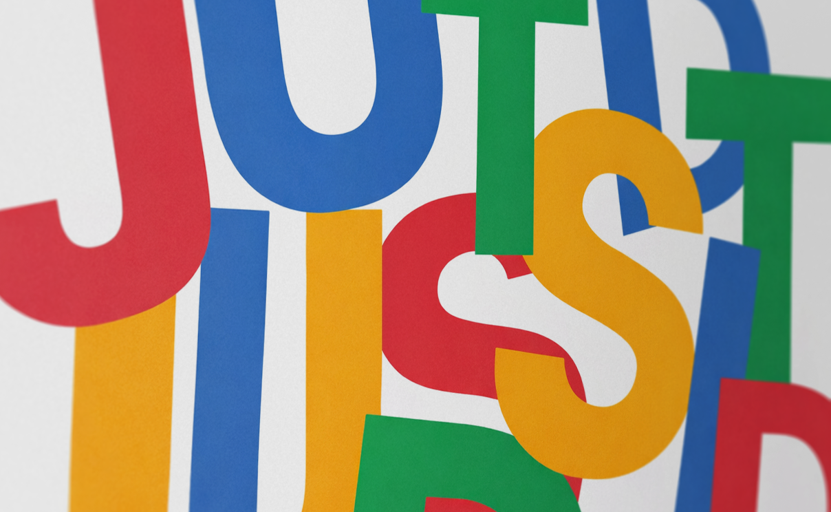
For the original billboard, color is used sparingly, which makes the punchline feel louder. Most of the board stays simple with black text on white, while “JUST DID!” uses bright color to stand out as the focal point. There is also restraint in the messaging itself, with no extra explanation or supporting claims. The idea stands on its own, and that level of confidence makes it more memorable.
Everyone has fallen for these highway-side billboards at least once. They are simple and effective. This post breaks down why.
A quick interaction, not just a statement
It Pulls You In And Pays It Off
“Does Advertising Work?” creates a small pause that your brain wants to resolve. Even at highway speed, that question is easy to process and naturally pulls your attention in because it feels familiar and open-ended. It sets up a moment where you expect an answer, even if you are only looking at it for a second or two.
“JUST DID!” The setup and payoff happen almost at the same time, which makes the billboard feel active instead of passive. This forces you to complete the idea yourself as you move past it, and that small interaction makes it far more memorable. You can’t argue with it.
Well played, billboard. You got us.
You. Complete. Me.
The Idea Proves Itself
Most ads make a claim and expect you to believe it. This one demonstrates the claim while you are looking at it. The fact that you noticed the billboard, read the message, and remembered it becomes the proof that the statement is true, which makes the concept feel more convincing without needing any supporting explanation. The product being sold is the billboard itself, furthering the ingenuity of it all.
That alignment between the idea and the execution is what makes it feel clever without trying too hard. The billboard is not explaining why advertising works, it is showing you in real time. That kind of self-contained concept tends to stick because it removes the gap between what is being said and what is being experienced.
Love it or hate it, this billboard is the equivalent of playing “The Game.” The second you read it, you are already in it, and by the time your brain catches up, you have lost in the most entertaining way possible. That is what makes it so effective. Like The Game, the trick is not in forcing participation, it is in making you aware of something that instantly changes your relationship to it. Now you are thinking about advertising working, which means the advertising is working, which means you got got. There is something annoyingly brilliant about that. It turns your own attention into the punchline and makes the viewer part of the mechanism. You complete the billboard. That little moment of realization, whether it makes you laugh or roll your eyes, is exactly the point.
Fast, clear, and readable at speed
It Respects How Billboards Work
Billboards are not meant to be studied, they are meant to be understood almost instantly. This one respects that constraint by limiting the amount of information to only what is necessary. A question, an answer, and a phone number. That is all your brain needs to process in a few seconds while driving.
Adding more content would slow it down and reduce its effectiveness. Extra words, additional visuals, or competing elements would make it harder to read at speed. The restraint here is what makes it work, and it highlights a common issue in outdoor design where too much information is treated as better, when in reality it muddies the message.
Lyft confidently broke all the rules to craft this clever billboard which is designed purposely poorly to encourage Lyft's services be used in order to fully absorb the information without sacrificing safety.
Nothing is competing for attention
The Execution Feels Confident
The layout guides your eye without effort. Left to right, top to bottom. Classic and simple. That reading order happens naturally because the hierarchy is clear and intentional, which removes any need for the viewer to figure out where to look. Confidence in design is powerful. Even poorly designed billboards can be confident when done in clever ways.
A few examples come to mind. Lyft created one of the worst billboards on purpose in order to highlight their services. Too many words, small font, but the purpose was clever and confident enough to work for passengers in the car rather than the driver, who is then left out of the joke. Another good example would be the viral Microsoft Paint Billboard for hiring a graphic designer.
For the original billboard, color is used sparingly, which makes the punchline feel louder. Most of the board stays simple with black text on white, while “JUST DID!” uses bright color to stand out as the focal point. There is also restraint in the messaging itself, with no extra explanation or supporting claims. The idea stands on its own, and that level of confidence makes it more memorable.

Matthew A.
Owner of Predi Designs
Matthew began as an online content creator in his teenage years, crafting Flash animations and games for internet audiences and collaborating with other young creatives worldwide. He later graduated cum laude from Texas A&M University’s Visualization Program, where he honed his skills in design, animation, and interactive media. He has owned and operated Predi Designs since 2016.
A Subscription Just Makes Sense.
Predi Designs delivers unlimited high-quality graphic design for a flat monthly rate, making top-tier branding and marketing more affordable, flexible, and efficient than traditional agencies. Plus, without salaries, benefits, or equipment costs, it’s more cost-effective than hiring in-house. No hourly fees, no scope limits. Just fast, reliable design on demand. Scale smarter, save more, and streamline creativity with Predi Designs.
blog tags
related posts
 Minimalism looks simple from the outside, which is why it is so often misunderstood. It asks the designer to make fewer choices and then make each choice count, which is a harder task than filling a page with decoration. Why does "minimal" work require more intent, more listening, and more discipline? Why does the best minimalist piece feel like the inevitable conclusion when you see it for the first time? If your brand leans clean and direct, or if your team is wrestling with cluttered assets, consider this my guide to doing less in a way that communicates more.
 My workflow is heavily dependent on my collaborator, and every collaborator is different. Over time, you start to notice patterns. Not good or bad, just different ways people approach collaboration. Some styles lead to fast, effective results. Others take a little more navigation to get there. This is just part of the job. My role is not just to design, it is to adapt. Every client comes with their own habits, expectations, and communication style, and the better I understand that, the better the work tends to be. If anything, this is more of a field guide. If you see yourself in one of these, you will probably recognize how it affects the process. And if you are looking to get the most out of a subscription like Predi, some of these approaches will naturally get you there faster.
 Before we even touch sketches, fonts, or clever symbolism, it helps to admit one simple thing, logo work messes with people’s heads. It’s one of the few creative tasks where taste, ego, fear, and pride all show up to the meeting at the same time. Everyone wants a result that feels obvious, but the route to “obvious” is usually a pile of awkward drafts, second guesses, and sudden strong opinions from someone who has never cared about design until now. That emotional mix is why the process can feel slower, louder, and strangely personal compared to other projects. If you’ve ever wondered why a tiny graphic can spark a full-on committee debate, welcome, this is that part of the ride.
