Designing Logos Can Be a Pain
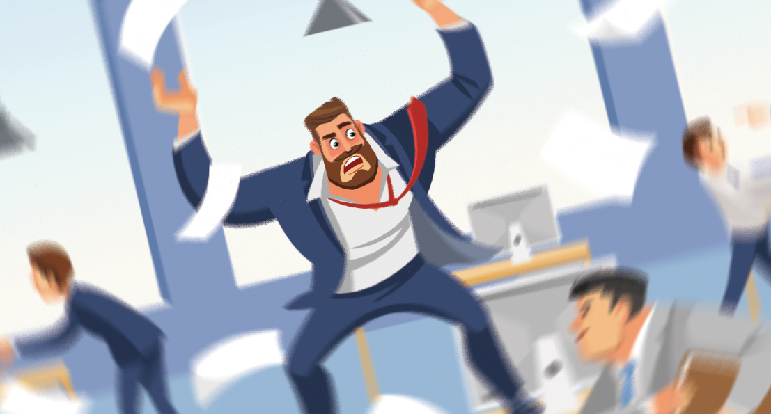
Before we even touch sketches, fonts, or clever symbolism, it helps to admit one simple thing, logo work messes with people’s heads. It’s one of the few creative tasks where taste, ego, fear, and pride all show up to the meeting at the same time. Everyone wants a result that feels obvious, but the route to “obvious” is usually a pile of awkward drafts, second guesses, and sudden strong opinions from someone who has never cared about design until now. That emotional mix is why the process can feel slower, louder, and strangely personal compared to other projects. If you’ve ever wondered why a tiny graphic can spark a full-on committee debate, welcome, this is that part of the ride.
about
We’re a high-quality, all-inclusive graphic design subscription for brands and businesses.
With great power comes great responsibility
Icons Are Powerful
A lot of people underestimate how difficult it is to design a company logo from nothing. A logo is not just another deliverable, it quietly becomes the north star for everything else that follows. It’s a high-pressure project. Colors, typography, website layout, marketing tone, even how confident a brand feels in public, all of it traces back to that first mark. Clients understand this on a deeper level than they realize, which is why logo projects tend to receive more scrutiny than anything else. Suddenly, everyone becomes more opinionated, more cautious, and far harder to please.
An icon is like a north star for your brand. Done properly, it should express clearly what the "vibe" is and ideally what your business can do for the customer.
That reaction makes sense. This is the visual identity that will represent a business for years. It is expensive to change later on down the road and it is difficult to ignore once it is public. So people obsess over it. They should. The challenge is that many clients place enormous importance on the logo before they have figured out what the logo is actually supposed to represent.
All of these companies have built brand recognition that has stood the tests of time, simply by designing an effective logo and sticking by it for decades, modernizing them over time.
More than a feeling
Why Logos Get So Much Attention
A logo is rarely just about aesthetics. It sets the direction for an entire brand. Once a logo is approved, it dictates color palettes, font families, layout styles, illustration approaches, animation language, and more. It becomes the reference point for every future design decision. That weight is why logo projects feel different. Clients may be more relaxed about social graphics or brochures, but logos trigger a different mindset entirely.
From the designer’s side, this means the logo is the least forgiving place to guess. Removing the guesswork requires a company story, a clear vision or purpose. Otherwise the designer is forced to work blind, throwing darts in the dark. That process is inefficient and exhausting for both of us, and we’ll likely not hit the bullseye. You can generate concepts endlessly, but without direction, none of them truly land. It becomes less about refining any good ideas and more about hoping something accidentally “feels right.”
A logo reflects the brand, it does not create one. If the brand does not exist yet, the logo has nothing solid to stand on.
When Feedback Is Just “More”
Swinging Blind
One early client experience taught me this lesson very clearly. They wanted two things, a logo and a website. The problem was that the website could not reasonably begin until the logo was finalized. A website is guided by choices decided in the brand building process, logo included. The logo would help define what font we should use for headers, what primary and secondary colors will be used throughout the site, should we have sharp edges or soft ones, etc.
They did not have much of a business plan or story to work from. They had no examples of brands they liked. They didn’t seem to understand that a business is more than just a government application and a bank account.
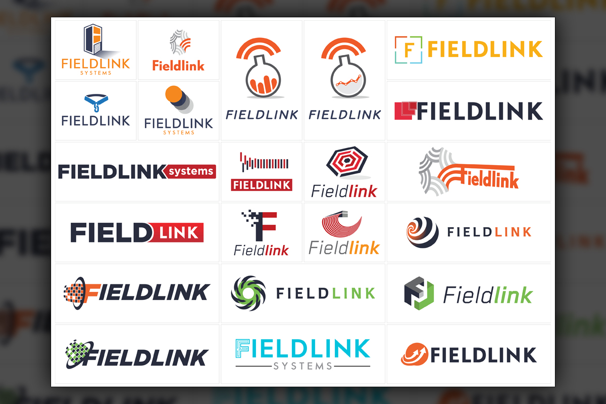
An early Predi Designs experience with logo design revolved around only receiving the response, "More?" After 100 logo designs with minimal feedback, the results grew uninspired and somewhat random.
I sent so many rounds of concepts and asked simple questions like, “Which of these directions feels right? What stands out? What feels wrong?” The only response I received was positive, but empty. “That’s great, do you have more?” No guidance, no preferences, no reactions beyond encouragement.
So I made more. Then more. Then more again. Weeks went by. Hundreds of concepts. Still no meaningful feedback. The work became less inspired, not because of lack of effort, but because there was nothing to refine. Every concept existed in isolation. I was not shaping something, I was swinging a bat around with my eyes closed, hoping to hit a homerun.
This experience taught me something important about the subscription model. It works best when the client acts like a collaborator instead of a judge. The quantity of requests is never the bottleneck. Direction is. Volume I can handle, but “more” without guidance leads us down a road that never ends.
Talk about your business. Please! Sell me on it.
What Helps? You!
Logo projects are usually the first major task for new subscriptions, especially when a company is undergoing a full branding overhaul. That makes sense. Everything else depends on it. These files will be used for the remainder of our working relationship. They will influence every website, presentation, brochure, social post, and animation that follows.
That is why meaningful collaboration matters so much at this stage. Doodles help. Reference logos help. Examples of what you like and what you hate help even more. A rough description of your audience, your values, or even what you want your brand to feel like helps tremendously. None of this needs to be perfect or polished. It just needs to exist.
Clients are right to care deeply about their logos. They should. The designer’s job is to translate that importance into something real. But that only works when both sides participate in shaping the target. The more substance a client brings to the table, the faster and better the outcome becomes.
For a broader look at why brand identity is so tightly linked to business strategy, the team at Interbrand publishes solid insights on how identity systems impact long term brand value.
After all the scrutiny, debate, and careful refinement, the identity is no longer an internal discussion, it becomes a signal to customers that the company is confident, consistent, and ready to be recognized.
Why These Projects Feel Different
Heavy Is The Icon
Logos feel harder than other design projects because they are. They sit at the foundation of a brand and quietly influence everything that follows. They carry emotional weight, financial implications, and long term consequences. That combination makes people cautious, opinionated, and sometimes overwhelmed.
I sympathize with that completely. The logo deserves attention. It deserves debate and care. But it also deserves collaboration, so when clients treat the logo as a shared problem to solve rather than a slot machine for infinite options, the process goes smoother and is far more rewarding for everyone involved.
An icon is like a north star for your brand. Done properly, it should express clearly what the "vibe" is and ideally what your business can do for the customer.
With great power comes great responsibility
Icons Are Powerful
A lot of people underestimate how difficult it is to design a company logo from nothing. A logo is not just another deliverable, it quietly becomes the north star for everything else that follows. It’s a high-pressure project. Colors, typography, website layout, marketing tone, even how confident a brand feels in public, all of it traces back to that first mark. Clients understand this on a deeper level than they realize, which is why logo projects tend to receive more scrutiny than anything else. Suddenly, everyone becomes more opinionated, more cautious, and far harder to please.
That reaction makes sense. This is the visual identity that will represent a business for years. It is expensive to change later on down the road and it is difficult to ignore once it is public. So people obsess over it. They should. The challenge is that many clients place enormous importance on the logo before they have figured out what the logo is actually supposed to represent.
All of these companies have built brand recognition that has stood the tests of time, simply by designing an effective logo and sticking by it for decades, modernizing them over time.
More than a feeling
Why Logos Get So Much Attention
A logo is rarely just about aesthetics. It sets the direction for an entire brand. Once a logo is approved, it dictates color palettes, font families, layout styles, illustration approaches, animation language, and more. It becomes the reference point for every future design decision. That weight is why logo projects feel different. Clients may be more relaxed about social graphics or brochures, but logos trigger a different mindset entirely.
From the designer’s side, this means the logo is the least forgiving place to guess. Removing the guesswork requires a company story, a clear vision or purpose. Otherwise the designer is forced to work blind, throwing darts in the dark. That process is inefficient and exhausting for both of us, and we’ll likely not hit the bullseye. You can generate concepts endlessly, but without direction, none of them truly land. It becomes less about refining any good ideas and more about hoping something accidentally “feels right.”
A logo reflects the brand, it does not create one. If the brand does not exist yet, the logo has nothing solid to stand on.
An early Predi Designs experience with logo design revolved around only receiving the response, "More?" After 100 logo designs with minimal feedback, the results grew uninspired and somewhat random.
When Feedback Is Just “More”
Swinging Blind
One early client experience taught me this lesson very clearly. They wanted two things, a logo and a website. The problem was that the website could not reasonably begin until the logo was finalized. A website is guided by choices decided in the brand building process, logo included. The logo would help define what font we should use for headers, what primary and secondary colors will be used throughout the site, should we have sharp edges or soft ones, etc.
They did not have much of a business plan or story to work from. They had no examples of brands they liked. They didn’t seem to understand that a business is more than just a government application and a bank account.
I sent so many rounds of concepts and asked simple questions like, “Which of these directions feels right? What stands out? What feels wrong?” The only response I received was positive, but empty. “That’s great, do you have more?” No guidance, no preferences, no reactions beyond encouragement.
So I made more. Then more. Then more again. Weeks went by. Hundreds of concepts. Still no meaningful feedback. The work became less inspired, not because of lack of effort, but because there was nothing to refine. Every concept existed in isolation. I was not shaping something, I was swinging a bat around with my eyes closed, hoping to hit a homerun.
This experience taught me something important about the subscription model. It works best when the client acts like a collaborator instead of a judge. The quantity of requests is never the bottleneck. Direction is. Volume I can handle, but “more” without guidance leads us down a road that never ends.
Talk about your business. Please! Sell me on it.
What Helps? You!
Logo projects are usually the first major task for new subscriptions, especially when a company is undergoing a full branding overhaul. That makes sense. Everything else depends on it. These files will be used for the remainder of our working relationship. They will influence every website, presentation, brochure, social post, and animation that follows.
That is why meaningful collaboration matters so much at this stage. Doodles help. Reference logos help. Examples of what you like and what you hate help even more. A rough description of your audience, your values, or even what you want your brand to feel like helps tremendously. None of this needs to be perfect or polished. It just needs to exist.
Clients are right to care deeply about their logos. They should. The designer’s job is to translate that importance into something real. But that only works when both sides participate in shaping the target. The more substance a client brings to the table, the faster and better the outcome becomes.
For a broader look at why brand identity is so tightly linked to business strategy, the team at Interbrand publishes solid insights on how identity systems impact long term brand value.
After all the scrutiny, debate, and careful refinement, the identity is no longer an internal discussion, it becomes a signal to customers that the company is confident, consistent, and ready to be recognized.
Why These Projects Feel Different
Heavy Is The Icon
Logos feel harder than other design projects because they are. They sit at the foundation of a brand and quietly influence everything that follows. They carry emotional weight, financial implications, and long term consequences. That combination makes people cautious, opinionated, and sometimes overwhelmed.
I sympathize with that completely. The logo deserves attention. It deserves debate and care. But it also deserves collaboration, so when clients treat the logo as a shared problem to solve rather than a slot machine for infinite options, the process goes smoother and is far more rewarding for everyone involved.

Matthew A.
Owner of Predi Designs
Matthew began as an online content creator in his teenage years, crafting Flash animations and games for internet audiences and collaborating with other young creatives worldwide. He later graduated cum laude from Texas A&M University’s Visualization Program, where he honed his skills in design, animation, and interactive media. He has owned and operated Predi Designs since 2016.
A Subscription Just Makes Sense.
Predi Designs delivers unlimited high-quality graphic design for a flat monthly rate, making top-tier branding and marketing more affordable, flexible, and efficient than traditional agencies. Plus, without salaries, benefits, or equipment costs, it’s more cost-effective than hiring in-house. No hourly fees, no scope limits. Just fast, reliable design on demand. Scale smarter, save more, and streamline creativity with Predi Designs.
blog tags
related posts
 Predi Designs was born from a realization: traditional employment often punishes efficiency. From childhood creativity in digital sandboxes to handling branding for multiple companies at once, the journey to entrepreneurship was anything but linear. After witnessing the limitations of corporate structure where being "too fast" led to busywork, Predi Designs was founded as a subscription-based design service that rewards productivity and provides financial security.
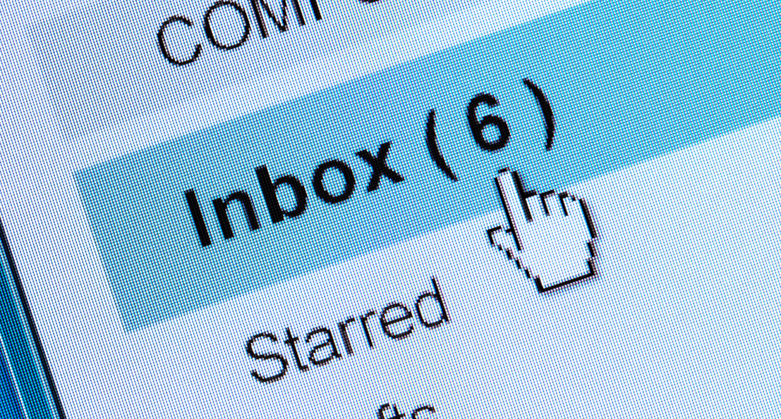 Clients chose email, and the work moved faster when I listened. I once built a polished project system with boards, colors, and real time updates that solved my problems, not theirs. Ultimately, this is why Predi kept the project management organization in email, so clients can request work in the simplest way possible. If your team wants to communicate without yet another software and login, no worries! With Predi Designs, we solved the problem on our end so you don't have to.
 One belief has guided how I work for years, long before Predi Designs ever existed. Rarely is a marketing project truly urgent enough to ruin a weekend. Marketing matters, but it is not life or death. If a project cannot survive even the shortest of turnaround times, something upstream has already gone very wrong. Over time, that belief became more than a personal preference. It shaped how I structure client relationships, how I set boundaries, and how Predi Designs operates as a subscription partner. I have seen what happens when teams live in constant emergency mode, and it is not sustainable. It burns out good people and produces rushed work that rarely performs well, and has the potential to hurt the brand with overlooked mistakes and rash decisions. The goal has never been to work less. The goal has always been to work better. That philosophy shows up in every subscription we run.