What Strong Branding Looks Like
When people talk about branding, they usually point to the most visible piece. The ad, the logo, the booth, the hero graphic. That is the part everyone sees first, so it gets most of the credit. What matters more is what happens beyond those visuals. The structure that keeps everything consistent across dozens of touchpoints, over time, without falling apart. The companies that get this right aren’t just relying on one standout moment. They are building something repeatable over time that, almost subliminally, slips into your consciousness. Something that works whether you are looking at a website, opening a shrink-wrapped box, or simply walking past a booth and catching a quick glimpse.
That level of consistency rarely comes from one person or one team working in isolation. It is usually a couple of marketing teams with their external partners working together toward the same system. That collaboration is what allows the brand to scale without losing itself. DEWALT has one of those systems.
about

We’re a high-quality, all-inclusive graphic design subscription for brands and businesses.
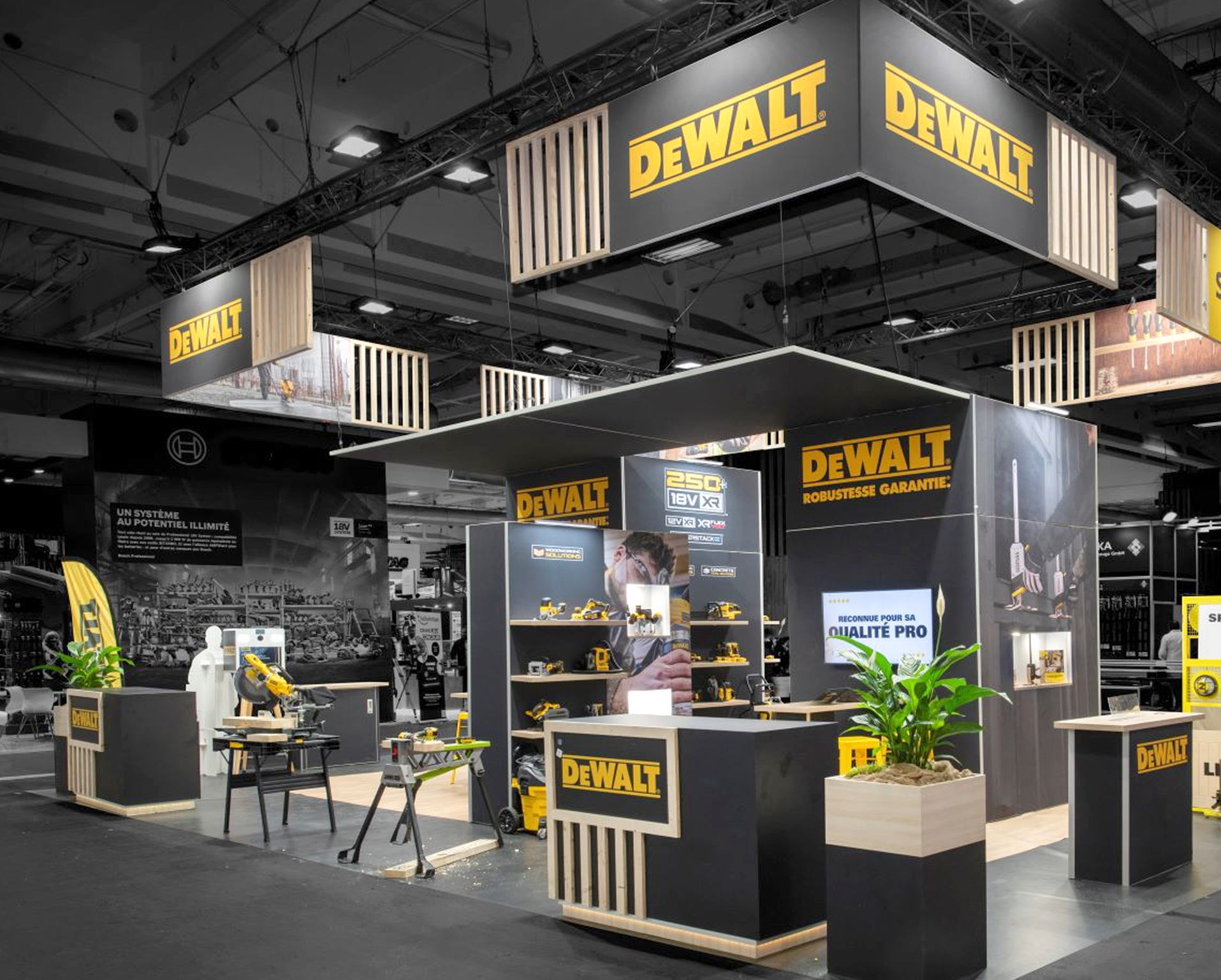
DEWALT’s trade show presence shows how the brand system can shift proportions while still staying instantly recognizable across every medium.
Consistent. See?
DEWALT As A System, Not A Style
DEWALT is a strong example of this kind of system thinking. The brand is recognizable before you even see the logo clearly. The black and yellow color palette, the physical design language, even the way products are grouped and presented all work together to create instant recognition.
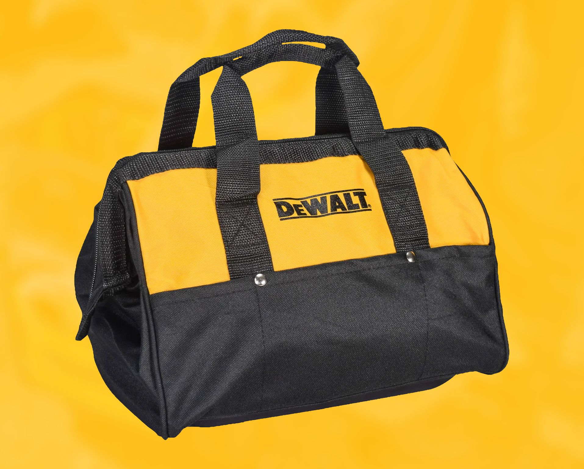
What stands out is how consistent that experience feels across different contexts. The website is structured around clear product families, all of which feature the specific #febd17 safety yellow that the company is known for. Even product packaging follows the same visual language, which the product design reinforces. You know if you are getting DEWALT, you are getting something quality. It feels like one continuous system instead of a series of disconnected decisions.
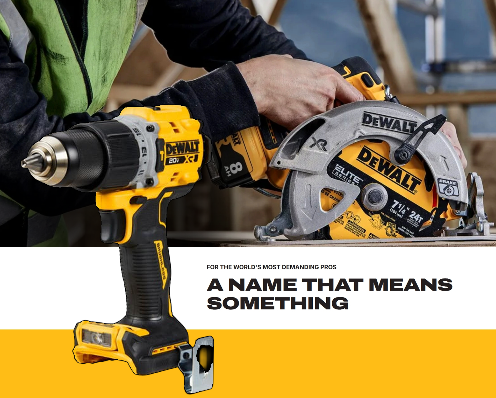
That kind of consistency matters because DEWALT is not selling one isolated product at a time. It is selling confidence in their entire catalog. It’s almost like an ecosystem. A drill, battery, charger, storage box, saw, and accessory all feel like they belong to the same larger world. I think about it like a Marvel Cinematic Universe for construction tools and supplies. For a customer, that reduces the hesitation before buying. For the brand, it builds recognition through repetition without needing to shout. The more places the system shows up, the more familiar and dependable it feels.
“I see it everywhere. Every site I go to uses it. I recognize it instantly. It MUST be good.”
If every DEWALT product category used a different color scheme, the likelihood of that thought process occurring diminishes significantly.
Uh-Huh, You Know What It Is
Black and Yellow, Black and Yellow.
DEWALT’s black and yellow color system is one of the biggest reasons the brand is so recognizable. While it may not be as colorful, it’s an effective form of “peacocking” in environments that are typically masculine. Yellow is loud, visible, and hard to ignore, especially in the kinds of places where DEWALT tools are usually seen. On job sites, in garages, inside trucks, on retail shelves, and across crowded trade show floors, that specific yellow gives the brand an immediate visual advantage. It is not just bright for the sake of being bright. It borrows from the same visual logic as safety signage, where color is used to grab attention fast and leave no confusion about what you are seeing. In a world of gray concrete, black tires, brown dust, and steel, DEWALT flags you down.
The black matters just as much. It gives the yellow contrast, weight, and durability. Yellow by itself could feel too bright or lightweight, but paired with black, it feels tougher and more industrial. It also works well in messy environments where tools are handled, dropped, stored, and used around dirt, dust, concrete, lumber, oil, and metal.
DEWALT has a specific color scheme that's recognizable instantly because it's been consistently used across all of their products and marketing for decades. Those colors fits the safety-focused job construction environment it has been calling home for over a century.
That color choice is not just a style preference. It has practical value. A DEWALT tool is easier to spot in a pile of equipment, easier to identify from a distance, and easier to recognize even when the logo is partially covered or the product is worn down. The colors become a shortcut for the brand itself, which is exactly what strong visual branding should do.
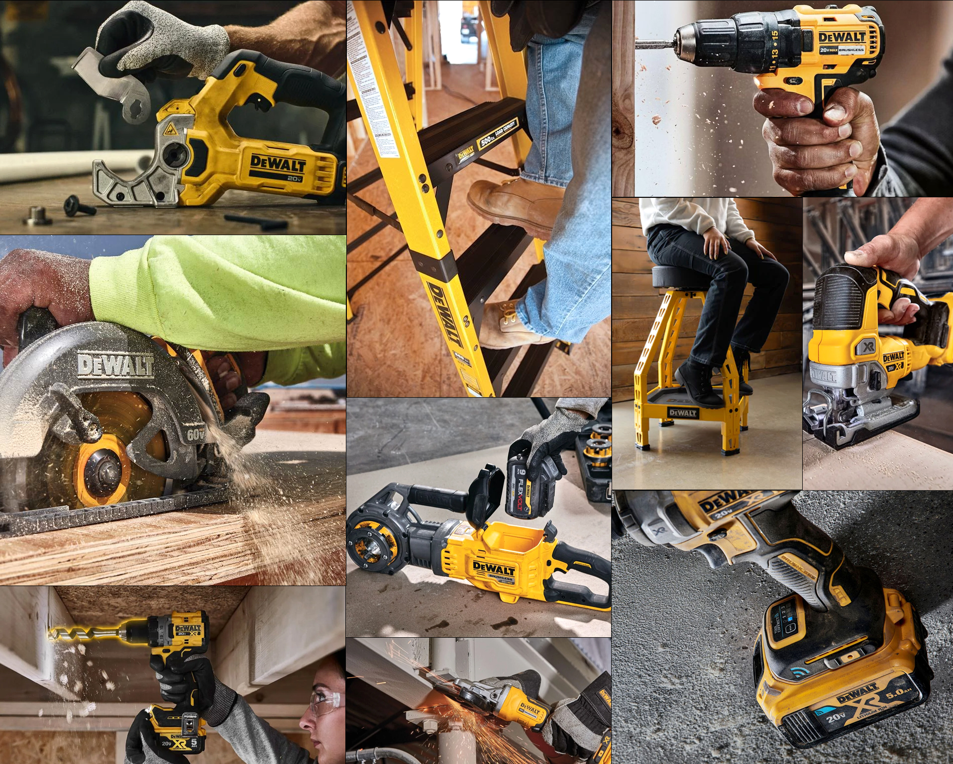
DEWALT’s yellow holds up where the tools actually live, cutting through dust, grease, clutter, and repeated use without losing recognition.
DIGITALLY OR IN REALITY...
The System Holds Up
This kind of system becomes even more obvious when you look at how the brand shows up physically. At events like World of Concrete, DEWALT’s booth, demos, and messaging all reflect the same identity you see in their products and packaging. Nothing feels like a separate campaign or a one-off idea.
That consistency builds trust. When everything looks and feels aligned, the brand comes across as more reliable and more intentional. You are not questioning whether different pieces belong together. You are recognizing it instantly and moving on.
That is the goal. Not to impress someone once, but to be recognized every time. A strong brand system should survive outside the controlled environment of a website mockup or polished ad. It needs to hold up on a crowded trade show floor, on a dusty job site, on retail shelves, and in the hands of the customer actually using the product. DEWALT does that well because the brand is built into the object, the environment, and the experience. It is not just decoration applied at the end.
This Does Not Happen By Accident
The Approach Matters
Brands like this are not the result of a single campaign or a one-time redesign. They are built over time through consistent decisions and clear systems that everyone follows. Internal teams play a big role, but they are rarely doing it alone. This is where external partners come in. We don’t replace the internal team, we support it, extend it, and help maintain that level of consistency across everything being produced.
That is the same approach we take at Predi. If a company wants this level of consistency, whether they already have a team or not, the focus is on building and maintaining a system that holds together across every touchpoint.
Intentional design is something Predi Designs thrives on. While we allow our clients to overwrite our judgement, our default is to craft visually similar branded deliverables like DEWALT does in order to create a similar system.
The real value is not just making each individual piece look good. It is making sure the website, sales materials, trade show displays, presentations, social graphics, ads, product literature, and internal documents all feel like they came from the same company. That takes repetition, judgment, and someone paying attention to the details that are easy to overlook when everything is moving fast.
For many companies, that is where consistency starts to break down. Different teams need different materials. Deadlines get tight. Vendors change. Old files get reused. Someone makes a quick edit, then someone else builds from that edit, and over time the brand starts to drift. A strong creative partner helps prevent that drift by understanding the system, applying it consistently, and knowing when something needs to be adjusted without losing the larger identity.
A brand becomes easier to recognize, easier to trust, and easier to manage because every piece feels connected visually.
DEWALT’s trade show presence shows how the brand system can shift proportions while still staying instantly recognizable across every medium.
Consistent. See?
DEWALT As A System, Not A Style
DEWALT is a strong example of this kind of system thinking. The brand is recognizable before you even see the logo clearly. The black and yellow color palette, the physical design language, even the way products are grouped and presented all work together to create instant recognition.
What stands out is how consistent that experience feels across different contexts. The website is structured around clear product families, all of which feature the specific #febd17 safety yellow that the company is known for. Even product packaging follows the same visual language, which the product design reinforces. You know if you are getting DEWALT, you are getting something quality. It feels like one continuous system instead of a series of disconnected decisions.
That kind of consistency matters because DEWALT is not selling one isolated product at a time. It is selling confidence in their entire catalog. It’s almost like an ecosystem. A drill, battery, charger, storage box, saw, and accessory all feel like they belong to the same larger world. I think about it like a Marvel Cinematic Universe for construction tools and supplies. For a customer, that reduces the hesitation before buying. For the brand, it builds recognition through repetition without needing to shout. The more places the system shows up, the more familiar and dependable it feels.
“I see it everywhere. Every site I go to uses it. I recognize it instantly. It MUST be good.”
If every DEWALT product category used a different color scheme, the likelihood of that thought process occurring diminishes significantly.
DEWALT has a specific color scheme that's recognizable instantly because it's been consistently used across all of their products and marketing for decades. Those colors fits the safety-focused job construction environment it has been calling home for over a century.
Uh-Huh, You Know What It Is
Black and Yellow, Black and Yellow.
DEWALT’s black and yellow color system is one of the biggest reasons the brand is so recognizable. While it may not be as colorful, it’s an effective form of “peacocking” in environments that are typically masculine. Yellow is loud, visible, and hard to ignore, especially in the kinds of places where DEWALT tools are usually seen. On job sites, in garages, inside trucks, on retail shelves, and across crowded trade show floors, that specific yellow gives the brand an immediate visual advantage. It is not just bright for the sake of being bright. It borrows from the same visual logic as safety signage, where color is used to grab attention fast and leave no confusion about what you are seeing. In a world of gray concrete, black tires, brown dust, and steel, DEWALT flags you down.
The black matters just as much. It gives the yellow contrast, weight, and durability. Yellow by itself could feel too bright or lightweight, but paired with black, it feels tougher and more industrial. It also works well in messy environments where tools are handled, dropped, stored, and used around dirt, dust, concrete, lumber, oil, and metal.
That color choice is not just a style preference. It has practical value. A DEWALT tool is easier to spot in a pile of equipment, easier to identify from a distance, and easier to recognize even when the logo is partially covered or the product is worn down. The colors become a shortcut for the brand itself, which is exactly what strong visual branding should do.
DEWALT’s yellow holds up where the tools actually live, cutting through dust, grease, clutter, and repeated use without losing recognition.
DIGITALLY OR IN REALITY...
The System Holds Up
This kind of system becomes even more obvious when you look at how the brand shows up physically. At events like World of Concrete, DEWALT’s booth, demos, and messaging all reflect the same identity you see in their products and packaging. Nothing feels like a separate campaign or a one-off idea.
That consistency builds trust. When everything looks and feels aligned, the brand comes across as more reliable and more intentional. You are not questioning whether different pieces belong together. You are recognizing it instantly and moving on.
That is the goal. Not to impress someone once, but to be recognized every time. A strong brand system should survive outside the controlled environment of a website mockup or polished ad. It needs to hold up on a crowded trade show floor, on a dusty job site, on retail shelves, and in the hands of the customer actually using the product. DEWALT does that well because the brand is built into the object, the environment, and the experience. It is not just decoration applied at the end.
Intentional design is something Predi Designs thrives on. While we allow our clients to overwrite our judgement, our default is to craft visually similar branded deliverables like DEWALT does in order to create a similar system.
This Does Not Happen By Accident
The Approach Matters
Brands like this are not the result of a single campaign or a one-time redesign. They are built over time through consistent decisions and clear systems that everyone follows. Internal teams play a big role, but they are rarely doing it alone. This is where external partners come in. We don’t replace the internal team, we support it, extend it, and help maintain that level of consistency across everything being produced.
That is the same approach we take at Predi. If a company wants this level of consistency, whether they already have a team or not, the focus is on building and maintaining a system that holds together across every touchpoint.
The real value is not just making each individual piece look good. It is making sure the website, sales materials, trade show displays, presentations, social graphics, ads, product literature, and internal documents all feel like they came from the same company. That takes repetition, judgment, and someone paying attention to the details that are easy to overlook when everything is moving fast.
For many companies, that is where consistency starts to break down. Different teams need different materials. Deadlines get tight. Vendors change. Old files get reused. Someone makes a quick edit, then someone else builds from that edit, and over time the brand starts to drift. A strong creative partner helps prevent that drift by understanding the system, applying it consistently, and knowing when something needs to be adjusted without losing the larger identity.
A brand becomes easier to recognize, easier to trust, and easier to manage because every piece feels connected visually.

Matthew A.
Owner of Predi Designs
Matthew began as an online content creator in his teenage years, crafting Flash animations and games for internet audiences and collaborating with other young creatives worldwide. He later graduated cum laude from Texas A&M University’s Visualization Program, where he honed his skills in design, animation, and interactive media. He has owned and operated Predi Designs since 2016.
A Subscription Just Makes Sense.
Predi Designs delivers unlimited high-quality graphic design for a flat monthly rate, making top-tier branding and marketing more affordable, flexible, and efficient than traditional agencies. Plus, without salaries, benefits, or equipment costs, it’s more cost-effective than hiring in-house. No hourly fees, no scope limits. Just fast, reliable design on demand. Scale smarter, save more, and streamline creativity with Predi Designs.
blog tags
related posts
 Predi Designs was built on strong relationships and consistent quality, not flashy sales tactics. From the start, clients have shared our work with others because collaboration makes the results worth talking about. The subscription model grew out of that trust. It gives every client full access without surprises and gives me the steady foundation to focus on great design instead of constant billing. This post explains how that single decision shaped the studio and why predictable revenue lets both sides create with confidence.
 Trade shows have always fascinated me, especially niche or industry specific conferences where companies invest in booths as a way to stay visible within their own market. I attend many of these events alongside clients, and a familiar pattern often emerges. Booth after booth is staffed by teams speaking primarily to industry peers. Sales teams talking to competitor sales teams. Competing brand marketing teams exchanging impressions of jobs well done. Leadership walking the floor to observe how competitors are positioning themselves. Every time, I find myself asking the same question. Why spend over fifteen thousand dollars to market your business in a room filled mostly with companies that already understand your space as well as you do? The most common answer usually centers on appearances. Staying visible. Reinforcing presence. Avoiding the perception that something has changed. Maybe a platinum sponsor is peacocking for the few potential customers that made an appearance in an attempt to stand out from the pack. While I understand that reasoning, it never fully clicked for me. There are often far more cost effective ways to signal stability and relevance. For someone who tends to think a bit differently about marketing, trade shows eventually became less about criticism and more about opportunity, specifically an opportunity to rethink how visibility really works.
 There was a time when icons looked more like illustrations than symbols. Detailed crests, layered textures, hand-drawn typography. The goal was to capture as much personality as possible in a single mark. That made sense in a world where branding mostly lived on signage, packaging, and print. You had the space, and you had the time to take it in. Today, that approach feels out of place. Most logos now live on screens, often at very small sizes. App icons, favicons, social avatars. That shift alone changes how design needs to function. What used to work at full scale no longer holds up when reduced to a tiny square.